自从我上次写我们在做什么已经有一段时间了,所以我有很多东西想要分享!说实话太多了——我发布这次更新的主要动力是下周我们还有更多新内容上线,而我觉得在分享我们已经发布的所有内容之前,我不能透露那些新内容。
🌐 It's been a while since I've written about what we've been working on so I have a lot to share! Too much honestly — my main motivator for even getting this update out is that we've got even more stuff coming next week, and I feel like I'm not allowed to share that stuff until I share all of the stuff we've already shipped.
所以穿上泳衣,坐在你的躺椅上,准备吸收一些 CSS 的精华。
🌐 So put your swim suit on, sit back in your lounge chair, and prepare to soak up some vitamin CSS.
Headless UI v1.6 已发布(Headless UI v1.6 is out)
几周前,我们发布了 Headless UI的新小版本,这是我们构建的无样式 UI 库,旨在使 Tailwind UI 可以支持 React 和 Vue。
查看 发行说明了解所有细节,以下是一些重点内容。
多选支持(Multiselect support)
我们在 Combobox 和 Listbox 组件中新增了一个 multiple 属性,以便用户可以选择多个选项。
🌐 We've added a new multiple prop to both the Combobox and Listbox components so people can select more than one option.
只需添加 multiple 属性,并将一个数组绑定为你的 value,你就可以开始使用了:
🌐 Just add the multiple prop and bind an array as your value and you are ready to go:
function MyCombobox({ items }) { const [selectedItems, setSelectedItems] = useState([]); return ( <Combobox value={selectedItems} onChange={setSelectedItems} multiple> {selectedItems.length > 0 && ( <ul> {selectedItems.map((item) => ( <li key={item}>{item}</li> ))} </ul> )} <Combobox.Input /> <Combobox.Options> {items.map((item) => ( <Combobox.Option key={item} value={item}> {item} </Combobox.Option> ))} </Combobox.Options> </Combobox> );}可空组合框(Nullable comboboxes)
在 v1.6 之前,如果你删除了组合框的内容然后切换聚焦,它会恢复先前选择的选项。这在很多情况下是合理的,但有时你确实希望清空组合框的值。
🌐 Prior to v1.6, if you deleted the contents of a combobox and tabbed away, it would restore the previously selected option. This makes sense a lot of the time, but sometimes you really do want to clear the value of a combobox.
我们添加了一个新的 nullable 属性,使这成为可能——只需添加该属性,你现在就可以删除值,而不会恢复之前的值:
🌐 We've added a new nullable prop that makes this possible — just add the prop and now you can delete the value without the previous value being restored:
function MyCombobox({ items }) { const [selectedItem, setSelectedItem] = useState([]); return ( <Combobox value={selectedItem} onChange={setSelectedItem} nullable> <Combobox.Input /> <Combobox.Options> {items.map((item) => ( <Combobox.Option key={item} value={item}> {item} </Combobox.Option> ))} </Combobox.Options> </Combobox> );}便捷的 HTML 表单支持(Easy HTML form support)
现在,如果你在像 Listbox、Combobox、Switch 和 RadioGroup 这样的表单组件上添加 name 属性,我们将自动创建一个与组件值同步的隐藏输入。
🌐 Now if you add a name prop to form components like Listbox, Combobox, Switch, and RadioGroup, we'll automatically create a hidden input that syncs with the component's value.
这使得通过常规表单提交,或者使用像 Remix中的<Form>组件这样的方式,将数据发送到服务器变得非常简单。
<form action="/projects/1/assignee" method="post"> <Listbox value={selectedPerson} onChange={setSelectedPerson} name="assignee" > </Listbox> <button>Submit</button></form>这适用于数字和字符串等简单值,也适用于对象 - 我们使用 1996 年的方括号表示法自动将它们序列化为多个字段:
🌐 This works with simple values like numbers and string, but also with objects — we automatically serialize them into multiple fields using that square bracket notation from 1996:
<input type="hidden" name="assignee[id]" value="1" /><input type="hidden" name="assignee[name]" value="Durward Reynolds" />如果你想再次完整阅读我刚才写的内容,但在不同的域上,可以查看 文档。
可滚动对话框改进(Scrollable dialog improvements)
对话框几乎是地球上最难构建的东西。我们已经在与棘手的滚动问题挣扎了一段时间,现在认为在 v1.6 中我们终于把它们都解决了。
关键在于我们改变了“点击外部关闭”的工作方式。我们以前使用这个 Dialog.Overlay 组件,把它放在对话框的后面,并在它上面添加一个点击处理器,当点击时关闭对话框。我实际上非常喜欢这种方法的简洁——检测特定元素被点击比检测特定元素以外的任何东西被点击要简单得多,尤其是当你的对话框内部还渲染了通过 portal 等方式渲染的其他内容时。
🌐 The crux of it is that we've changed how "click outside to close" works. We used to use this Dialog.Overlay component that you put behind your actual dialog, and we had a click handler on that that would close the dialog on click. I actually really love the simplicity of this in principle — it's a lot less quirky to detect when a specific element is clicked than it is to detect when anything other than a specific element is clicked, especially when you have things rendered inside your dialog that themselves are rendering other things in portals and stuff.
这种方法的问题在于,如果你有一个需要滚动的长对话框,你的覆盖层会覆盖在滚动条上方,尝试点击滚动条时会关闭对话框。这不是你想要的效果!
🌐 The problem with this approach is that if you had a long dialog that required scrolling, your overlay would sit on top of your scrollbar, and trying to click the scrollbar would close the dialog. Not what you want!
因此,为了以不破坏现有功能的方式解决这一问题,我们添加了一个新的 Dialog.Panel 组件供你使用,现在无论何时你点击该组件之外的区域,都会关闭对话框,而不是仅在点击覆盖层时才关闭它:
🌐 So to fix this in a non-breaking way, we've added a new Dialog.Panel component you can use instead, and now we close the dialog any time you click outside of that component, rather than closing it specifically when the overlay is clicked:
<Dialog open={isOpen} onClose={closeModal} className="fixed inset-0 flex items-center justify-center ..."> <Dialog.Overlay className="fixed inset-0 bg-black/25" /> <div className="fixed inset-0 bg-black/25" /> <div className="bg-white shadow-xl rounded-2xl ..."> <Dialog.Panel className="bg-white shadow-xl rounded-2xl ..."> <Dialog.Title>Payment successful</Dialog.Title> </div> </Dialog.Panel></Dialog>查看 更新的对话文档,获取使用新面板组件而非覆盖层的更完整示例。
更好的聚焦捕获(Better focus trapping)
对话框之所以是地球上最难构建的东西之一,其中一个原因是聚焦困陷。我们对这一点的第一次尝试是劫持 Tab 键,并手动聚焦下一个/上一个元素,以便当你到达聚焦困陷的末尾时,可以循环回到第一个项目。
🌐 One of the many reasons dialogs are the hardest thing to build on the planet is because of focus trapping. Our first attempt at this involved hijacking the tab key and manually focusing the next/previous element, so that we could circle back to the first item in the focus trap when you get to the end.
这在使用聚焦限制时效果还可以,直到人们开始在其中使用门户。现在基本上无法管理,因为你可能会通过 tab 键切换到一个日期选择器之类的东西,它在概念上属于对话框内部,但实际上并不属于,因为它是为了样式原因而在门户中渲染的。
🌐 This works okay until people start using portals inside the focus trap. Now it's basically impossible to manage because you could tab to a datepicker or something that is conceptually inside the dialog, but isn't actually because it's rendered in a portal for styling reasons.
Robin 想出了一个非常棒的解决方案,而且超级简单——与其尝试手动控制 Tab 键的行为,不如在聚焦陷阱的开头和结尾各放一个不可见的可聚焦元素。现在,每当其中一个哨兵元素获得聚焦时,你只需根据当前是第一个元素还是最后一个元素,以及用户是向前还是向后按 Tab,将聚焦移动到实际应该去的位置即可。
使用这种方法,你完全无需劫持 Tab 键 - 你只需让浏览器完成所有工作,并且只在你的某个哨兵元素获得聚焦时才手动移动聚焦。
🌐 With this approach, you don't have to hijack the tab key at all — you just let the browser do all of the work and only move focus manually when one of your sentinel elements receives focus.
弄清楚之后,我们发现其他几个库已经在做同样的事情,所以这算不上突破性或新颖的,但我认为这非常巧妙,值得与那些从未想过这种技术的人分享。
🌐 After figuring this out we noticed a couple of other libraries already doing the same thing so it's nothing groundbreaking or new, but I thought it was pretty damn clever and worth sharing for anyone who hadn't thought of this technique.
Tailwind UI 的团队管理功能(Team management features for Tailwind UI)
当我们首次发布 Tailwind UI时,“团队”只有我和 Steve,所以如果我们希望仅凭我们两个人就能把项目推出,我们就必须把很多事情保持简单。
其中一件事是团队许可。我们没有提供任何花哨的团队成员邀请流程之类的东西,我们只是让人们与他们的团队共享他们的 Tailwind UI 凭证。对于我们来说,这已经足够让产品顺利发布,因为 Tailwind UI 并不针对特定用户做什么,而且你团队的每个成员都能获得相同的体验。
🌐 One of those things was team licensing. We didn't ship with any fancy team member invitation flow or anything, we just asked people to share their Tailwind UI credentials with their team. This was good enough for us to get things out the door, because Tailwind UI doesn't really do anything in a user-specific way, and every member of your team gets the same experience anyways.
此外,对于我们来说,获取团队中每个人的电子邮件地址,将其输入到某个表单中,向每个人发送邀请邮件,并让他们接受邀请,这感觉就像一场行政地狱,尤其是在每个人登录后都获得相同体验的情况下。
🌐 Plus to us, having to get the email addresses of everyone on your team, enter them into some form, send each person an invitation email, and have them accept the invitation felt like administrative hell, especially when every single person gets the same experience after they sign in.
不过,同时来说,分享任何凭证都是很低端的做法,这也不是我们引以为傲的设计决策。我对 Tailwind UI 用的密码(slayerfan1234)和我银行账户用的是一样的——我可不想把它分享给任何人!
🌐 At the same time though, sharing credentials for anything is pretty low-end, and it's not a design decision we took a lot of pride in. I use the same password (slayerfan1234) for Tailwind UI as I do for my bank account — I don't want to share that with anyone!
几周前,我们决定解决这个问题并构建一些东西。
🌐 So a couple of weeks ago we decided to figure it out and build something.
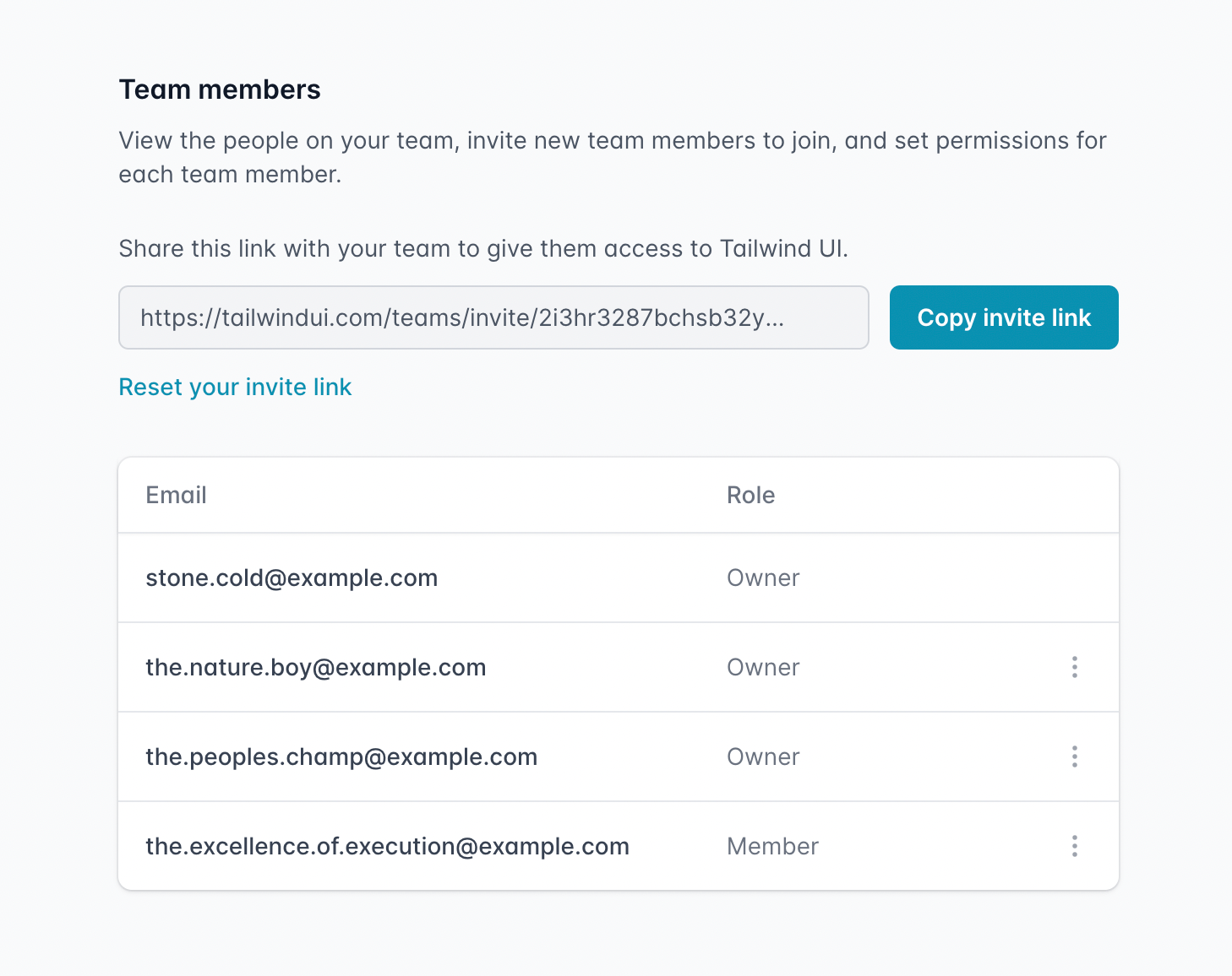
我们最终采用的是一种纯链接式邀请系统,你可以直接复制你的邀请链接,通过 Slack、Discord 或其他渠道分享给你的团队,如果需要还可以重置链接。你还可以给他人分配“成员”或“拥有者”权限,这决定了他们是否可以管理团队成员或查看账单记录。
🌐 What we landed on was a purely link-based invitation system, where you could just copy your invite link, share it with your team in Slack/Discord/whatever, and reset your link if needed. You can also give people either "Member" or "Owner" permissions, which control whether they can manage team members or view billing history.
这样可以非常轻松地邀请你的团队,而无需进行大量繁琐的数据输入;如果有人离开,也可以在 UI 中直接撤销访问权限,而无需更改共享密码。
🌐 This makes it super easy to invite your team without a bunch of tedious data entry, and revoke access if someone leaves right in the UI instead of by changing your shared password.
现在,拥有 Tailwind UI 团队账户的任何人都可以使用——只需打开下拉菜单并点击“我的团队”,即可为你的团队命名并开始邀请同事。
🌐 This is available now for anyone with a Tailwind UI team account — just open the dropdown menu and click "My Team" to name your team and start inviting your co-workers.
你可以在 Tailwind UI 网站上 为你的团队购买许可证,或者如果你拥有个人许可证并希望开始与团队一起使用 Tailwind UI,可以 升级为团队许可证。
将 Tailwind UI 中的 Vue 示例更新为 <script setup>(Updating the Vue examples in Tailwind UI to <script setup>)
自从为 Tailwind UI 发布 Vue 支持以来,Vue 3 中新的 <script setup> 语法已成为编写单文件组件的推荐方式。
🌐 Since releasing Vue support for Tailwind UI, the new <script setup> syntax in Vue 3 has become the recommended way to write your single-file components.
我们已经更新了 Tailwind UI 中所有的 Vue 示例,使用这种新格式,这大大减少了大量的样板代码:
🌐 We've updated all of the Vue examples in Tailwind UI to use this new format, which cuts out a ton of boilerplate:
<template> <Listbox as="div" v-model="selected"> <!-- ... --> </Listbox></template><script setup> import { ref } from "vue"; import { Listbox, ListboxButton, ListboxLabel, ListboxOption, ListboxOptions } from "@headlessui/vue"; import { CheckIcon, SelectorIcon } from "@heroicons/vue/solid"; const people = [ { id: 1, name: "Wade Cooper" }, // ... ]; const selected = ref(people[3]);</script>对我来说,最棒的地方是你不再需要显式地在 components 下注册任何东西——任何在作用域内的组件都会自动在模板中可用。
🌐 To me, the absolute best part is that you don't have to explicitly register anything under components anymore — any components that are in scope are automatically available to the template.
使用 <script setup> 还可以让你像在 Headless UI 的 React 版本中使用的那样使用 命名空间组件,例如 Listbox.Button。我们还没有更新 Headless UI 来以这种方式暴露组件,但我们可能很快就会这样做,这将让你省去大量的导入。
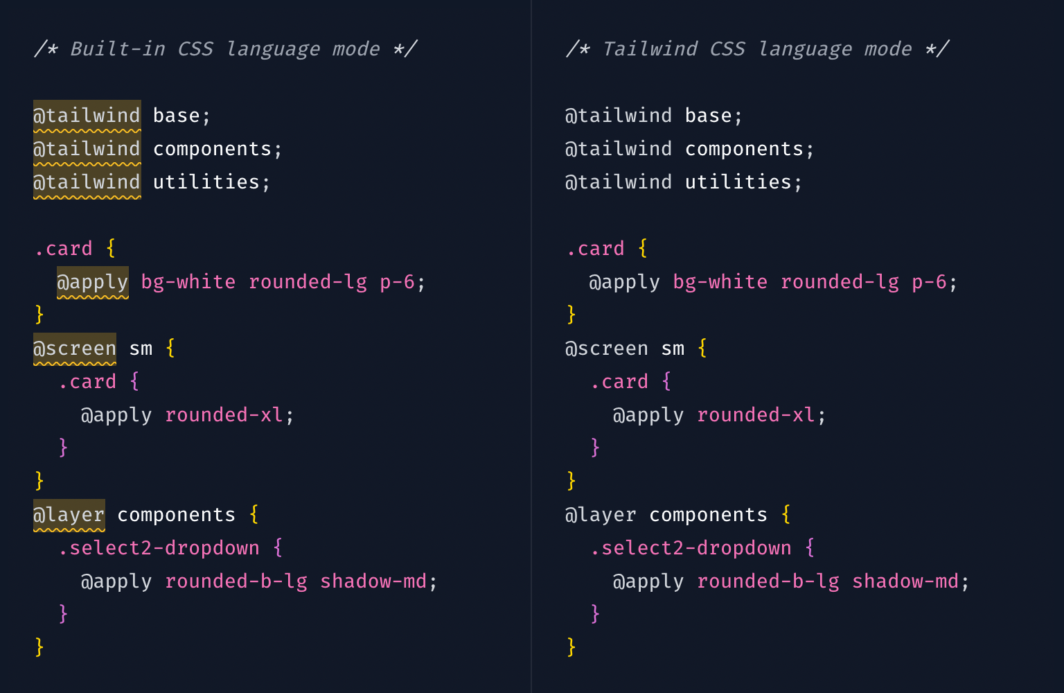
VS Code 的新 Tailwind CSS 语言模式(New Tailwind CSS language mode for VS Code)
Tailwind 使用了一些非标准的 at-rule,比如 @tailwind 和 @apply,所以如果你在 VS Code 中使用常规的 CSS 语言模式,会收到 lint 警告。
🌐 Tailwind uses a bunch of non-standard at-rules like @tailwind and @apply, so you get lint warnings in VS Code if you use the regular CSS language mode.
为了解决这个问题,我们一直建议大家使用 PostCSS 语言支持插件,它可以消除这些警告,但也会移除所有其他的 CSS 智能感知支持。
几周前,我们在我们的 Tailwind CSS IntelliSense 扩展中发布了第一个官方的 Tailwind CSS 语言模式,它基于内置的 CSS 语言模式,添加了 Tailwind 特定的语法高亮,并修复了你通常会看到的 Lint 警告,同时不会丢失你 确实 想保留的任何 CSS IntelliSense 功能。
通过下载最新版本的 Tailwind CSS IntelliSense 并将 CSS 文件的语言模式选择为“Tailwind CSS”来尝试它。
🌐 Try it out by downloading the latest version of Tailwind CSS IntelliSense and choosing "Tailwind CSS" as the language mode for your CSS files.
Tailwind Play 中的“生成 CSS”面板(“Generated CSS” panel in Tailwind Play)
在过去几个月里,我们对 Tailwind Play 做了一些小改进,我最喜欢的是新的“生成的 CSS”面板。
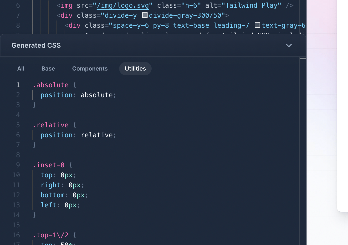
它会显示由你的 HTML 生成的所有 CSS,并允许你按层过滤,这在排查问题时非常有用。在内部,我们一直在使用它来调试类未被检测到的奇怪问题,以便我们可以执行任何必要的 可怕的正则表达式修复使其正常工作。
我们还在每个窗格中添加了一个“整理”按钮(Cmd + S),可以自动格式化你的代码(并对你的类进行排序!),还有一个“复制”按钮(Cmd + A Cmd + C,不过你已经知道了)。
重新设计 Refactoring UI 网站(Redesigning the Refactoring UI website)
当我们在2018年12月发布 Refactoring UI时,Steve和我实际上是在发布前一晚凌晨1点左右设计并制作了最终的登陆页面。
发生的事情是我们设计了整个很吸引人的登录页面,然后我在写给我们邮件列表上所有人的公告邮件时,我们都觉得“这封邮件的内容很棒,比我们在这个登录页面设计里的内容更有吸引力”。
🌐 What happened is we had this whole sexy landing page designed, then I was writing up the announcement email to send to everyone on our mailing list and we both thought "man the content in this email is great and a lot more compelling than what we have in this landing page design".
但那些内容并不真正适合我们设计的东西,所以在最后时刻,我们把之前设计的所有东西都放弃了,基于新内容匆忙拼出了一个更简单的页面。它看起来还算可以,但并不是我们真正想要的超级漂亮的体验。
🌐 But that content didn't really fit into what we had designed, so at the eleventh hour we scrapped everything we had designed and whipped together a much simpler page based on the new content. It looked fine but it wasn't the super beautiful experience we really wanted it to be.
所以几周前,我们决定终于设计 一些新东西。
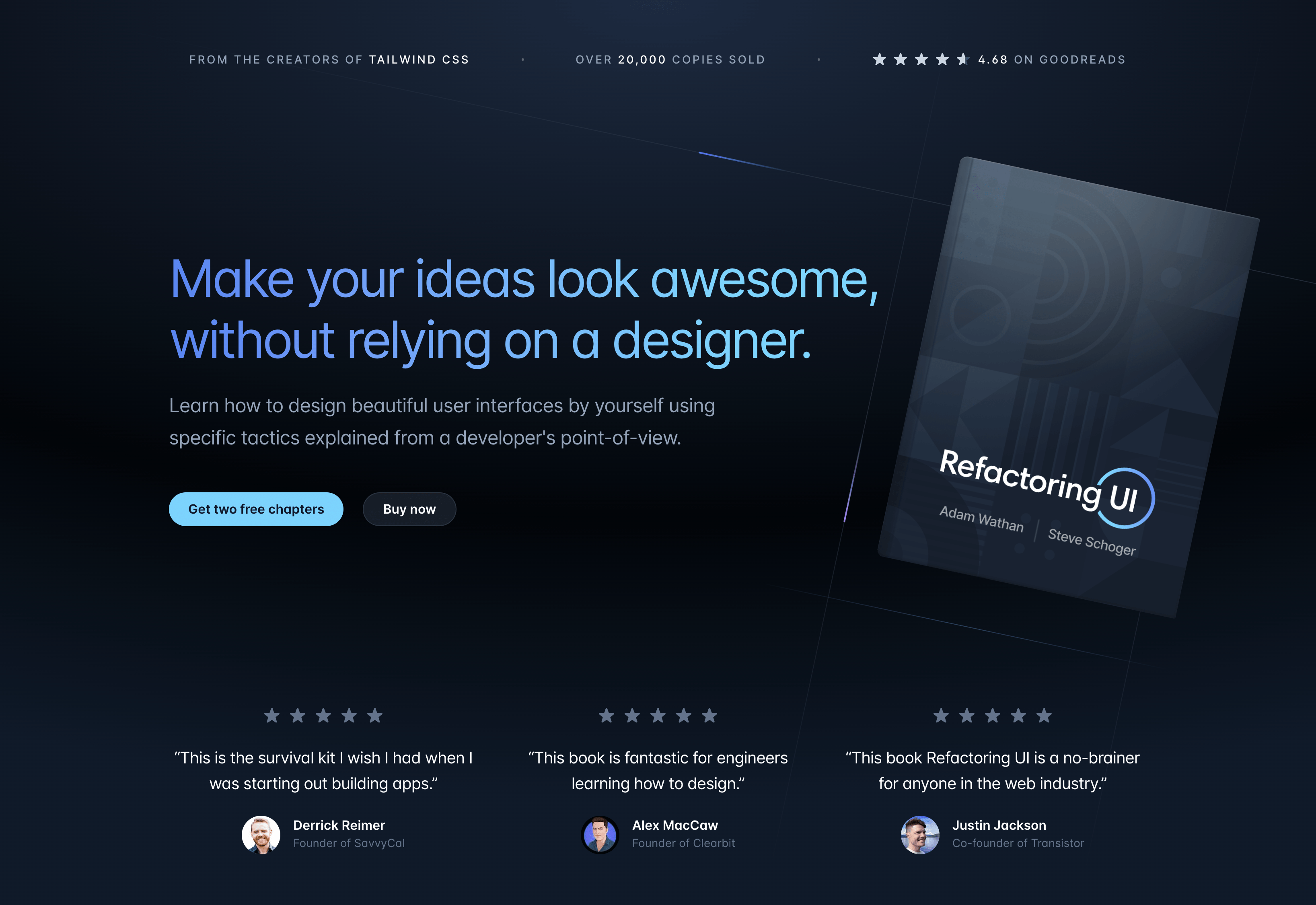
我仍然对这本书感到非常自豪——可能比我们曾经做过的任何作品都更自豪。它在 Goodreads上的评分为4.68,有超过1100条评分和近200条评论,对于一本自发布的电子书来说,这让我觉得相当不可思议。
期待未来有一天能用我们学到的所有知识来制作第二版!
🌐 Looking forward to doing a second edition one day with everything we've learned since!
Tailwind CSS 模板即将推出(Tailwind CSS templates are coming soon)
我们已经在 on Twitter 上稍微预告过了,但在过去的几个月里,我们一直在努力制作一堆完整的 Tailwind CSS 网站模板。
这是其中一个的预览——一个使用 Next.js和Stripe全新 Markdoc库构建的文档网站模板:
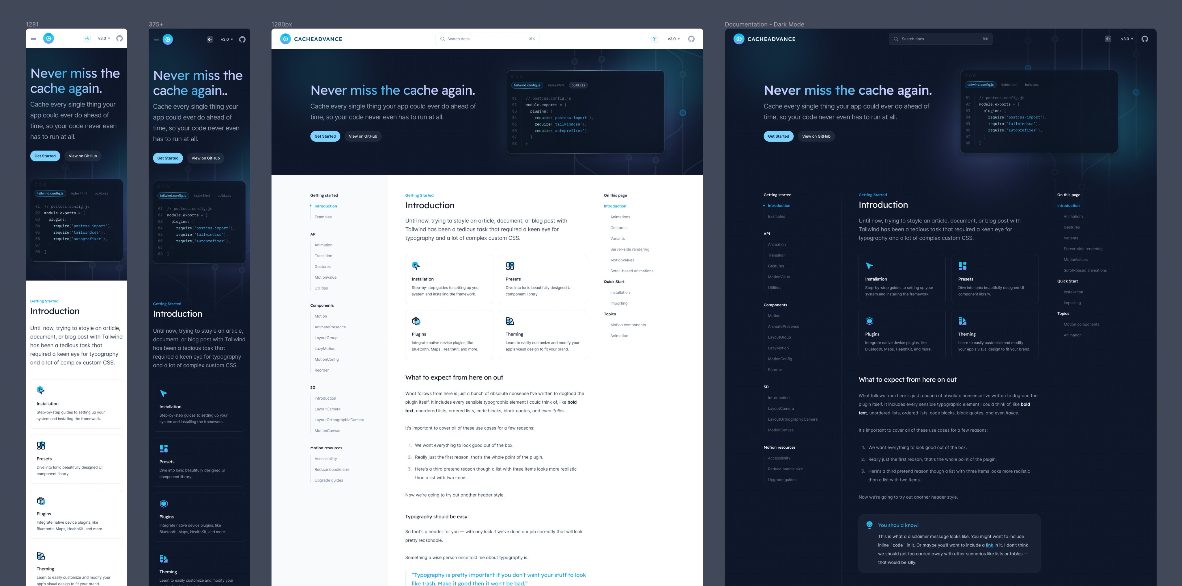
我对发布这些东西感到异常兴奋。我真的为 Tailwind UI 这个产品感到自豪,但 可复制粘贴的代码片段 这种形式的一个局限是,我们没有机会真正向你展示如何将功能组件化、最小化重复,以及将项目架构成一个完整的、可投入生产的网站。
🌐 I'm unreasonably excited about getting these out. I'm really proud of Tailwind UI as a product, but one of the limitations of the copy-and-pasteable-code-snippet format is that we don't get an opportunity to really show you how to componentize things, minimize duplication, and architect things as a complete, production-ready website.
我们现在正在制作的模板将在弥补这一空白方面表现得非常出色。除了可以获得用于自己项目的精美模板作为起点之外,你还可以深入研究代码,准确了解我们自己是如何使用 Tailwind CSS 构建网站的。
🌐 The templates we're working on now are going to be amazing at filling that gap. On top of just getting beautiful templates to use as a starting point for your own projects, you'll be able to dig through the code and study exactly how we build websites with Tailwind CSS ourselves.
我们还没有确定这些的具体发布日期,但希望能够在下个月推出一些内容。随着进展,我们会分享更多信息!
🌐 We haven't set an exact release date on these yet but we're hoping to have something out next month. Will share more as we make more progress!