这周我们忙着收尾一系列项目,但一切终于尘埃落定,所以感觉是时候再更新一下了。
🌐 It's been a busy week wrapping up a bunch of projects we've been working on, but everything is finally out the door so it feels like a good time for another update.
自我上次发布以来,我们已经整理并解决了另外 226个GitHub问题和拉取请求,而我们的整个组织的未解决问题/拉取请求首次降至50个以下。所以请别再找漏洞了,我只想用Tailwind CSS设计和构建美丽的东西一段时间。
说到精彩的功能,以下是过去几周发布的内容!
🌐 Speaking of beautiful stuff, here's what shipped over the last couple of weeks!
聚光灯:你的全新个人网站(Spotlight: Your new personal website)
几天前,我们发布了 Spotlight,这是我们为 Tailwind UI 设计的一款令人惊叹的全新个人网站模板。
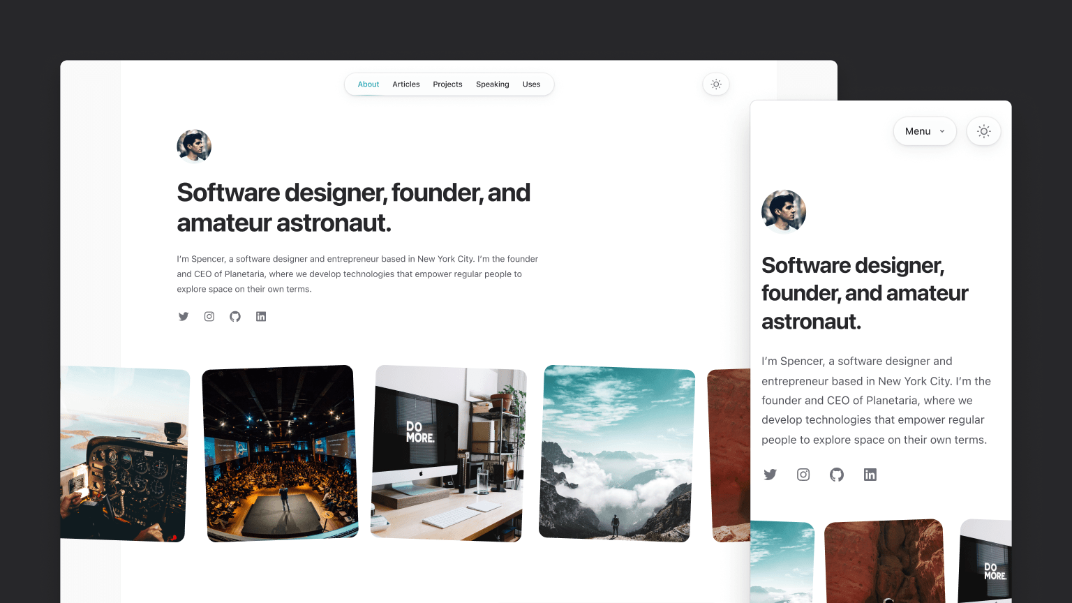
和我们的其他模板一样,它是使用 Next.js 构建的,这次我们使用 MDX 来驱动所有基于 Markdown 的内容,比如博客部分。
🌐 Like our other templates, it's built with Next.js, and this time we're using MDX to power all of the markdown-driven stuff like the blog section.
设计这个模板是一个相当有趣且有挑战性的过程——我们希望设计出既美观又能激发灵感的作品,同时足够中立,让几乎任何人都觉得合适。最终我们选择了一个相当极简的设计风格,通过一些小细节展现个性,例如旋转的图片、链接的颜色提示,以及在顶部导航等地方通过阴影和层次感带来的微妙深度。
🌐 Designing this template was a pretty fun and interesting challenge — we wanted to come up with something that was really beautiful and inspiring, but that was also unopinionated enough to feel like a good fit for almost anyone. We landed on a pretty minimalist design that gets its personality from little touches like rotated images, hints of color for links, and some subtle depth from shadows and layering in places like the top navigation.
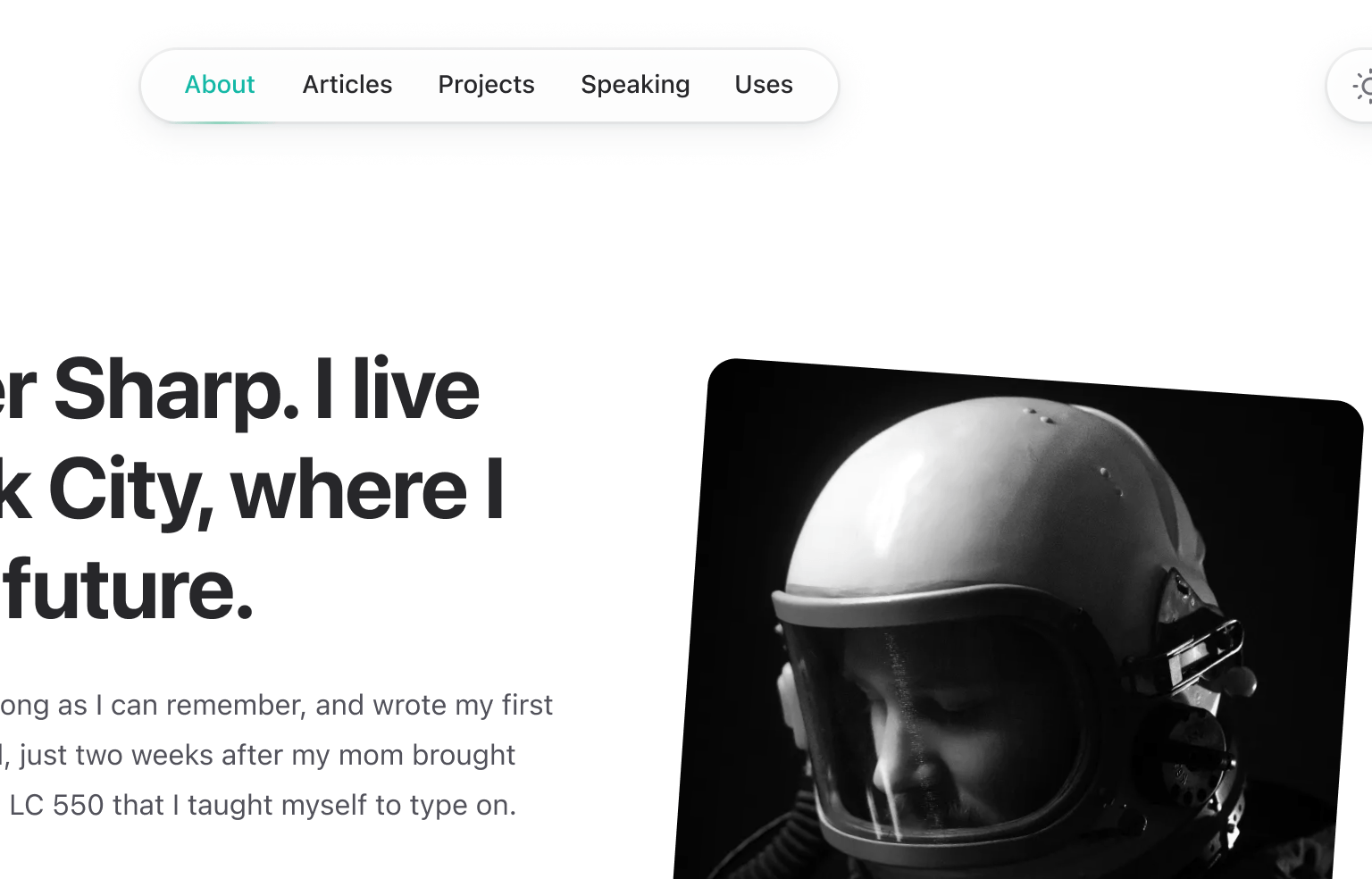
一如既往,我建议查看 实时预览以获得完整体验——尤其注意在滚动时主页上头像和导航的显示方式,当你在真实网站上操作时,这种感觉简直完美无缺。
我们尝试按照我们自己个人网站的方式来构建这个网站,因此它包括一个专门的博客、一页用于列出你最喜欢的项目、一个区域供你链接到你曾做过的会议演讲,以及一个“使用”页面来列出你所有喜欢的工具和装备。
如果你拥有 Tailwind UI 全访问权限许可证,那么你已经可以访问这个模板了!如果没有,建议考虑一下——这是支持我们在 Tailwind CSS、Headless UI 和 Heroicons 等开源项目上工作的最佳方式。
Heroicons v2.0
去年我们发布了 Heroicons v1.0。而就在上周,我们发布了 Heroicons v2.0,这是一个全新的图标集,Steve 从零开始绘制,花费了大约一年的时间。

它包含 280 个以三种不同风格绘制的图标:
🌐 It includes 280 icons drawn in three distinct styles:
- 轮廓 — 线条图标,线宽1.5px,绘制在24px视图框中。
- 实心 — 使用填充形状绘制的实心图标,适用于24像素视图框。
- 迷你 — 使用填充形状的实心图标,绘制在 20px 的视图框中。
与 v1 版本最大的区别在于,轮廓集使用了更细的描边,这在当今看来更具现代感和时尚感,而且图标的视觉风格也更加俏皮。
🌐 The biggest differences from v1 are that the outline set uses a thinner stroke, which feels a bit more modern and fashionable these days, and visually the icons are a bit more playful in style.
尽管这些名字中带有“v2”,但更好把 Heroicons v2 想象成《终端2》而不是 OpenSSL 2——我们觉得它们代表了我们的最佳作品,但它是一个新的图标集,而不完全是原始图标集的升级。不要像升级真正的应用依赖那样给现有项目施加压力,但如果你想迁移, 查看发布说明,了解切换所需的一切信息。
要探索所有新图标,请访问我们随新图标集推出的全新设计的 Heroicons 网站。
Headless UI v1.7
本周早些时候,我们为 Headless UI 标记了一个新版本,这是我们为 React 和 Vue 提供的无样式 UI 组件库。
Headless UI v1.7 不仅修复了大量常见的错误并进行了改进,还包含一些非常实用的新功能!
🌐 Headless UI v1.7 includes the usual slew of bug fixes and improvements, but also some really useful new features!
新增用于控制对象比较的“by”属性(Added "by" prop for controlling object comparisons)
我们在 Listbox、Combobox 和 RadioGroup 组件中添加了一个新的 by 属性,使将对象绑定为表单值变得不那么繁琐。
🌐 We've added a new by prop to the Listbox, Combobox, and RadioGroup components that make it a lot less cumbersome to bind an object as the form value.
import { Listbox } from "@headlessui/react";const departments = [ { id: 1, name: "Marketing", contact: "Durward Reynolds" }, { id: 2, name: "HR", contact: "Kenton Towne" }, { id: 3, name: "Sales", contact: "Therese Wunsch" }, { id: 4, name: "Finance", contact: "Benedict Kessler" }, { id: 5, name: "Customer service", contact: "Katelyn Rohan" },];function DepartmentPicker({ selectedDepartment, onChange }) { return ( <Listbox value={selectedDepartment} by="id" onChange={onChange}> <Listbox.Button>{selectedDepartment.name}</Listbox.Button> <Listbox.Options> {departments.map((department) => ( <Listbox.Option key={department.id} value={department}> {department.name} </Listbox.Option> ))} </Listbox.Options> </Listbox> );}这使得值更容易来自组件外部,并且省去了你必须仅绑定 id 或类似内容,然后在需要时自己进行一堆查找来找到完整对象的麻烦。
🌐 This makes it a lot easier for the value to come from outside the component, and saves you having to just bind the id or similar and do a bunch of lookups yourself to find the full object when needed.
查看每个组件的更新 “将对象作为值绑定”文档以获取更多详细信息。
将表单控件用作非受控组件(Use form controls as uncontrolled components)
Listbox、Combobox 和 RadioGroup 组件现在允许你可选地传入 defaultValue 而不是 value,从而可以将它们用作非受控组件。
🌐 The Listbox, Combobox, and RadioGroup components now let you optionally pass a defaultValue instead of a value, allowing you to use them as an uncontrolled component.
import { Listbox } from "@headlessui/react";const people = [ { id: 1, name: "Durward Reynolds" }, { id: 2, name: "Kenton Towne" }, { id: 3, name: "Therese Wunsch" }, { id: 4, name: "Benedict Kessler" }, { id: 5, name: "Katelyn Rohan" },];function Example() { return ( <form action="/projects/1/assignee" method="post"> <Listbox name="assignee" defaultValue={people[0]}> <Listbox.Button>{({ value }) => value.name}</Listbox.Button> <Listbox.Options> {people.map((person) => ( <Listbox.Option key={person.id} value={person}> {person.name} </Listbox.Option> ))} </Listbox.Options> </Listbox> <button>Submit</button> </form> );}当使用传统 HTML 表单或使用 FormData 收集其状态而不是通过 React 状态跟踪的表单 API 时,这可以简化你的代码。
🌐 This can simplify your code when using traditional HTML forms or form APIs that collect their state using FormData instead of tracking it using React state.
查看每个组件的 “作为非受控组件使用”文档,以查看更多示例。
仅 CSS 状态样式的数据属性(Data attributes for CSS-only state styling)
从历史上看,你一直需要通过检查传递给渲染属性的参数,并有条件地渲染合适的类或内容,来为 Headless UI 组件的不同状态设置样式。当你只是想调整背景颜色或进行其他仅 CSS 的更改时,这可能会感觉像是大量的样板代码。
🌐 Historically, you've always had to style the different states of a Headless UI component by inspecting arguments passed through a render prop and conditionally rendering whatever classes or content made sense. This could feel like a lot of boilerplate when just trying to tweak a background color or make some other CSS-only change.
在 Headless UI v1.7 中,我们在渲染的 HTML 中添加了一个 data-headlessui-state 属性,其中包含有关当前状态的信息,这样你就可以仅使用 CSS 来定位它。
🌐 In Headless UI v1.7, we've added a data-headlessui-state attribute to the rendered HTML that includes information about the current state so you can target it with just CSS.
我们还发布了一个新的 @headlessui/tailwindcss 插件,它为这些状态提供了变体,使它们只用 Tailwind CSS 类就能轻松样式化:
<Listbox.Option key={person.id} value={person} className="ui-active:bg-blue-500 ui-active:text-white ui-not-active:bg-white ui-not-active:text-black"> <CheckIcon className="ui-selected:block hidden" /> {person.name}</Listbox.Option>查看有关 使用数据属性进行样式设置的新文档以获取更多详细信息。
Tailwind Play 上的 Insiders 支持(Insiders support on Tailwind Play)
并不是每个人都知道,我们会向 npm 发布一个 insiders 版本的 Tailwind CSS,每次新的提交进入仓库时,这个版本都会自动构建和部署。这使得在新功能和修复正式发布之前测试它们变得非常容易。
🌐 Not everyone knows this but we ship an insiders build of Tailwind CSS to npm that is automatically built and deployed every single time a new commit lands in the repository. This makes it really easy to test out new features and fixes before they are actually tagged in a proper release.
现在我们在 Tailwind Play中也包括对内测版本的访问,因此你可以在不设置项目的情况下尝试最新功能:
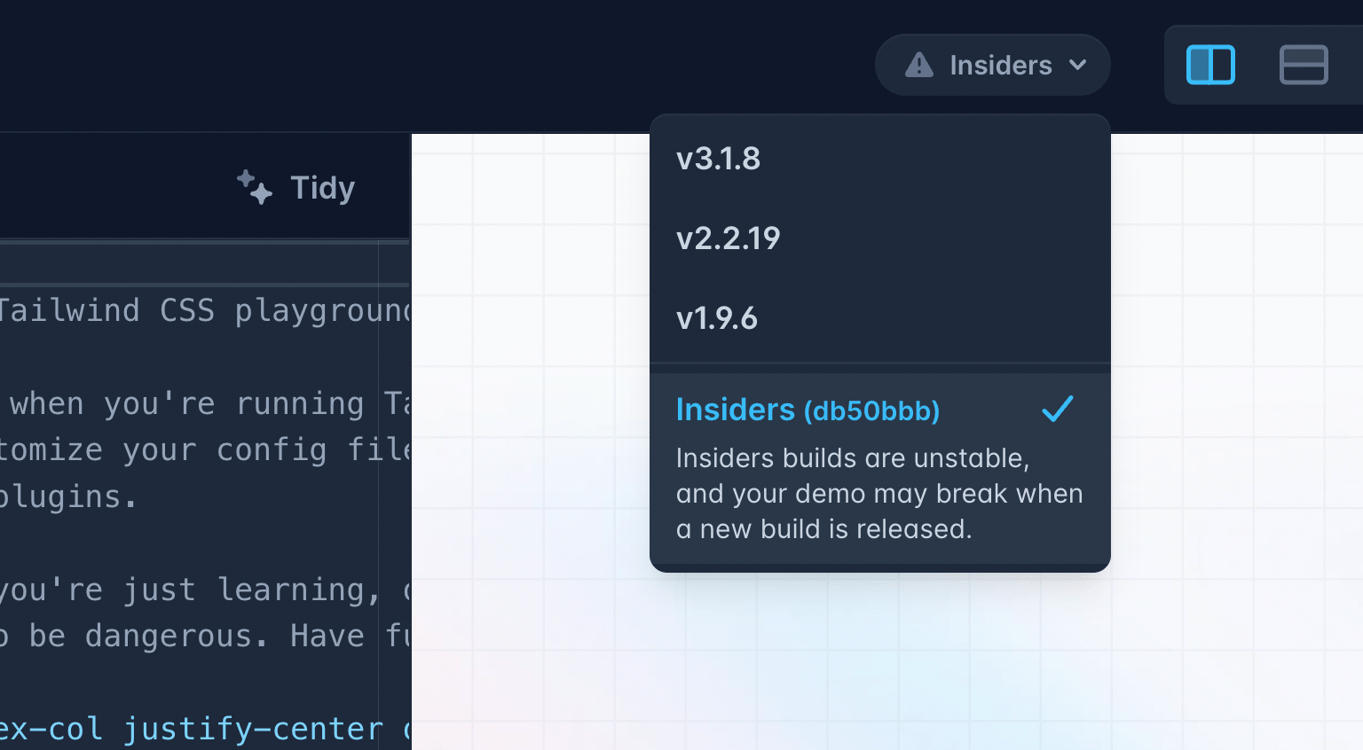
我们只在 Play 上保留最新的内部测试版,所以如果你使用内部测试版创建了演示,请注意如果下一个内部测试版对你使用的某些未发布功能进行更改,演示可能会出问题。无论如何,你也不应该把重要内容放在那里,来吧,做个专业人士。
🌐 We only keep the latest insiders build on Play, so if you create a demo using an insiders build know that it might break if the next insiders build changes something in some unreleased feature you were using. You shouldn't be putting important things there anyways, come on be a professional.
Tailwind CSS + Phoenix v1.7
不久前,我们开始与 Phoenix团队进行交流,因为他们希望在未来的版本中默认集成Tailwind CSS。我觉得这非常令人兴奋,并希望与他们合作,让开箱即用的体验真正出色。
我们设计了一个新的启动画面以及生成器系统所需的所有脚手架,这些将作为 Phoenix v1.7 的一部分发布。
🌐 We designed a new splash screen and all of the necessary scaffolding for their generator system, which will ship as part of Phoenix v1.7.
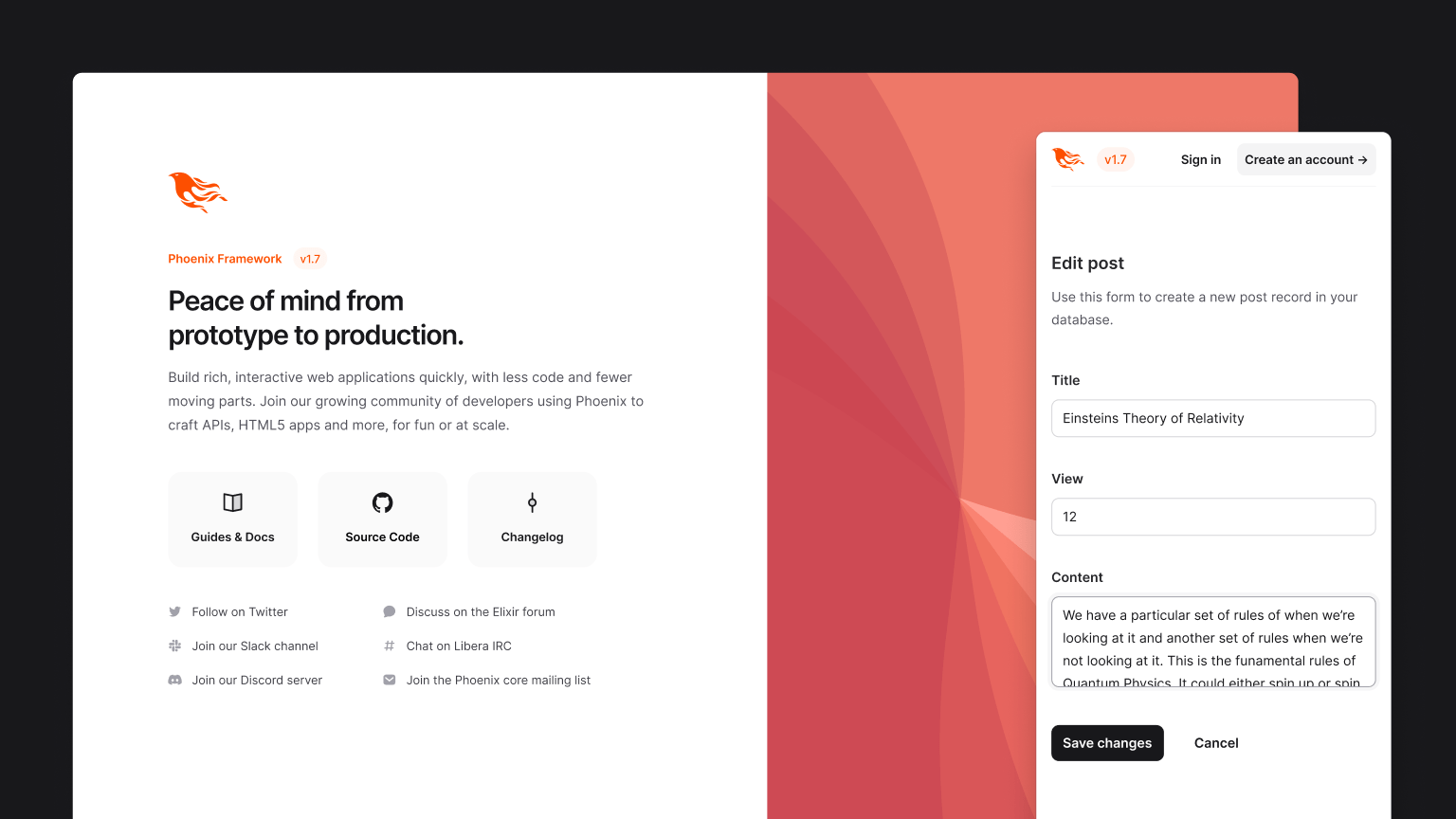
Phoenix 的创始人 Chris McCord 上周做了一个很棒的演讲,讲解了他们正在发布的所有 Tailwind CSS 内容,如果你想了解更多,非常值得一看。
好了,这就是我们过去几周一直在努力完成的所有酷炫内容!
🌐 So there you go, that's all of the coolest stuff we've been working on over the last few weeks!
在接下来的一个月左右,我很期待构建我们一直在设计的一堆新的 Tailwind UI 组件,探索一些 Tailwind CSS 的 新功能想法,并开始进行一些研发,研究使用 Tailwind + Next.js 创建一种应用启动模板会是什么样子——如果我们能做到的话,我觉得这可能会非常酷。
下次更新再见!
🌐 Catch you in the next update!