经过数月的筹备,我很高兴终于推出我们的下一个网站模板—— Protocol,这是一个用于构建精彩 API 文档网站的漂亮入门套件。
它由 Next.js 和 MDX 提供支持,并使用 Tailwind CSS 进行样式设计,其构建方式与我们构建自己的 API 参考文档的方式完全相同。
🌐 Powered by Next.js and MDX and styled with Tailwind CSS, it's built exactly the way we'd build our own API reference documentation.
可以 试玩演示,或者如果你拥有 Tailwind UI 全访问许可, 下载源码——对于全访问客户当然是免费的更新。
包含丰富的设计细节(Loaded with design details)
像往常一样,我们在设计过程中投入了大量的时间和精力,并对网站进行了额外的润色,使浏览体验更加愉悦。
🌐 As usual we had a lot of fun getting carried away with the design, and putting that extra layer of polish on things to make it really delightful to browse the site.
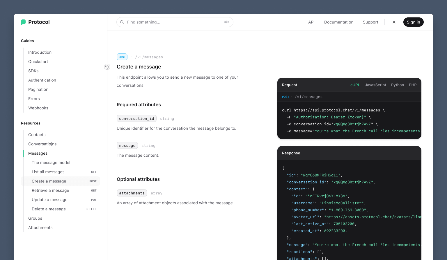
我们提供了粘性代码块,当你滚动浏览该端点的请求和响应详细信息时,它们会保留在视图中:
🌐 We've got sticky code blocks that stay in view as you scroll through the request and response details for that endpoint:
主页卡片上还有这个漂亮的悬停效果 - 它会跟随鼠标光标移动,并以渐变光晕展现出微妙的背景图案:
🌐 There's also this beautiful hover effect on the homepage cards — it follows your mouse cursor with this gradient glow that uncovers a subtle background pattern:
不过我最喜欢的细节还是侧边栏导航,它可以跟踪可见的页面内容,但采用了一种“迷你地图”的策略,所有可见的页面部分都会被高亮显示:
🌐 My favorite detail though has to be the sidebar navigation, which tracks the visible page content but using a sort of "minimap" strategy, where all visible page sections are highlighted:
当你滚动页面时观看这个动画真是令人惊叹——要为 Framer Motion的出色工作点赞。即使我极度不喜欢 React,我也几乎可以肯定我仍会使用它,仅仅是为了使用这个库,它真的非常好。
我们渴望拥有的开发者体验(The developer experience we'd want ourselves)
我们花了很多时间决定如何布置这部分的实际内容。我们探索了使用不同标准自动生成文档的多种选项,但就我个人而言,所有选项都感觉有点受限。
🌐 We spent a lot of time deciding how to wire up the actual content on this one. We explored a bunch of different options for autogenerating documentation using different standards, but for my tastes anyways it all felt a little restrictive.
就个人而言,我希望能够完全按照自己的意愿撰写文档。因此,对于 Protocol,我们在优化最大控制的同时,加入了许多便捷的创作功能,使你能够快速且轻松地撰写出完全符合自己需求的内容。
🌐 Personally I want to be able to just write exactly the documentation I want. So for Protocol, we optimized for maximum control but with a lot of authoring conveniences that make it really easy to write exactly what you want, fast.
你用 MDX 编写端点文档,并混合使用我们提供的几个小组件来快速构建:
🌐 You write your endpoint documentation in MDX, mixing in a handful of little components we provide to structure things quickly:
## Create a message {{ tag: 'POST', label: '/v1/messages' }}<Row> <Col> Publishes a new message to a specific conversation. ### Required attributes <Properties> <Property name="conversation_id" type="string"> Unique identifier for the conversation the message belongs to. </Property> <Property name="message" type="string"> The message content. </Property> </Properties> </Col> <Col sticky> <CodeGroup title="请求" tag="POST" label="/v1/messages"> ```bash {{ title: 'cURL' }} curl https://api.protocol.chat/v1/messages \ -H "Authorization: Bearer {token}" \ -d conversation_id="xgQQXg3hrtjh7AvZ" \ -d message="You're what the French call 'les incompetents.'" ``` ```js import ApiClient from '@example/protocol-api' const client = new ApiClient(token) await client.messages.create({ conversation_id: 'xgQQXg3hrtjh7AvZ', message: 'You're what the French call 'les incompetents.'', }) ``` </CodeGroup> ```json {{ title: 'Response' }} { "id": "gWqY86BMFRiH5o11", "conversation_id": "xgQQXg3hrtjh7AvZ", "message": "You're what the French call 'les incompetents.'", "reactions": [], "created_at": 692233200, } ``` </Col></Row>这将生成如下所示的文档:
🌐 This will produce documentation that looks like this:
为了真正优化创作体验,我们甚至开发了 mdx-annotations —— 一个新库,将我们在使用 Markdoc时喜爱的注释功能引入到 MDX 中。
它允许你通过使用对象注释将 props 传递给 MDX 内容中的标签,就像这个标题一样:
🌐 It lets you pass props into tags in MDX content by annotating them with an object, like this heading:
## Create a message { tag: 'POST', label: '/v1/messages' }...它被翻译成这个 JSX:
<Heading level={2} tag="POST" label="/v1/messages"> Create a message</Heading>这可以让你的速度更快,因为你可以继续使用 Markdown 编写,而不必为了传递一些额外的数据而使用原始 JSX。
🌐 This lets you move quite a bit faster because you can keep writing in Markdown and not have to drop into raw JSX just to pass along some extra data.
适应性设计(Adaptable design)
我认为这个模板对很多人来说都非常有用,所以对我们来说,能够轻松定制设计以匹配你的品牌非常重要。
🌐 I think this template is going to be really useful to lots of people right off-the-shelf, so it was important to us that it was easy to customize the design to match your brand.
我们故意设计了网站使用的插图背景图案,让其对基本上任何人来说都感觉“符合品牌”——你可以看出这是专业设计师的作品,但它很简洁,并且体现了“技术”主题,而这是所有 API 参考网站都会共有的特性。
🌐 We deliberately designed the illustrated background pattern we use in the site to feel "on brand" for basically anyone — you can tell it's the work of a professional designer but it's simple and leans into the "technical" motif, which is something that all API reference sites are going to have in common anyways.

我们用代码构建了图案,而不是将其导出为包含所有颜色的资源,因此你可以轻松调整以匹配你自己的配色方案。
🌐 We built the pattern in code rather than exporting it as an asset with all of the colors baked in, so it's easy to tweak it to match your own color scheme.
为了语法高亮,我们使用 Shiki和 css-variables 主题,这使你只需选择 9 种颜色就能轻松更新品牌的语法高亮:
:root { --shiki-color-text: theme("colors.white"); --shiki-token-constant: theme("colors.emerald.300"); --shiki-token-string: theme("colors.emerald.300"); --shiki-token-comment: theme("colors.zinc.500"); --shiki-token-keyword: theme("colors.sky.300"); --shiki-token-parameter: theme("colors.pink.300"); --shiki-token-function: theme("colors.violet.300"); --shiki-token-string-expression: theme("colors.emerald.300"); --shiki-token-punctuation: theme("colors.zinc.200");}这比从头开始制作自己的主题要省事得多!
🌐 This is a hell of a lot less work than trying to craft your own theme from scratch!
除了我们在演示中使用的四个图标之外,我们还为一系列常见的 API 资源类型添加了另外 24 个图标:
🌐 In addition to the four icons we've used in our demo, we've included another 24 icons for a bunch of common API resource types:
看看这张截图,我们已经把协议模板改编成好像是由我们在 ConvertKit的朋友们用来支持他们的 API 参考的样子:
乍一看,它看起来有很大不同,但深入研究后,你会发现其实并没有太大的变化 - 只是更新了一些按钮和链接的颜色、logo、调整了插图的渐变色,以及选择了一些不同的语法高亮颜色。
🌐 Looks a lot different at a quick glance, but when you really dig in there's actually not much that has changed here at all — just updating some button and link colors, the logo, adjusting the gradient in the illustration, and picking some different syntax highlighting colors.
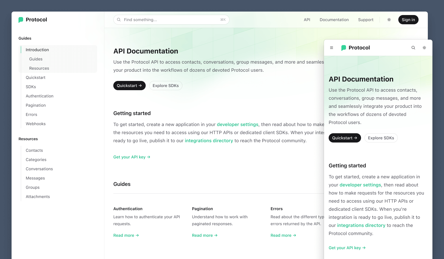
夜间模式(Dark mode)
网站当然支持暗黑模式——它是为开发者设计的,你真的认为我们会那么无知吗?你绝不会原谅我们的。
🌐 Naturally the site includes dark mode support — it's meant for developers, do you really think we could possibly be that ignorant? You would never forgive us.
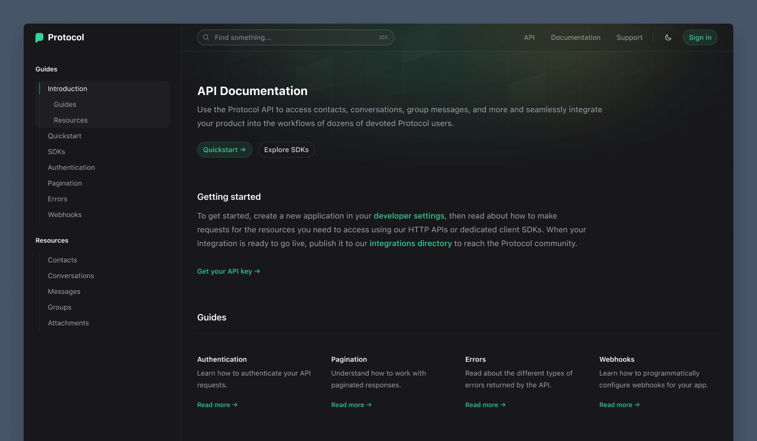
暗黑模式版本也有很多很酷的设计细节 - 比如,我喜欢不同的主按钮处理方式。
🌐 The dark mode version has lots of its own cool design details too — I love the different primary button treatment for instance.
Algolia DocSearch 集成的命令面板(Command palette with Algolia DocSearch integration)
我们喜欢 Algolia 用于文档搜索,我们也在 Tailwind CSS 网站以及我们的 Syntax 模板中使用它。
我们也为 Protocol 接好了线,但这次使用了 Algolia 的 headless 自动补齐库,因此我们可以完全控制搜索界面:
这种方法的好处是,我们可以使用普通的工具类来为所有内容添加样式,而不必为已经有样式的组件编写自定义 CSS,这在 Tailwind CSS 项目中感觉要自然得多。
🌐 The nice thing about this approach is we can use regular old utility classes to style everything instead of writing custom CSS to style an already-styled widget, which just feels a lot more right in a Tailwind CSS project.
就这样——最后一个 Tailwind UI 模板来结束 2022 年!我们还有 另一个几乎准备好发布,所以在新的一年里请留意它。很快还会有一些非常令人兴奋的 Tailwind CSS v4.0 的消息要分享!