自从我们在十二月发布 Protocol 模板 以来,我还没有分享过 Tailwind UI 的更新,但这并不是因为我们没有忙碌。
🌐 I haven't shared a Tailwind UI update since we released the Protocol template in December, but that's not because we haven't been busy.
在过去的四个月里,我们在 Tailwind UI 上投入的工作可能比以往任何时候都多,现在我们终于完成了既定目标,我很高兴能把这一切都渲染给大家!
🌐 Over the last four months we've probably done more work on Tailwind UI than we ever have, and having finally wrapped up what we set out to achieve I'm excited to lay it all out for you!
提交:为你的下一个创意准备的漂亮更新日志模板(Commit: A beautiful changelog template for your next idea)
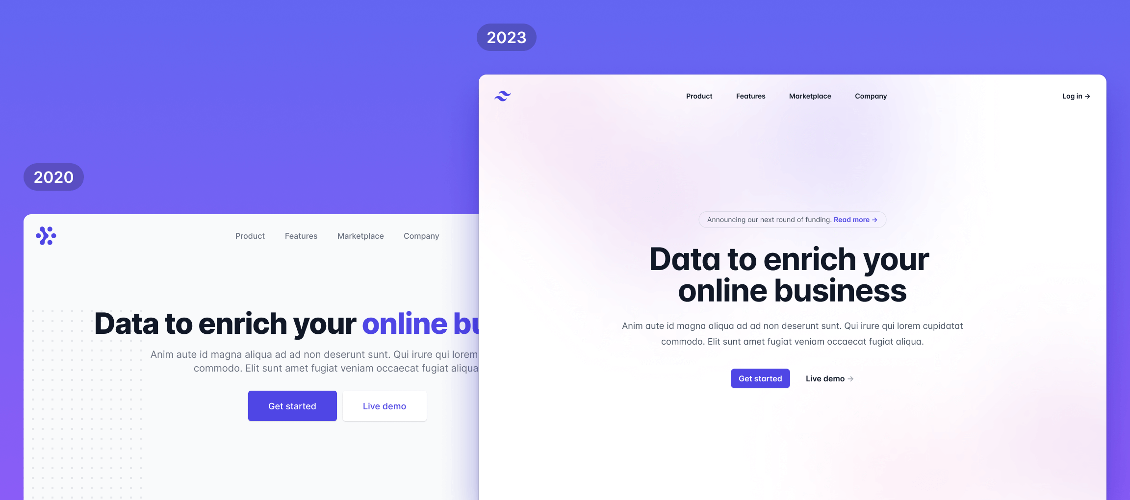
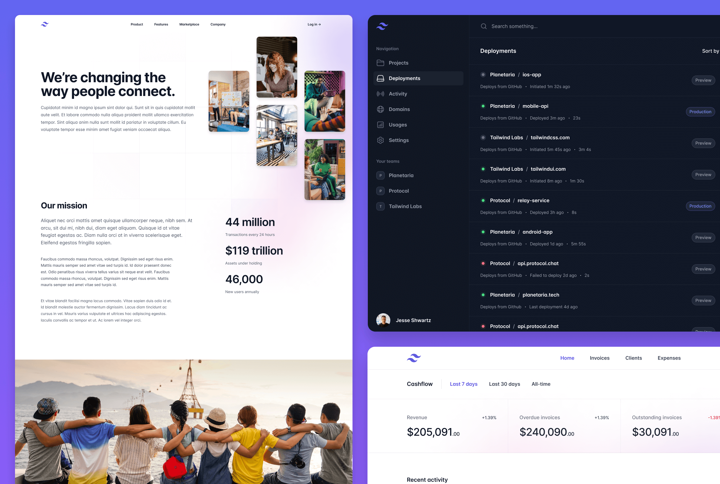
就在几天前,我们发布了 Commit,这是我们为 Tailwind UI 设计的全新更新日志模板——当然,它是用 Tailwind CSS 和 Next.js 构建的。
🌐 Just a few days ago we released Commit, a brand new changelog template we designed for Tailwind UI — built of course with Tailwind CSS and Next.js.
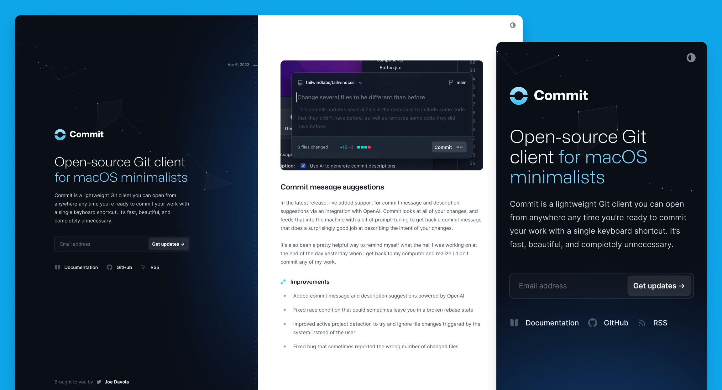
公开更新日志已经成为让人们了解你在做什么、保持责任感以及增强发布能力的一种非常流行的方式。当然,它们绝不是一个新概念,但我认为直到 Linear 开始在他们的更新日志网站上发布内容,其他人才对使用它们几乎作为公司博客的替代方式感到兴奋。
🌐 Public changelogs have become a really popular way to keep people in the loop about what you've been working on, and to stay accountable and build your shipping muscles. They aren't a new concept by any means of course, but I don't think it was until Linear started publishing to their changelog site that others got excited about using them almost as an alternative to a company blog.
Commit 是我们对现代产品更新日志的理解,它被设计为一个单页网站,可以同时作为你的项目主页和你所有工作内容的动态展示。
与我们所有的模板一样,它拥有丰富的功能和细节,让你体验愉悦,使用起来也乐在其中:
🌐 Like all of our templates, it's loaded with features and details that make it a delight to experience and a pleasure to work on:
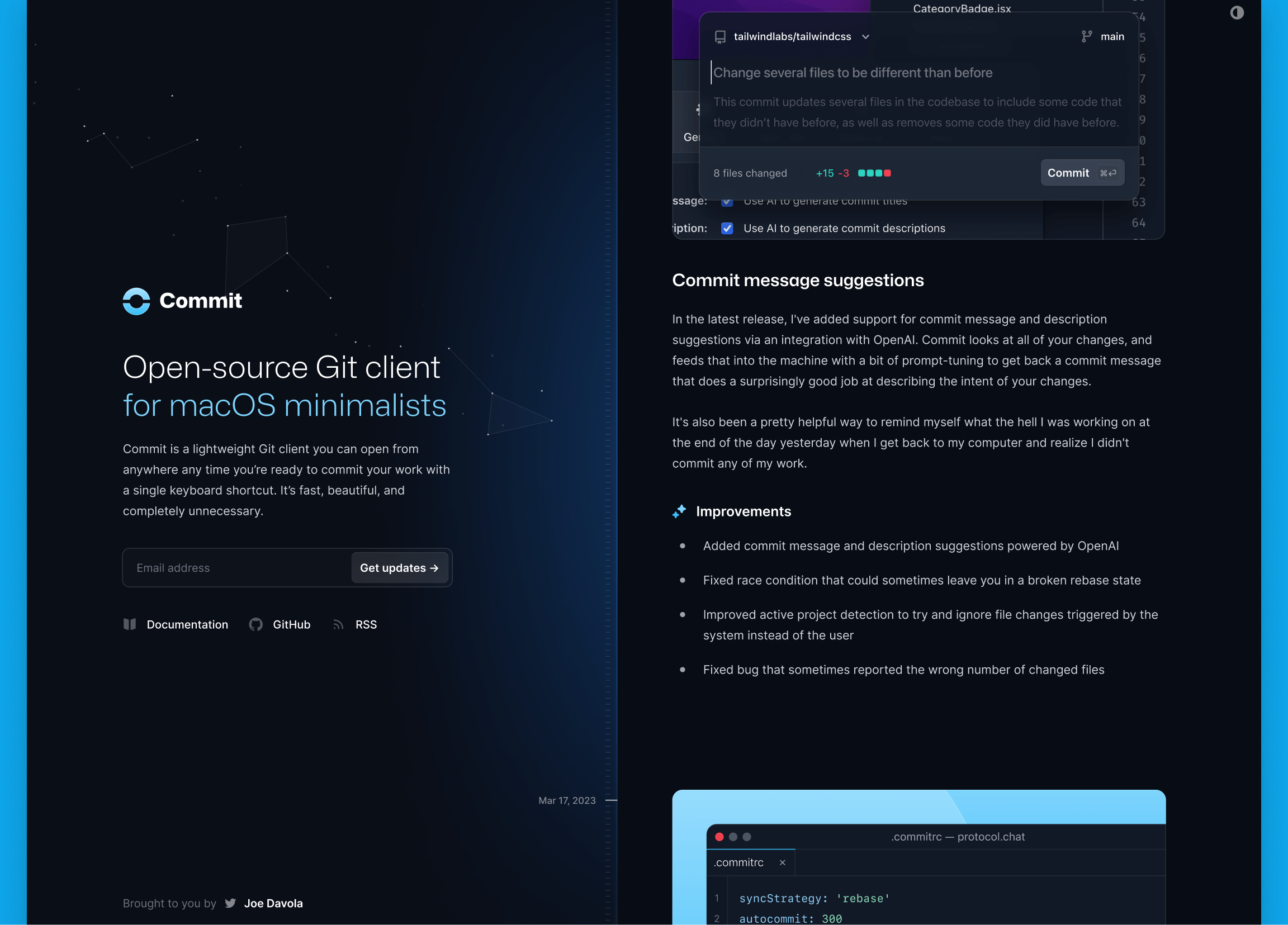
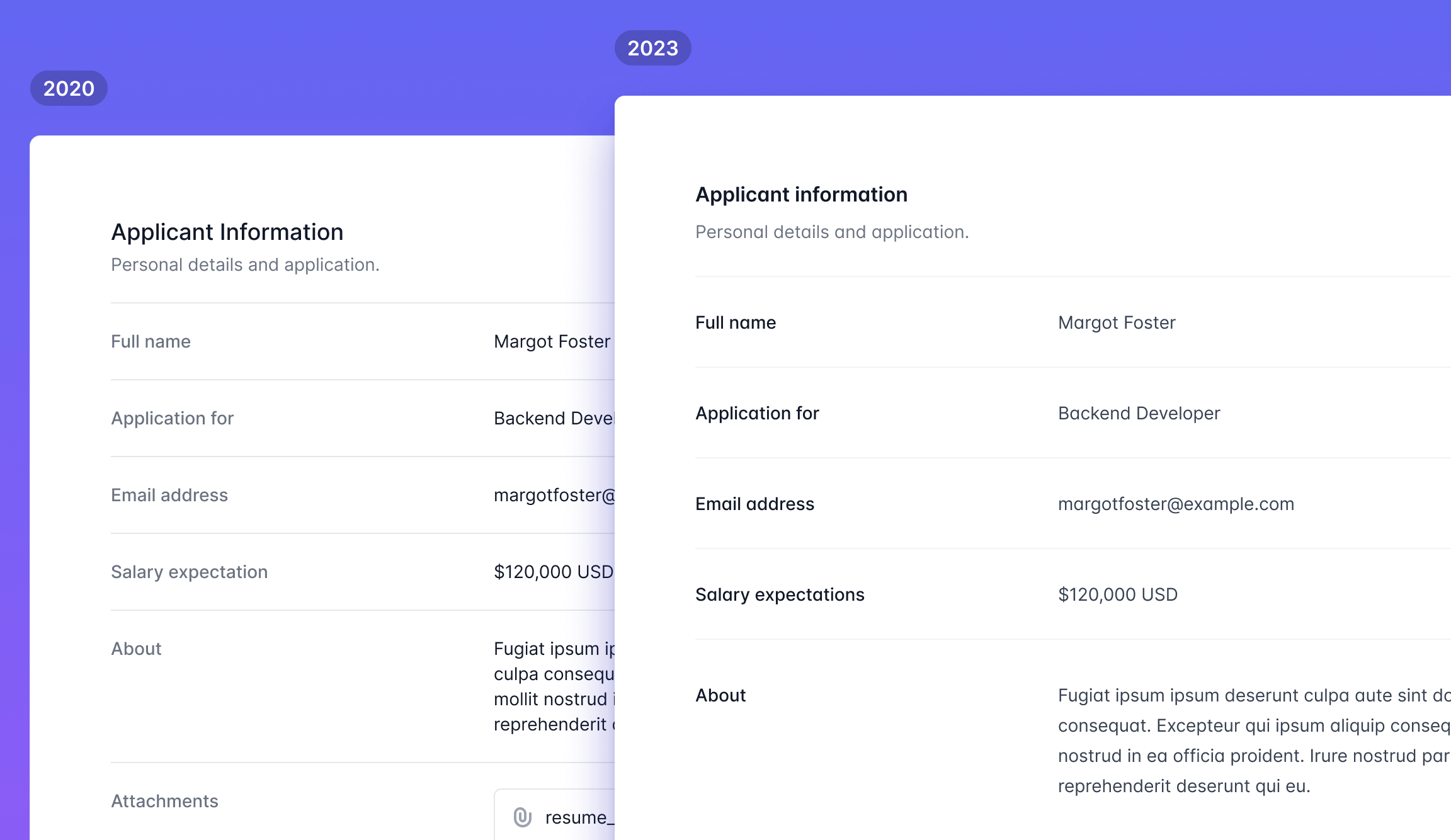
- 支持明夜间模式,因为你无法制作任何开发者可能会阅读的内容而不优化它,以便在凌晨两点关灯时也能看得清楚。
- 手工设计的排版风格,精心挑选的字体大小、间距、列表样式等,专为此模板设计。
- 内置语法高亮,由 Shiki 提供支持,并且可以通过几个 CSS 变量轻松自定义。
- 单文件编辑体验,每个条目都存放在单个 MDX 文件中,因此更新你的更改日志就像在开源项目中更新一个
CHANGELOG.md文件一样轻松。 - 漂亮的动画和效果,这次由 Motion One 提供支持,使其成为一个很好的资源,可以用来学习如何使用这个前沿的新库实现这类效果。
一如既往,你可以轻松进入代码并自行修改 - 我们只调整了一些颜色,就让网站焕然一新:
🌐 As always it's easy to jump into the code and make it your own — here we've just tweaked a handful of colors and it feels like a totally different website:
查看实时演示获取完整体验,如果你已经拥有Tailwind UI 全访问许可,可以下载模板副本,用于你的下一个项目,或者仅仅是研究源代码以学习一两个新技巧。
🌐 Check out the live demo for the full experience, and if you're already the proud owner of a Tailwind UI all-access license, download a copy of the template to use it in your next project or just to study the source code to learn a new trick or two.
为 Tailwind UI 重新设计数百个组件(Redesigning hundreds of components for Tailwind UI)
设计发展日新月异,距离我们首次发布 Tailwind UI 已有三年多,我们觉得值得对其进行仔细的审视,确保它仍然是我们最好的作品。
🌐 Design moves fast and with it being over three years since we first released Tailwind UI, we felt like it deserved to be put under the microscope and make sure it still felt like our best work.
我们惊喜地发现,是的,在过去三年里,我们的设计水平确实提高了,所以我们花了四个月的时间,用我们新获得的能力,尽可能地将每个组件和类别都做到像素级完美。
🌐 We were pleasantly surprised to discover that yes, we have actually gotten better at design over the past three years, so we spent four months heads down making every component and category as pixel-perfect as we possibly could with our newfound powers.
当我们走出洞穴,重见阳光时,我们已经拥有了数百个重新设计的组件、数十个全新的想法,以及一批全新的页面示例来展示它们。
🌐 Once we came out of our cave to see the sunlight again we had hundreds of redesigned components, dozens of totally new ideas put together, and a fresh batch of page examples to show them all off.
以下是我们所做的一些改进的概述。
🌐 Here's a run down of some of the types of improvements we made.
重新设计感觉过时的现有模式(Redesigning existing patterns that felt dated)
Tailwind UI 中的许多组件模式都是永恒的理念,但随着设计趋势的变化和我们成为更优秀的设计师,这些模式的具体实现可能会开始感觉像是来自另一个时代。
🌐 A lot of the component patterns in Tailwind UI are really timeless ideas, but as design trends change and we become better designers, the specific implementations of those patterns can start to feel like it's from another era.
我们逐一检查了所有组件,发现其中有很多模式值得我们再次尝试,并竭尽全力将它们带入 2023 年。
🌐 We went through all of the components one-by-one and found lots of patterns we wanted to take another stab at and did our best to bring them into 2023.
看看 Hero Sections 类别,了解这些更新模式的精彩示例。
🌐 Take a look at the Hero Sections category for some great examples of what these refreshed patterns look like.
全面微调细微细节(Fine-tuning subtle details across the board)
很多组件其实并不需要彻底重新设计,只需要稍微打磨一下就行了。
🌐 A lot of components didn't really need a full on redesign as much as they needed just a little bit of extra polishing.
我们仔细检查了大量组件,并对间距、排版和对比度进行了细微的改进,最终的效果感觉更加清晰锐利。
🌐 We went through tons of components making subtle improvements to the spacing, typography, and contrast, and the results just feel so much sharper and cleaner.
上面的例子来自 描述列表 类别 — 如果你想在浏览器中完整查看它的效果,可以去那里看看。
🌐 The example above is from the Description Lists category — check it out there if you want to see it in its full browser-rendered glory.
设计大量全新示例(Designing a ton of brand new examples)
在审查所有现有组件的过程中,我们不断涌现出一些新想法,这些想法似乎在原始模式中缺失。
🌐 As we were going through all of the existing components, we kept coming up with new ideas that felt like they were missing from the original set of patterns.
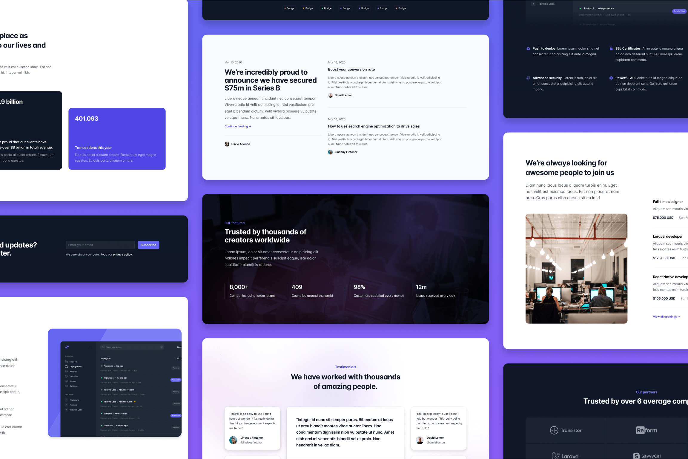
因此,我们设计了大量全新的组件,试图填补尽可能多的突出的漏洞。
🌐 So we designed tons of brand new components, trying to fill as many holes that stood out to us as we could.
许多类别的规模都翻了一番多,比如充满非常棒新创意的特色栏目类别。
🌐 Lots of categories more than doubled in size, like the Feature Sections category which is loaded with really killer new ideas.
添加更多深色变体(Adding more dark variations)
感觉最近我看到的几乎每个新网站默认都是深色的,所以我们觉得我们有道义上的责任给你提供更多针对深色背景优化的示例。
🌐 It feels like almost every new website I see these days is dark by default, so it felt like we had a moral obligation to give you some more examples optimized for dark backgrounds.
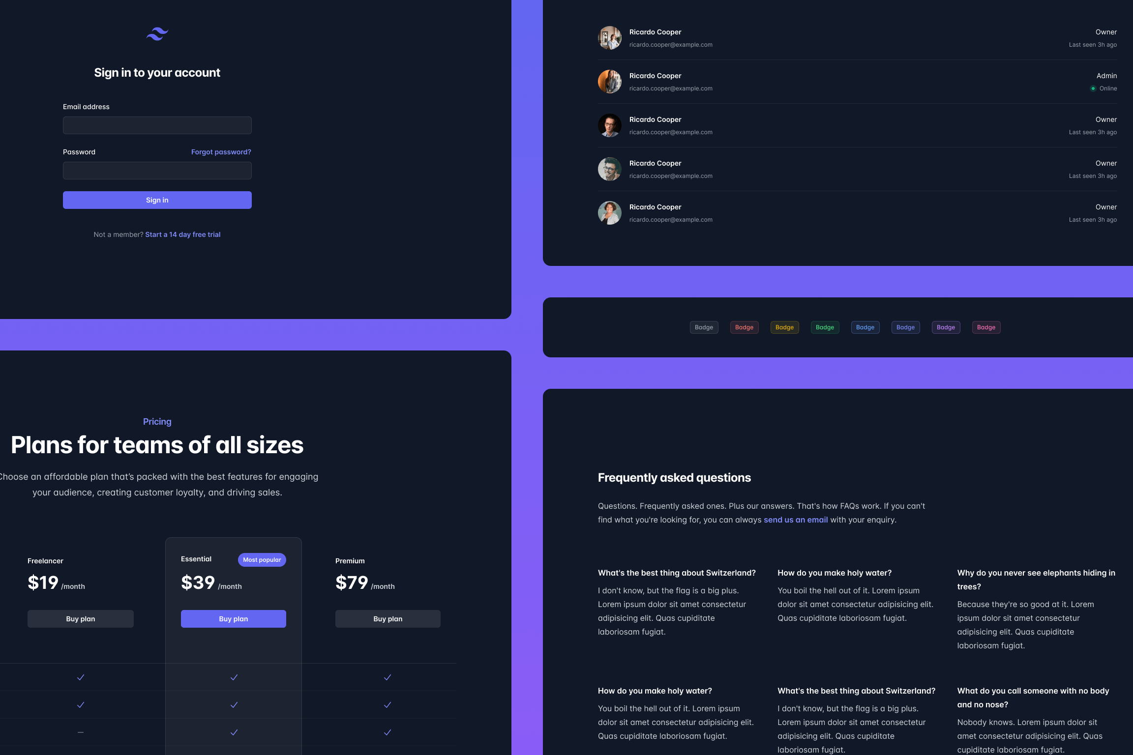
我非常喜欢的一个例子是这些新的深色徽章——其实它们没有太多花哨的东西,但背景颜色上那一点点不透明效果对于深色设计来说真的很棒。
🌐 One of examples I really like are these new dark badges — there's not much to them really but that little bit of opacity on the background color is such a nice effect for dark designs.
全新页面示例(All-new page examples)
最后,我们将所有这些新内容整理成一系列全新的页面示例来展示,其中包括大家一直从我们一些营销组件的屏幕截图中向我们索要的应用 UI 示例。
🌐 Finally we took all of this new stuff and put together a bunch of brand new page examples to show them off, including the application UI example everyone has been bugging us for from the screenshots in some of our marketing components.
查看更新后的主屏幕类别示例,看看其中的一些新设计。
🌐 Check out the updated Home Screens category for example to see some of these new designs.
所以就是这样,无疑这是我们有史以来最大的 Tailwind UI 更新。自一月份以来,我们一直在逐步推出这些改进,所有内容都记录在 Tailwind UI 更新日志 中,如果你想更详细地了解变化,可以去查看。
🌐 So there you go, without a doubt our biggest Tailwind UI update of all time. We've been dripping out these improvements slowly since January and it's all captured in the Tailwind UI changelog so check that out if you want to dig in to what's changed in more detail.
接下来我们将深入研究我们为 Tailwind CSS v4.0 想出的众多创意,并探索我们的第一个 Next.js 应用入门套件。期待在接下来的几周与大家分享更多内容!
🌐 Next up for us — digging in to a ton of ideas we have for Tailwind CSS v4.0, and exploring our first Next.js application starter kit. Excited to share more in the coming weeks!