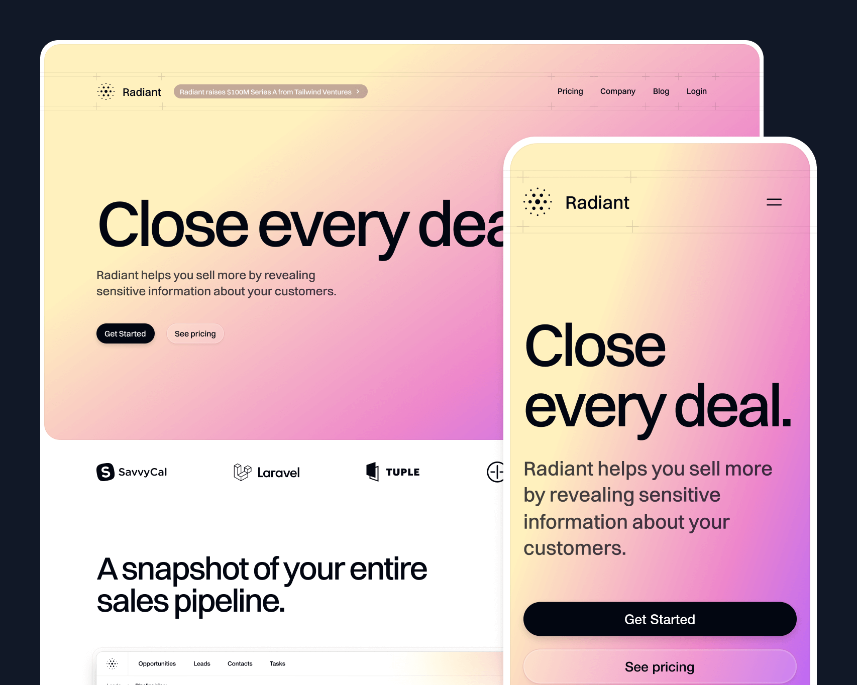
我们刚刚完成了一个漂亮的新SaaS营销网站模板,名为Radient,现在已作为Tailwind UI的一部分提供。
🌐 We just wrapped up work on a beautiful new SaaS marketing site template called Radiant, and it's available now as part of Tailwind UI.
它基于 Next.js、Framer Motion 和 Tailwind CSS 构建,并由 Sanity 提供支持博客。
🌐 It’s built with Next.js, Framer Motion, and Tailwind CSS, with a blog powered by Sanity.
自从我们上次制作这样的SaaS营销模板已经有一段时间了,在这期间我们学到了很多关于如何让模板既实用又易于使用的知识。我们尝试将所有这些经验教训都融入到Radiant中。
🌐 It's been a while since we built a SaaS marketing template like this, and in that time we've learned a lot about what makes a template like this useful and easy to work with. We've tried to incorporate all of those learnings into Radiant.
像往常一样,查看实时预览以获得完整体验 —— 这一版有很多很酷的细节,你必须在浏览器中才能真正欣赏。
🌐 Check out the live preview as always for the full experience — there are tons of cool details in this one that you have to see in the browser to really appreciate.
高雅的交互体验(Tastefully interactive)
在这样的网站上很容易用动画过度。我们都见过那些网站,你甚至无法滚动几像素,页面上就有一堆不同的元素开始动画显示。更糟糕的是,当你必须等待内容出现才能阅读时,整体感觉就很慢。
🌐 It's super easy to overdo animation on a site like this. We've all seen sites where you can't even scroll a few pixels without a bunch of different elements animating in to place. Even worse is how slow things feel when you have to wait for the content to appear before you can read it.
Radiant 充满了令人愉快的动画,但它们都叠加在现有内容上,并通过用户交互触发,因此网站仍然感觉快速。在大多数情况下,我们选择了循环动画,让元素在你与之互动时显得“有生命”。
🌐 Radiant is loaded with delightful animations, but they are all layered on to existing content and triggered by user interaction so the site still feels fast. In most cases, we went for animations that loop to make elements feel "alive" while you're interacting with them.
我们几乎所有的动画都使用了 Framer Motion。它是声明式的,使我们能够轻松创建自己的复杂动画 API,其他人可以轻松进行自定义。
🌐 We used Framer Motion for almost all of the animations. It's declarative, making it easy to create our own APIs for complex animations that other people can customize without much effort.
不过,它确实有一些需要解决的缺点。例如,当你有多个元素独立动画时,将悬停状态传递给每个子元素会很麻烦。我们最终利用了 Framer 的变体传播来实现这一点 —— 悬停事件会触发父元素的变体更改,并因为子元素共享相同的变体键而向下传播到子元素。
🌐 It does have some drawbacks to work around though. For example, when you have multiple elements animating independently it's annoying to pass a hover state down to each child. We ended up leveraging Framer's variant propagation to make this work — a hover event triggers a variant change in the parent that propagates down to the children because they share the same variant keys.
export function BentoCard() { return ( <motion.div initial="idle" whileHover="active" variants={{ idle: {}, active: {} }} data-dark={dark ? "true" : undefined} > /* ... */ </motion.div> );}父级中的变体之间没有区别,因此实际上不会发生变化,但子级在悬停时仍然会收到更改变体的信号,即使它们是深度嵌套的。
🌐 There is no difference between the variants in the parent so it doesn't actually change but the children still get a signal to change variants on hover, even if they are deeply nested.
function Marker({ src, top, offset, delay,}: { src: string top: number offset: number delay: number}) { return ( <motion.div variants={{ idle: { scale: 0, opacity: 0, rotateX: 0, rotate: 0, y: 0 }, active: { y: [-20, 0, 4, 0], scale: [0.75, 1], opacity: [0, 1] }, }} transition={{ duration: 0.25, delay, ease: 'easeOut' }} style={{ '--offset': `${offset}px`, top } as React.CSSProperties} className="absolute left-[calc(50%+var(--offset))] size-[38px] drop-shadow-[0_3px_1px_rgba(0,0,0,.15)]" > /* ... */ </motion.div> )}/* ... */徽标时间轴动画有些不同,因为我们希望当你停止悬停时,徽标能在当前位置停留,而不是回到原始位置。这与 Framer 指定起始和结束状态的方法不太兼容,所以实际上用 CSS 来实现会更容易。
🌐 The logo timeline animation is a bit different, because we wanted the logos to pause in their current position when you stop hovering, rather than return to their original position. This doesn't play very well with Framer's approach of specifying start and end states, so it was actually easier to build this in CSS.
它利用了可以设置负的 animation-delay 值来偏移元素起始位置的这一特性。这样所有的标志都共享相同的动画关键帧,但它们可以从不同的位置开始并具有不同的持续时间。
🌐 It exploits the fact that you can set a negative animation-delay value to offset the start position of the element. That way all the logos share the same animation keyframes but they can start at different positions and have different durations.
function Logo({ label, src, className,}: { label: string src: string className: string}) { return ( <div className={clsx( className, 'absolute top-2 grid grid-cols-[1rem,1fr] items-center gap-2 whitespace-nowrap px-3 py-1', 'rounded-full bg-gradient-to-t from-gray-800 from-50% to-gray-700 ring-1 ring-inset ring-white/10', '[--move-x-from:-100%] [--move-x-to:calc(100%+100cqw)] [animation-iteration-count:infinite] [animation-name:move-x] [animation-play-state:paused] [animation-timing-function:linear] group-hover:[animation-play-state:running]', )} > <img alt="" src={src} className="size-4" /> <span className="text-sm/6 font-medium text-white">{label}</span> </div> )}export function LogoTimeline() { return ( /* ... */ <Row> <Logo label="Loom" src="./logo-timeline/loom.svg" className="[animation-delay:-26s] [animation-duration:30s]" /> <Logo label="Gmail" src="./logo-timeline/gmail.svg" className="[animation-delay:-8s] [animation-duration:30s]" /> </Row> /* ... */这种方法意味着我们不需要在 JavaScript 中跟踪播放状态,我们可以仅使用一个 group-hover:[animation-play-state:running] 类在父元素被悬停时启动动画。
🌐 This approach means we don't need to track the play state in JavaScript, we can just use a group-hover:[animation-play-state:running] class to start the animation when the parent is hovered.
正如你可能注意到的,我们在这个组件中的各个 animation 属性上使用了许多任意属性,因为这些实用工具在当前的 Tailwind 中并不存在。这就是构建这些模板的好处——它帮助我们发现 Tailwind CSS 的盲点。谁知道呢,也许我们会看到这些实用工具在 v4.0 中被加入!
🌐 As you've maybe noticed, we're using a bunch of arbitrary properties for individual animation properties in this component, since these utilities don't exist in Tailwind today. This is what's great about building these templates — it helps us find blind spots in Tailwind CSS. Who knows, maybe we'll see these utilities added for v4.0!
可重复使用(Deliberately reusable)
设计像这样的SaaS模板最棘手的部分是想出用户可以轻松应用到自己产品中的交互元素。没有什么比买了一个模板后发现它对示例内容过于具体,以至于根本无法用于自己的项目更糟糕的了。
🌐 The trickiest part of designing a SaaS template like this, is coming up with interactive elements that people can apply to their own product without too much effort. There's nothing worse than buying a template and realizing that it's so specific to the example content that you can't actually use it for your own project.
我们想出了几个大多数SaaS产品可能会用到的核心图形元素。比如带标记的地图、徽标集群、键盘——这些都可以应用到各种不同的功能中。因为我们希望它们可以轻松地用于你自己的产品,所以我们很多都是用代码构建的,并为它们设计了良好的API。
🌐 We came up with some core graphical elements that most SaaS products might have. A map with pins, a logo cluster, a keyboard — things that could be applied to a bunch of different features. Because we wanted them to be easy to repurpose for your own product, we built a lot of them in code and designed nice APIs for them.
例如,徽标集群有一个简单的 API,可让你传入自定义徽标,调整其位置并设置悬停动画以匹配。
🌐 The logo cluster, for example, has a simple API that lets you pass in your own logos, tweak their position and hover animation to match.
<Logo src="./logo-cluster/dribbble.svg" left={285} top={20} hover={{ x: 4, y: -5, rotate: 6, delay: 0.3 }} />键盘快捷键部分是另一个很好的例子。添加自己的快捷键非常简单,只需将键名数组传递给 Keyboard 组件,由于每个键都是一个组件,你可以轻松添加自定义键或更改布局。
🌐 The keyboard shortcuts section is another good example. Adding your own shortcuts is as simple as passing an array of key names to the Keyboard component and because each key is a component, you can easily add custom keys or change the layout.
<Keyboard highlighted={["F", "M", "L"]} />事实证明,用代码构建键盘实际上需要大量工作,但至少现在你不用自己去发现这个问题了。
🌐 It turns out it's actually quite a lot of work to build a keyboard in code, but at least now you'll never have to find that out for yourself.
当然,我们还为你预留了位置,可以插入你自己的产品截图。这是为我们的朋友 SavvyCal 定制的这一部分,看起来的样子,使用了相同的互动组件。
🌐 Of course, we also left spots for you to drop in screenshots of your own product. Here's what this section looks like customized to suit our friends at SavvyCal, using the same interactive components.

由……提供支持 CMS(Powered by a CMS)
通常我们在将博客添加到模板时只使用 MDX,但这次我们想尝试使用无头 CMS 来玩玩看。经过对我们的观众进行投票并听到许多好评后,我们决定这次尝试使用 Sanity。
🌐 Usually we just use MDX when adding a blog to a template, but this time we thought it would be fun to play with a headless CMS for a chance instead. We decided to give Sanity a go for this one after polling our audience and hearing a lot of good things.
CMS 无需手动创建文件、提交代码以及管理图片和其他内容,它允许你从 UI 中处理所有操作,因此即使是非开发者也可以轻松地做出贡献。
🌐 Instead of creating files, making commits, and managing images and stuff by hand, a CMS lets you handle everything from their UI, so even non-developers can easily contribute.
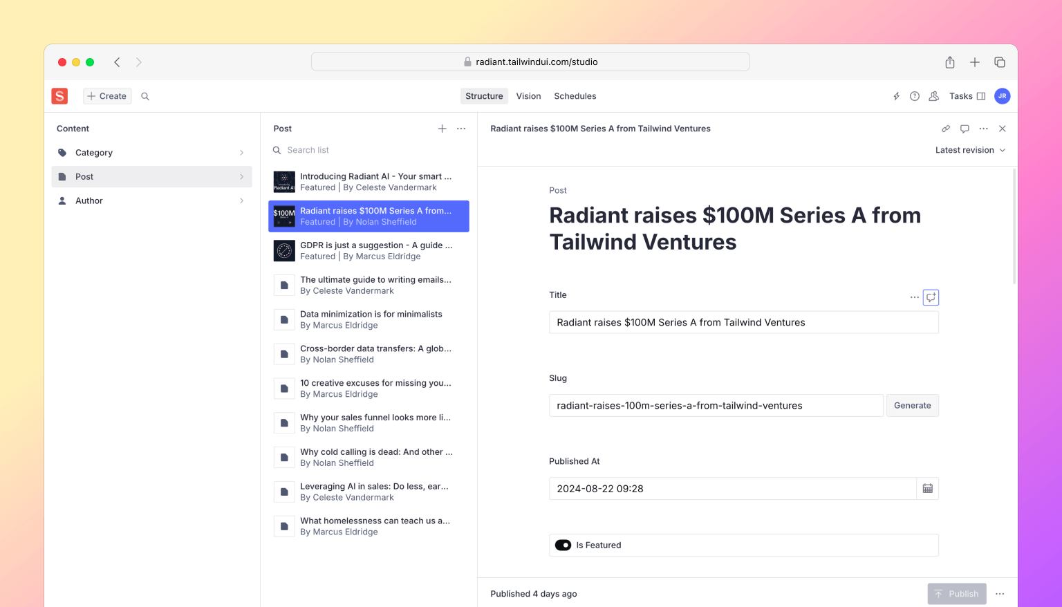
像 Sanity 这样的无头内容管理系统 (CMS) 的一个很酷的特点是,你可以以结构化的格式获取内容,这与 MDX 非常相似,你可以将元素映射到你自己的自定义组件中,以处理所有排版样式。
🌐 One cool thing about headless CMSes like Sanity is you get your content back in a structured format, so similar to MDX you can map elements to your own custom components to handle all of your typography styles.
<PortableText value={post.body} components={{ block: { normal: ({ children }) => <p className="my-10 text-base/8 first:mt-0 last:mb-0">{children}</p>, h2: ({ children }) => ( <h2 className="mt-12 mb-10 text-2xl/8 font-medium tracking-tight text-gray-950 first:mt-0 last:mb-0"> {children} </h2> ), h3: ({ children }) => ( <h3 className="mt-12 mb-10 text-xl/8 font-medium tracking-tight text-gray-950 first:mt-0 last:mb-0"> {children} </h3> ), blockquote: ({ children }) => ( <blockquote className="my-10 border-l-2 border-l-gray-300 pl-6 text-base/8 text-gray-950 first:mt-0 last:mb-0"> {children} </blockquote> ), }, types: { image: ({ value }) => ( <img className="w-full rounded-2xl" src={image(value).width(2000).url()} alt={value.alt || ""} /> ), }, /* ... */ }}/>使用 CMS 还意味着你的所有资源(例如图片)都由你托管,并且你可以动态控制图片的大小、质量和格式。
🌐 Working with a CMS also means all of your assets like images are hosted for you, and you can control the size, quality, and format of the image on the fly.
<div className="text-sm/5 max-sm:text-gray-700 sm:font-medium"> {dayjs(post.publishedAt).format('dddd, MMMM D, YYYY')}</div>{post.author && ( <div className="mt-2.5 flex items-center gap-3"> {post.author.image && ( <img className="aspect-square size-6 rounded-full object-cover" src={image(post.author.image).width(64).height(64).url()} alt="" /> )} <div className="text-sm/5 text-gray-700"> {post.author.name} </div> </div>)}就像你可能在 Markdown 的前置内容中所做的那样,你也可以通过自定义字段来丰富内容。例如,我们在博客文章的模式中添加了一个 featured 布尔字段,这样你就可以在博客的特殊部分高亮某些文章。
🌐 Like you might do with front matter in Markdown, you can also enrich content with custom fields. For example, we added a featured boolean field to the blog post schema so you can highlight some posts in a special section on the blog.

Sanity 尤其是一个付费产品,但他们有一个相当慷慨的免费层,非常适合尝试使用。如果你想试用不同的无头 CMS,我认为我们在这里整合的 Sanity 仍然可以作为一个很好的参考示例,展示你如何使用其他工具进行连接。
🌐 Sanity in particular is a paid product, but they have a pretty generous free tier which is more than enough to play around. And if you wanted to try out a different headless CMS, I think the Sanity integration we've put together here will still serve as a great informative example of how you might approach wiring things up with another tool.
那就是 Radiant!来看看内部结构,试用一下,然后告诉我们你的想法。
🌐 And that's Radiant! Have a look under the hood, kick the tires, and let us know what you think.
像我们所有的模板一样,它包含在一次性购买的 Tailwind UI 全访问 许可中,这是支持我们在 Tailwind CSS 上工作的最佳方式,也让我们能够在未来多年继续为你打造出色的内容。
🌐 Like all of our templates, it's included with a one-time purchase Tailwind UI all-access license, which is the best way to support our work on Tailwind CSS and make it possible for us to keep building awesome stuff for you for years to come.