
我们刚刚发布了 Headless UI v1.5,其中包括一个全新的 Combobox 组件。组合框(Combobox)类似于选择控件,但具有自动补齐功能/输入提示功能,当你处理大型数据集并希望快速筛选出正确选项时,它是常规选择控件的一个很好的替代方案。
🌐 We just released Headless UI v1.5, which includes a brand new Combobox component. Comboboxes are like select controls but with autocomplete/typeahead functionality, and are a great alternative to a regular select when you're working with large datasets and want to quickly filter for the right option.
与所有其他 Headless UI 组件一样,组合框抽象出了所有复杂的可访问性考虑因素,将样式完全交给你,让你可以完全控制设计你想要的组合框,而无需担心键盘导航或屏幕阅读器支持等问题。
🌐 Like all other Headless UI components, the combobox abstracts away all of the complex accessibility considerations but leaves the styling completely up to you, giving you total control to design exactly the combobox you want without worrying about things like keyboard navigation or screen reader support.
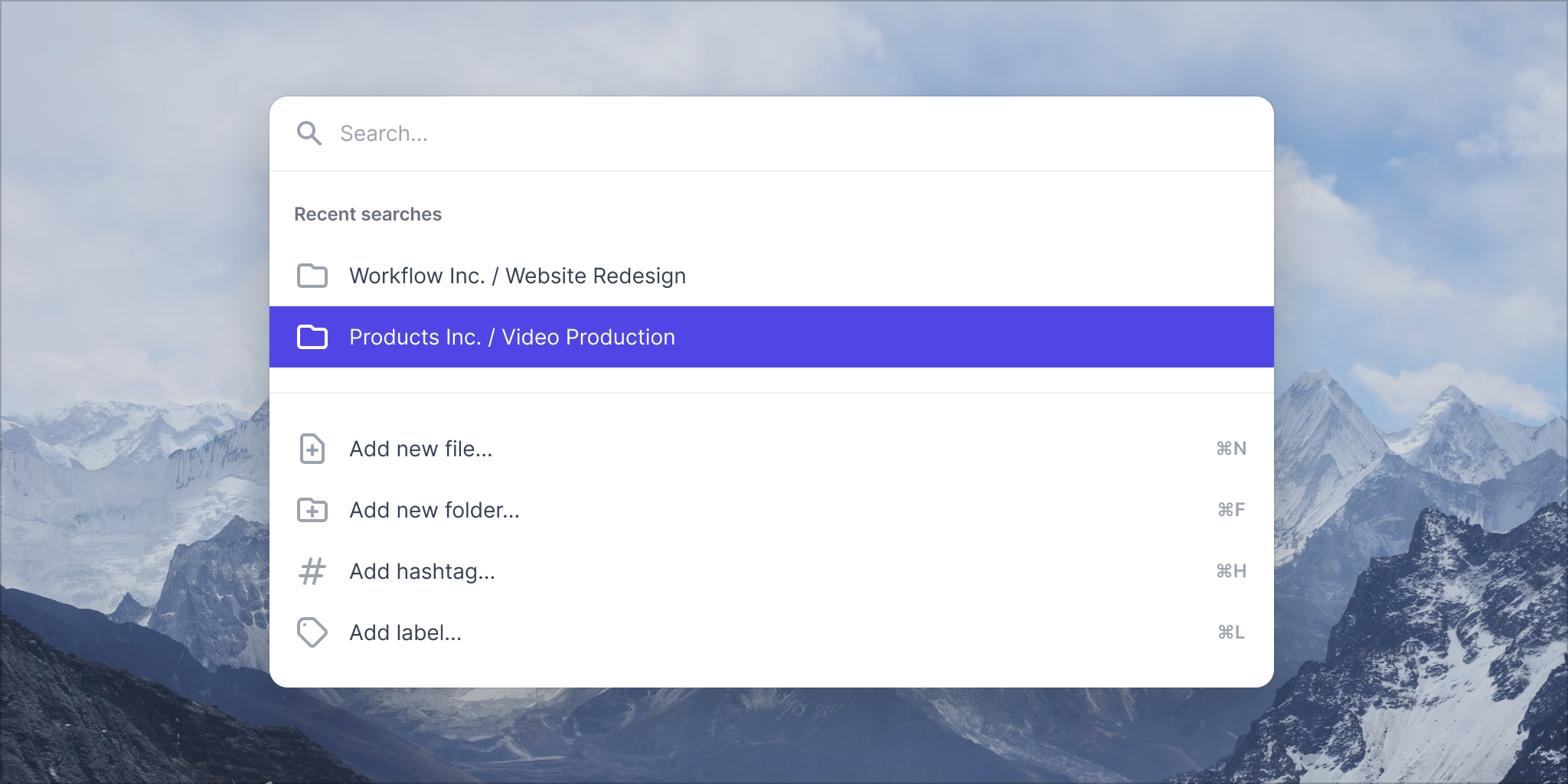
如果你想亲眼看看实际效果,这里有一个简短的演示:
🌐 Here's a quick demo if you'd like to see it in action:
我们故意将其设计成让你可以完全控制实际结果的过滤。你可以进行基本的字符串比较,使用像 Fuse.js这样的模糊搜索库,甚至可以向服务器端 API 发起请求——无论哪种方式,只要适合你的项目即可。
使用基本字符串比较过滤结果的样子如下:
🌐 Here's what it looks like to filter the results using a basic string comparison:
import { useState } from 'react'import { Combobox } from '@headlessui/react'const people = [ 'Wade Cooper', 'Arlene McCoy', 'Devon Webb', 'Tom Cook', 'Tanya Fox', 'Hellen Schmidt',]function MyCombobox() { const [selectedPerson, setSelectedPerson] = useState(people[0]) const [query, setQuery] = useState('') const filteredPeople = query === '' ? people : people.filter((person) => { return person.toLowerCase().includes(query.toLowerCase()) }) return ( <Combobox value={selectedPerson} onChange={setSelectedPerson}> <Combobox.Input onChange={(event) => setQuery(event.target.value)} /> <Combobox.Options> {filteredPeople.map((person) => ( <Combobox.Option key={person} value={person}> {person} </Combobox.Option> ))} </Combobox.Options> </Combobox> )}命令面板(Command palettes)
组合框不仅可以作为独立的输入控件,还可以用作构建更复杂组件(例如命令面板)的底层原语。
🌐 Comboboxes are not only great as standalone inputs, but they can also be used as a lower-level primitive for building more complex components, such as command palettes.
这实际上就是我们最初创建组合框组件的动机 - 我们想在 Tailwind UI 中添加一个新的命令面板类别,并且需要这个组件来实现这一点。
🌐 This is actually what originally motivated us to create the combobox component in the first place — we wanted to add a new command palettes category to Tailwind UI and needed this component to make that happen.
如果你恰好拥有 Tailwind UI 许可证,务必浏览新的 Command Palettes类别,看看它们的效果。如果你想知道,我们还添加了一个新的 Comboboxes类别。
乘着新命令面板带来的兴奋,我们还刚刚发布了一个新的 深入教学录像,讲解如何从零开始使用 Tailwind CSS、React 和 Headless UI 构建命令面板。
它涵盖了大量有趣的 Tailwind 技巧,可帮助你获得恰到好处的设计和动画,并教你大量有关如何使用新的组合框组件并将其连接到你的应用中的知识。
🌐 It covers tons of interesting Tailwind tricks for getting the design and animations just right, and teaches you a ton about how to use the new combobox component and wire it into your app.
试用(Try it out)
如果你已经在项目中安装了 Headless UI,请务必升级到 v1.5 以获取新的 Combobox 组件。这是一次小更新,因此没有破坏性更改。
🌐 If you already have Headless UI installed in your project, be sure to upgrade to v1.5 to get the new Combobox component. This is a minor update so there are no breaking changes.
# For Reactnpm install @headlessui/react# For Vuenpm install @headlessui/vue务必查看 官方网站以获取最新文档。