今天就是日子——我们刚刚发布了 Catalyst 的第一个开发预览版,正好适合你的假期编程时光。
🌐 Today's the day — we just published the first development preview of Catalyst, just in time for your holiday hacking sessions.
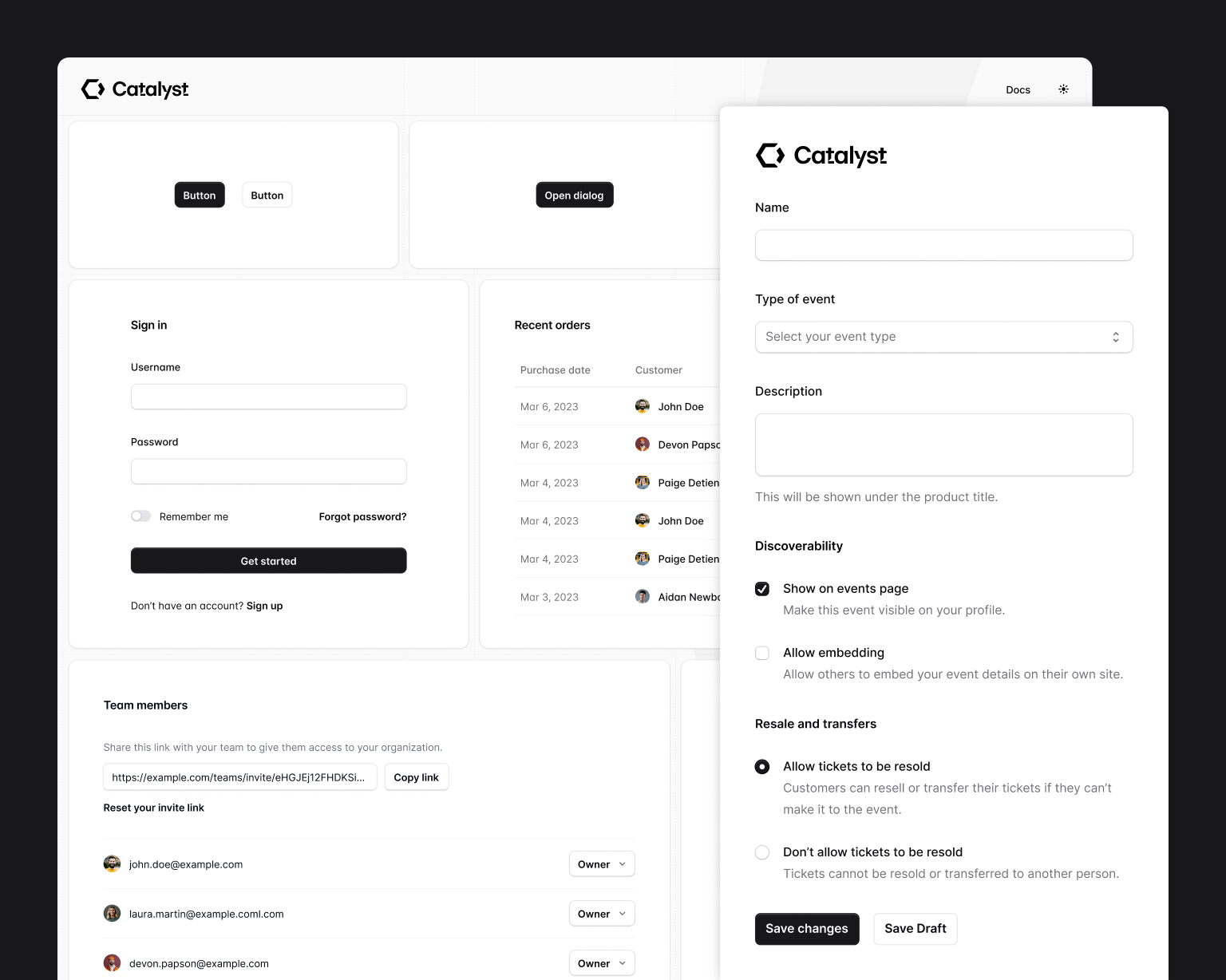
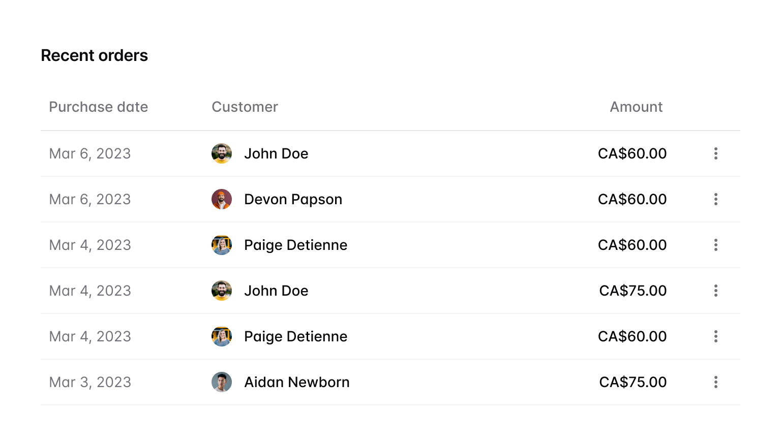
Catalyst 是我们第一个完全组件化、内置所有功能的应用 UI 套件——真正的 React 组件,配有经过深思熟虑的 API,彼此协作创建真实的组件架构,就像我们在实际应用中所做的那样。
查看实时演示,阅读文档,如果你是 Tailwind UI 全访问客户,下载它并在新的项目中试用。
🌐 Check out the live demo, read the documentation, and if you're a Tailwind UI All-Access customer, download it and try it out in a new project today.
Catalyst 目前处于开发预览阶段,还有很多功能即将推出,但我们今天就先发布它,这样你可以立即尝试,同时我们会继续开发新的组件,并寻找方法让使用体验更加出色。
你的组件,而非我们的(Your components, not ours)
借助 Catalyst,我们着手构建一个 UI 套件,让未来的 Stripe 或 Linear 乐于使用它来构建他们的产品 - 这些团队痴迷于设计,希望拥有自己的 UI 组件,并且永远不会选择现成的库。
🌐 With Catalyst, we set out to build a UI kit that tomorrow's Stripe or Linear would feel good about using to build their products — design-obsessed teams who want to own their UI components, and would never choose an off-the-shelf library.
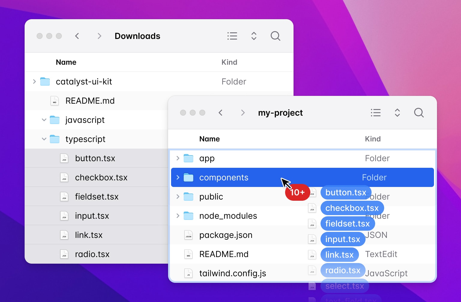
因此,它不是你安装的依赖,而是下载源代码并将组件复制到你自己的项目中,在那里它们成为你自己的组件系统的起点:
🌐 So it's not a dependency you install, instead you download the source and copy the components into your own project where they become the starting point for your own component system:
想要更改按钮的边框圆角吗?只需打开 button.tsx 并修改一些类即可。你不需要在 GitHub 上提交问题,也不需要尝试说服我们新增一个配置选项。
🌐 Want to change the border radius on your buttons? Just open button.tsx and change some classes. You don't need to open a GitHub issue and try to convince us to expose a new configuration option.
Catalyst 是一个“消失的 UI 套件”——安装六个月后,你几乎会忘记最初的组件不是你自己做的。
🌐 Catalyst is a "disappearing UI kit" — six months after you've installed it, you should almost forget it wasn't you who built the original components.
设计在于细节(Design is in the details)
在这样的项目中把视觉风格做对很难。我们开始时有几个目标:
🌐 Getting the visual style right on a project like this is hard. We went into it with a few goals:
- 保持竞争力——我们希望设计出一种能够在当今网络上一些最漂亮的界面中脱颖而出的产品。
- 永不过时 — 我们不希望设计出在6个月后就显得落伍的作品,因为它过于追随某些特定潮流。
- 高效工作 — 无论我们设计什么,都需要让真实用户感觉快捷高效,而不仅仅是在 Dribbble 图片中看起来很棒。
我们付出了很多努力,也进行了很多权衡,但我真的很喜欢我们最终的成果:
🌐 It took a lot of work and there were a lot of trade-offs to balance, but I'm really in love with where we ended up:
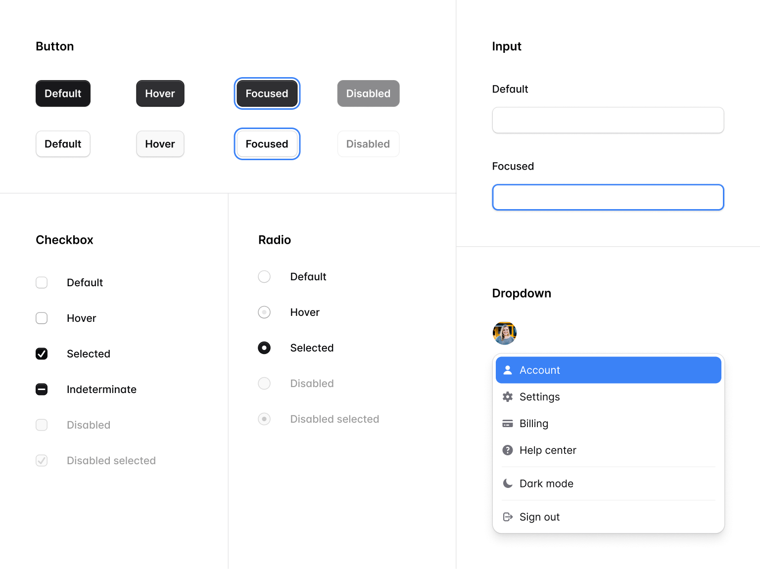
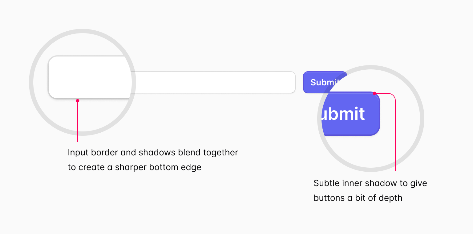
为了保持竞争力,我们在许多细节上进行了投入,比如下拉菜单上的微妙背景模糊、完善表单控件上阴影和边框的融合方式,以及在对话框和切换开关等元素中对动画的精心使用。
为了永不过时,我们尝试在扁平设计与拟物设计之间找到合适的平衡,只使用足够的深度提示,让我们的组件即使潮流有所变化,也依然看起来出色。
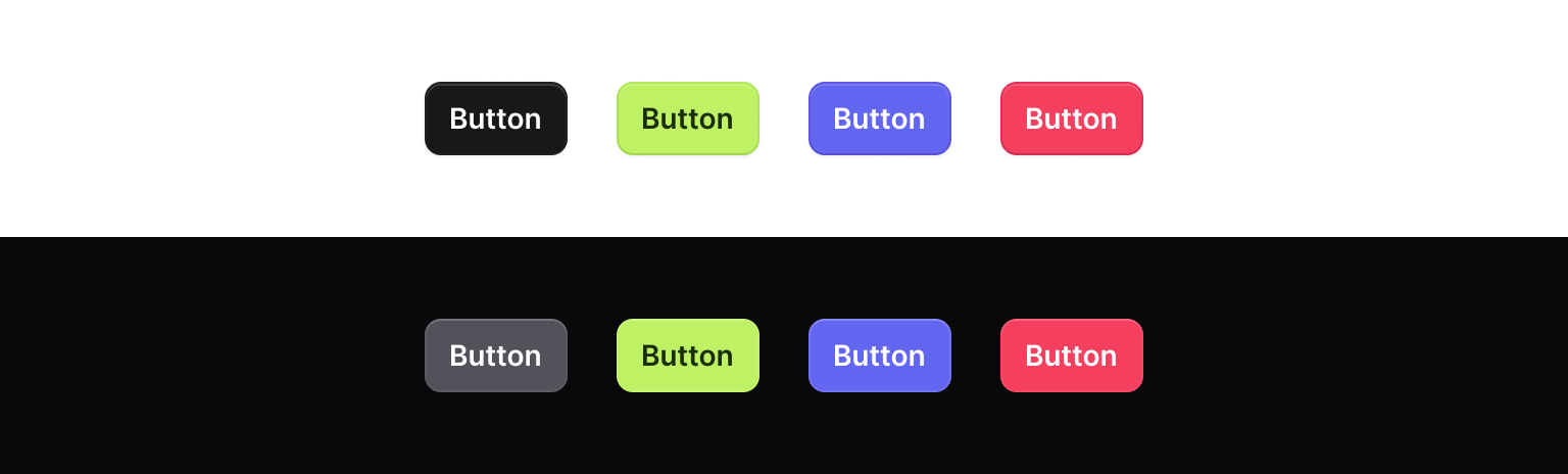
我们还从浏览器中汲取灵感,使用了不带偏见的蓝色聚焦环,以避免选择可能很快就会过时的处理方式。
🌐 We also took inspiration from the browser, and used unopinionated blue focus rings to avoid picking a treatment that might soon look out of fashion.
为了高效工作,我们仔细设计,确保有足够的留白,同时界面仍然足够紧凑,以便在屏幕上显示大量信息。
我们还将过渡和动画的使用限制在重要的地方,并尽量保持它们的快速运行,让你不会感觉在 UI 上等待。
🌐 We also limited our use of transitions and animations only to places where it felt important, and even then tried to keep them fast so it never feels like you're waiting on the UI.
Catalyst 还支持完整的暗黑模式,使用 Catalyst 组件构建的任何内容都会自动适应明夜间模式。
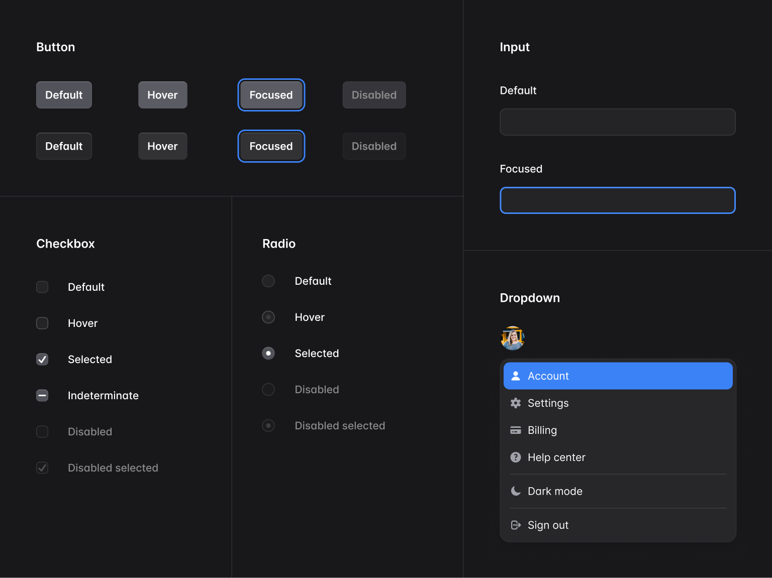
虽然不太明显,但为了使内容在暗黑模式下看起来最佳,我们不得不更改大量小细节,例如调整阴影、将外圈更改为内圈以模拟光照变化等等。
🌐 It's not obvious, but there are a ton of little details we had to change to make things look their best in dark mode, like adjusting shadows, changing outer rings to inner rings to mimic the change in lighting, and more.
基于 HTML 建模(Modeled after HTML)
我们花了大量时间在组件 API 上,努力让使用者能够非常容易地直接使用,同时又不牺牲灵活性。
🌐 We spent a lot of time working on the component APIs, trying very hard to make things really easy to drop in and use right away, without compromising on flexibility.
UI 库通常会使用如下 API:
🌐 It's common for UI libraries to use APIs like this:
function Example() { return ( <TextField name="product_name" label="Product name" description="使用你希望人们在购物车中看到的名字。" /> );}但是当所有属性都存在同一个组件时,像仅给 <input> 元素添加一个类这样的操作就变得困难了。
🌐 But with all the props living on the same component, it starts to get difficult to do things like add a class just to the <input> element itself.
最终,我们开发了与 HTML 高度相似的 API,单个组件很少会渲染多个元素。
🌐 Ultimately that led us to APIs that closely mirrored HTML, where it's rare that a single component renders more than one element.
例如,使用 Catalyst 创建文本字段如下所示:
🌐 Creating a text field with Catalyst looks like this for example:
import { Description, Field, Label } from "@/components/fieldset";import { Input } from "@/components/input";function Example() { return ( <Field> <Label>Product name</Label> <Description>Use the name you'd like people to see in their cart.</Description> <Input name="product_name" /> </Field> );}通过保持这样的可组合性,可以很容易地执行诸如限制输入宽度之类的操作,而无需限制任何其他元素的宽度:
🌐 By keeping things composable like this, it makes it really easy to do things like constrain the width of the input, without constraining the width of any of the other elements:
import { Description, Field, Label } from "@/components/fieldset";import { Input } from "@/components/input";function Example() { return ( <Field> <Label>Product name</Label> <Description>Use the name you'd like people to see in their cart.</Description> <Input name="product_name" /> <Input name="product_name" className="max-w-sm" /> </Field> );}它还可以轻松将描述移到输入框的下方,而不是上方:
🌐 It also makes it easy to move the description below the input, instead of above:
import { Description, Field, Label } from '@/components/fieldset'import { Input } from '@/components/input'function Example() { return ( <Field> <Label>Product name</Label> <Description>Use the name you'd like people to see in their cart.</Description> <Input name="product_name" className="max-w-sm" /> <Description>Use the name you'd like people to see in their cart.</Description> </Field> )}为了找到让这些 API 正常工作的正确方法,我们进行了大量的实验,尤其是在为正确的子组件添加布局样式等细节方面,但最终的回报是值得的,这些组件使用起来真的非常愉快。
🌐 It took a lot of experimenting to figure out the right way to make these APIs work, especially around details like adding layout styles to the right children, but the payoff was worth it, and these components are really a delight to use.
由下一代 Headless UI 提供支持(Powered by the next generation of Headless UI)
我们在2020年夏天发布了Headless UI的第一个版本,但自上一次重大功能发布以来已经过了一年多,因为我们一直专注于Tailwind CSS本身的工作。
🌐 We released the first version of Headless UI back in the summer of 2020, but it's been just over a year now since the last significant feature release because of all the work we've been focused on with Tailwind CSS itself.
Catalyst 是我们再次尝试 Headless UI 的绝佳机会,我们很快找到了许多改进项目的方法,从而简化了 Catalyst 本身的代码。
🌐 Catalyst was the perfect excuse to get our hands dirty with Headless UI again, and we quickly found lots of ways to improve the project to simplify the code in Catalyst itself.
我们刚刚发布了 Headless UI v2.0.0-alpha.1,其中包含大量新内容:
🌐 We just published Headless UI v2.0.0-alpha.1, which includes a ton of new stuff:
- 内置锚点定位 —— 使用 Floating UI,组件如
Menu、Listbox等现在可以自动将其弹出框定位到触发元素上,并根据视口的变化进行自适应调整。 - 无头复选框组件 — 我们添加了一个无头的
Checkbox组件来补充现有的RadioGroup组件,使构建完全自定义的复选框控件变得轻松。 - HTML 表单组件 — 我们新增了
Input、Select、Textarea、Label、Description、Fieldset和Legend组件,这些组件可以处理所有 ID 生成和aria-*属性映射,帮助你将表单字段连接在一起。 - 改进的悬停和可聚焦可见检测 — Headless UI 现在在底层使用出色的 React Aria 库的钩子,为你的控件添加更智能的
data-hover和data-focus属性,比原生伪类在不同设备上的表现更一致。 - 下拉列表虚拟化 — Headless UI 的下一版本现在可以处理巨大的下拉选项列表,而不会出现性能问题。
...还有许多其他改进即将推出,包括日期选择器、工具提示等等。
目前,在早期 alpha 测试阶段,这些改进仅适用于 React,但我们计划在 v2.0 版本发布之前,将所有改进也引入 Vue。
🌐 These improvements are React-only for now during this early alpha period, but we plan to bring all of these improvements to Vue as well before tagging v2.0.
我们很快就会发布这些内容的文档,但我们还是忍不住要在假期前发布 Catalyst,即使这意味着 Headless UI 文档要晚几天发布。
🌐 We'll have documentation published for this stuff really soon, but couldn't resist getting Catalyst out before the holidays, even if it meant publishing the Headless UI docs a few days later.
试用(Try it out)
Catalyst 是针对所有 Tailwind UI 全访问 客户的免费更新,你可以 下载它 并从今天开始体验这个首个版本。
为了让我们今天发布的所有内容都尽善尽美,我们投入了比你想象的更多的努力,但我们渴望获得反馈和改进建议,所以用它做些东西,并告诉我们你的想法。
🌐 More work went into getting everything we're releasing today just right than you could ever imagine, but we're eager for feedback and ways it could be improved, so build some stuff with it and let us know what you think.
我们将利用假期的几周时间进行休整,但新年伊始,我们将立即回归 Catalyst,开发新的组件,例如应用布局、组合框、命令面板、工具提示等等。
🌐 We're going to take a couple weeks to recharge over the holidays, but we'll be right back into Catalyst in the new year, working on new components like application layouts, comboboxes, command palettes, tooltips, and more.