差不多一年半前,我们发布了 Tailwind CSS v1.0,这标志着我们对稳定性的承诺,同时在每个小版本中都持续突破,推出令人兴奋的新功能。
🌐 Almost exactly 18 months ago we released Tailwind CSS v1.0, which signalled a commitment to stability while continuing to push the boundaries with exciting new features in every minor release.
今天,我们终于发布了 Tailwind CSS v2.0。
🌐 Today we're finally releasing Tailwind CSS v2.0.
Tailwind CSS v2.0 是有史以来的第一次重大更新,包括:
🌐 Tailwind CSS v2.0 is the first major update ever, including:
- 全新色彩调色板,包含总共 220 种颜色,并提供创建自己配色方案的新工作流程
- 暗黑模式支持,使在启用暗黑模式时动态更改设计比以往任何时候都更容易
- 超宽 2XL 断点,用于设计 1536px 及以上屏幕
- 新的轮廓环工具,几乎和它们如果直接把
outline-radius做成真实东西一样好 - 实用的表单样式,一种新的表单重置方式,使得仅用工具类就能轻松自定义表单元素(甚至包括复选框)
- 每种字体大小的默认行高,因为如果我们不能禁止在 48px 字体上使用 1.5 的行高,我们至少应该让它不要成为默认值
- 扩展的间距、排版和透明度刻度,用于在微观层面进行微调,以在巨大标题上产生更大的影响,以及当
opacity-25不够而opacity-50又太多时使用 - 将 @apply 用于任何内容,包括响应式、悬停、聚焦和其他变体
- 新的文本溢出工具,可以比仅使用
truncate更精确地控制内容 - 扩展变体,这样你就可以启用额外的变体,比如
focus-visible,而无需重新声明整个列表或考虑顺序 - 默认情况下的 group-hover 和 focus-within,因为你无论如何都会在每个项目中启用它们
- 默认过渡持续时间和缓动曲线,所以你只需要添加 17 个类就可以制作按钮,而不是 19 个
- 与 IE11 不兼容,所以你可以对负责人说:“抱歉老板,这不在我的掌控范围内,怪 Tailwind 吧”
...还有其他一堆小东西呢。
尽管 Tailwind CSS v2.0 是一个新的主要版本,我们已经尽最大努力来最小化重大破坏性更改,尤其是那些会迫使你修改大量模板的更改。我们重命名了两个类,删除了三个在现代浏览器中已不再相关的类,并用两个更强大的替代类进行了替换。任何其他可能影响你的破坏性更改都可以通过在你的 tailwind.config.js 文件中添加几行小代码来解决。升级过程不应超过大约 30 分钟。
🌐 Even though Tailwind CSS v2.0 is a new major version, we've worked really hard to minimize significant breaking changes, especially ones that would force you to edit tons of your templates. We've renamed two classes, removed three that are no longer relevant in modern browsers, and replaced two with more powerful alternatives. Any other breaking changes that might impact you can be remedied with a couple small additions to your tailwind.config.js file. Upgrading shouldn't take more than about 30 minutes.
查看升级指南以获取更多详细信息以及将项目迁移到 Tailwind CSS v2.0 的逐步说明。
如果你想使用 v2.0 开始一个全新的项目,请查看我们更新的安装文档以快速上手。
🌐 If you'd like to start a brand new project with v2.0, head over to our updated installation documentation to get started fast.
那个全新网站怎么样啊?真是棒极了。
🌐 Also how about that brand new website eh? Hot damn.
全新调色板(All-new color palette)
自从我们在 Tailwind CSS v0.1.0 时代第一次尝试设计通用调色板以来,我们已经学到了很多关于颜色的知识,而 v2.0 代表了我们迄今为止最好的尝试。
🌐 We've learned a lot about color since the first time we tried to design a general purpose color palette back in the Tailwind CSS v0.1.0 days, and v2.0 represents our best attempt so far.
新的颜色调色板包括22种颜色(以前为10种),每种颜色有10种色调(以前为9种),总共有220个值。
🌐 The new color palette includes 22 colors (compared to 10 previously) with 10 shades each (instead of 9) for a total of 220 values.
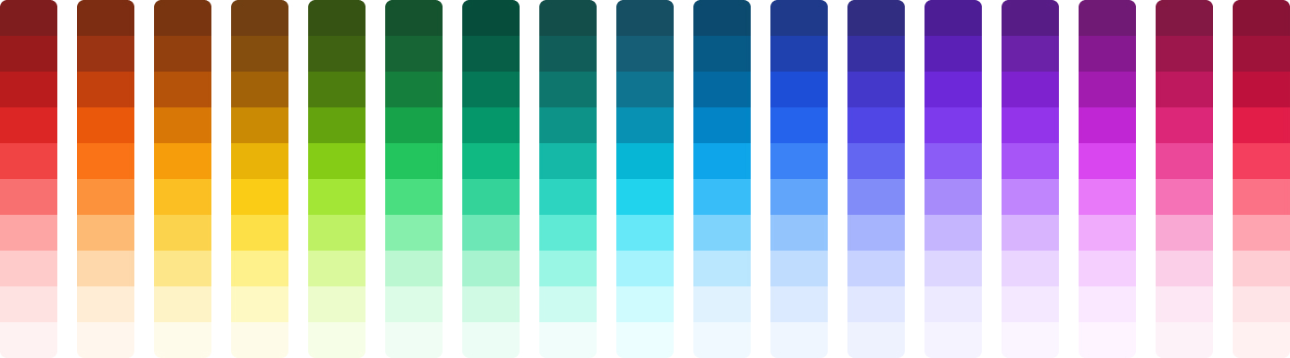
我们为每种颜色增加了一个额外的浅色调 50,所以它们现在的范围是 50–900:
🌐 We've added an extra light 50 shade for every color, so they go from 50–900 now:
<div class="bg-gray-50">I can't believe it's not white.</div>现在调色板甚至包括了 5 种不同的灰色,因此如果你想要一些真正冷调的颜色,可以选择“蓝灰色”,或者选择“暖灰色”,如果你想要更多棕色调的效果。
🌐 The palette even includes 5 different shades of gray now, so you can choose "blue gray" if you want something really cool, or go all the way to "warm gray" for something with a lot more brown in it.

我们为你开箱即用配置了一个均衡的八色调色板,但完整的调色板位于一个新的 tailwindcss/colors 模块中,你可以在配置文件的顶部导入该模块,以便按照自己的喜好创建自定义调色板:
🌐 We configure a well-balanced 8-color palette for you out of the box, but the complete color palette lives in a new tailwindcss/colors module that you can import at the top of your config file to curate your own custom palette however you like:
const colors = require("tailwindcss/colors");module.exports = { theme: { colors: { gray: colors.trueGray, indigo: colors.indigo, red: colors.rose, yellow: colors.amber, }, },};在新的自定义颜色文档中了解更多信息。
🌐 Learn more in the new customizing colors documentation.
夜间模式(Dark mode)
自从 iOS 添加了原生夜间模式之后,你们这些夜间模式迷就一直缠着我,要我在 Tailwind 中加入它。好吧,你们做到了,它来了,你们赢了。
🌐 Ever since iOS added native dark mode all you dark mode nerds haven't been able to leave me alone about adding it to Tailwind. Well you did it, it's here, you win.
打开你的 tailwind.config.js 文件并将 darkMode 切换到 media:
🌐 Open up your tailwind.config.js file and flip darkMode to media:
module.exports = { darkMode: "media", // ...};哇——现在只需在像 bg-black 这样的类前加上 dark:,它就只会在启用夜间模式时生效:
🌐 Boom — now just add dark: to the beginning of a class like bg-black and it'll only take effect when dark mode is enabled:
<div class="bg-white dark:bg-black"> <h1 class="text-gray-900 dark:text-white">Dark mode</h1> <p class="text-gray-500 dark:text-gray-300">The feature you've all been waiting for.</p></div>也适用于悬停和其他功能:
🌐 Works with hover and stuff too:
<button class="bg-gray-900 hover:bg-gray-800 dark:bg-white dark:hover:bg-gray-50"> <!-- ... --></button>以及响应式功能:
🌐 And responsive stuff:
<div class="lg:bg-white lg:dark:bg-black ..."> <!-- ... --></div>以及响应式悬停功能:
🌐 And responsive hover stuff:
<button class="lg:dark:bg-white lg:dark:hover:bg-gray-50 ..."> <!-- ... --></button>查看暗黑模式文档了解所有详细信息。
🌐 Check out the dark mode docs for all the gory details.
超宽 2XL 断点(Extra wide 2XL breakpoint)
我很确定他们现在会推出 1280px 宽度的 iPhone,所以是时候升级了。
🌐 I'm pretty sure they make an iPhone that is 1280px wide now, so it's time to step it up.
我们已经新增了一个开箱即用的 2xl 断点,让你可以针对 1536px 及以上的内容进行设置:
🌐 We've added a new 2xl breakpoint out-of-the-box that lets you target things at 1536px and above:
<h1 class="2xl:text-9xl ...">Godzilla</h1>我知道很令人兴奋,但也让我们认真一下:你自己可以添加这个已经三年了。不过现在终于有福了,我明白了。
🌐 Exciting I know but also let's be serious you've been able to add this yourself for like three years. Now it's blessed though, I get it.
新的轮廓环工具(New outline ring utilities)
你知道 outline 属性是如何忽略边框圆角,并且几乎总是看起来很糟糕吗?ring 工具是我们试图通过血汗努力创造出更好解决方案的尝试。
🌐 You know how the outline property ignores border radius and pretty much just always looks bad? The ring utilities are our attempt to will a better solution into existence through blood, sweat, and tears.
它们的工作方式与 border 工具非常相似,只是它们添加了一个实心的盒子阴影而不是边框,所以不会影响布局:
🌐 They work a lot like the border utilities, except they add a solid box-shadow rather than a border so they don't impact the layout:
<button class="focus:ring-opacity-50 focus:ring-2 focus:ring-blue-300 focus:outline-none ..."> <!-- ... --></button>你甚至可以将它们偏移,从而使用 ring-offset-{width} 工具创建一种光环效果:
🌐 You can even offset them to create a sort of halo effect with ring-offset-{width} utilities:
<button class="focus:ring-opacity-50 focus:ring-2 focus:ring-blue-300 focus:ring-offset-2 focus:outline-none ..."> <!-- ... --></button>通过使用大量 CSS 自定义属性,我们甚至使它们自动与常规的 box-shadow 组合:
🌐 Using a bunch of CSS custom property voodoo we've even made them automatically combine with regular box-shadows, too:
<button class="shadow-sm focus:ring-2 ..."> <!-- Both the shadow and ring will render together --></button>环宽文档 是学习这些新 API 的最佳起点。它们真的非常酷,比你想象的更有用。
🌐 The ring width documentation is the best starting point for learning these new APIs. They seriously turned out so cool, more useful than you probably think.
实用友好的表单样式(Utility-friendly form styles)
让我一直感到惊讶的一件事是,很少有人抱怨在 Tailwind 中表单元素本身几乎毫无用处。它们看起来真的很糟糕,而且如果不写充满奇怪背景图片 SVG 技巧的自定义 CSS,你几乎做不了任何事情,还要担心一些奇怪的边缘情况,这些情况需要用到你从未听说过的 CSS 属性,比如 color-adjust。
🌐 One thing I am constantly surprised by is how few people complain about how unbelievably useless form elements are out of the box with Tailwind. They literally look awful and you can't do anything about it without writing custom CSS full of weird background-image SVG tricks and worrying about obscure edge cases that require CSS properties you've never heard of before like color-adjust.
我曾经尝试用 @tailwindcss/custom-forms 插件来解决这个问题,但添加像 form-input 和 form-checkbox 这样的一堆类总感觉不太对,所以我们并没有真正推广它,也没有在 Tailwind 文档中链接到它。不过这次我觉得我们已经找到了办法。
🌐 I tried to solve this a while back with the @tailwindcss/custom-forms plugin, but something about adding a bunch of classes like form-input and form-checkbox just didn't feel quite right so we didn't really promote it and didn't even link to it from the Tailwind documentation. This time though I think we figured it out.
随着 Tailwind CSS v2.0 的发布,我们推出了一个全新的官方插件 @tailwindcss/forms,它可以在各个浏览器中统一和重置所有基本表单控件,使其处于一个非常容易使用纯工具类进行样式化的状态:
🌐 Alongside Tailwind CSS v2.0, we're releasing a brand new official plugin called @tailwindcss/forms that normalizes and resets all of the basic form controls across browsers to a state that is super easy to style with pure utility classes:
<!-- This will be a nice rounded checkbox with an indigo focus ring and an indigo checked state --><input type="checkbox" class="focus:ring-opacity-50 h-4 w-4 rounded border-gray-300 text-indigo-500 focus:border-indigo-300 focus:ring-2 focus:ring-indigo-200"/>它默认不包含,但你可以通过在 tailwind.config.js 文件中添加一行来实现:
🌐 It's not included out of the box but you can add it to your tailwind.config.js file with a single line:
module.exports = { // ... plugins: [require("@tailwindcss/forms")],};查看 @tailwindcss/forms 文档 了解更多信息。
🌐 Check out the @tailwindcss/forms documentation for more information.
每个字体大小的默认行高(Default line-heights per font-size)
Tailwind 中的每个字体大小工具现在都配备了合理的默认行高:
🌐 Every font-size utility in Tailwind now comes paired with a sensible default line-height:
// Tailwind's default thememodule.exports = { theme: { // ... fontSize: { xs: ["0.75rem", { lineHeight: "1rem" }], sm: ["0.875rem", { lineHeight: "1.25rem" }], base: ["1rem", { lineHeight: "1.5rem" }], lg: ["1.125rem", { lineHeight: "1.75rem" }], xl: ["1.25rem", { lineHeight: "1.75rem" }], "2xl": ["1.5rem", { lineHeight: "2rem" }], "3xl": ["1.875rem", { lineHeight: "2.25rem" }], "4xl": ["2.25rem", { lineHeight: "2.5rem" }], "5xl": ["3rem", { lineHeight: "1" }], "6xl": ["3.75rem", { lineHeight: "1" }], "7xl": ["4.5rem", { lineHeight: "1" }], "8xl": ["6rem", { lineHeight: "1" }], "9xl": ["8rem", { lineHeight: "1" }], }, },};所以现在,当你添加像 text-xl 这样的工具时,相应的默认行高(在这种情况下是 1.75rem)会自动添加:
🌐 So now when you add a utility like text-xl, the corresponding default line-height (1.75rem in this case) is added automatically:
<p class="text-xl">This will have a line-height of 1.75rem automatically.</p>如果你想覆盖这个,你仍然可以通过叠加一个 leading 工具来实现:
🌐 If you want to override this, you can still do it by layering on a leading utility:
<p class="text-3xl leading-normal">Come on don't do this to me.</p>查看字体大小文档以获取更多详细信息。
🌐 Check out the font size documentation for some additional details.
扩展的间距、排版和透明度缩放比例(Extended spacing, typography, and opacity scales)
我们扩展了默认的间距尺度,包括一些微小的值,如 0.5、1.5、2.5 和 3.5:
🌐 We've extended the default spacing scale to include a bunch of micro values like 0.5, 1.5, 2.5, and 3.5:
<span class="ml-0.5">Just a little nudge.</span>还有一些新的高端值,比如 72、80 和 96:
<div class="p-96">This is too much padding.</div>我们还扩展了 inset(对于你们这些老古董来说,就是上/右/下/左)和 translate 插件,以包含完整的间距刻度,所以现在你可以这样做:
🌐 We've also extended the inset (that's top/right/bottom/left for you dinosaurs) and translate plugins to include the full spacing scale, so now you can do things like this:
<div class="top-8"> <!-- .... --></div>我们已经用新的 7xl、8xl 和 9xl 值扩展了默认的排版比例:
🌐 We've extended the default typography scale with new 7xl, 8xl, and 9xl values:
<h1 class="text-9xl font-bold">What is this, an Apple website?</h1>我们还扩展了默认透明度等级,步长为 10,以及 5 和 95 的值:
🌐 And we've also extended the default opacity scale with steps of 10, as well as 5 and 95 values:
<figure class="opacity-5"> <blockquote>You can't see me.</blockquote> <figcaption>John Cena</figcaption></figure>仔细查看整个默认配置文件,以了解具体有哪些可用项。
🌐 Peruse the entire default config file to see exactly what's available.
使用 @apply 处理任何内容(Use @apply with anything)
多年来,我收到的最常见的问题无疑是“为什么 @apply hover:bg-black 不起作用?”
🌐 By far the most common question I've gotten over the years is "why doesn't @apply hover:bg-black work?"
这是一个合理的问题,它没能奏效真是愚蠢。
🌐 And it's a fair question, it's stupid that it ~~doesn't~~ didn't work.
这需要相当强大的工程技术,但我们搞定了——现在你可以对任何东西进行 @apply :
🌐 It took some serious engineering muscle but we figured it out — now you can @apply literally anything:
.btn { @apply focus:ring-opacity-50 bg-indigo-500 hover:bg-indigo-600 focus:ring-2 focus:ring-indigo-200;}查看更新后的 @apply 文档以了解更多信息。
🌐 Check out the updated @apply documentation to learn more.
新的文本溢出工具(New text overflow utilities)
直到 v2.0,如果你想控制溢出文本,我们真正提供的只是相当笨重的 truncate 工具。
🌐 Up until v2.0, if you wanted to control overflowing text all we really gave you was the fairly heavy-handed truncate utility.
现在我们添加了专门的 overflow-ellipsis 和 overflow-clip 工具来仅控制 text-overflow 属性,以防你想在不将文本限制为单行的情况下为溢出文本添加省略号。
🌐 Now we've added dedicated overflow-ellipsis and overflow-clip utilities to control just the text-overflow property, in case you wanted to add ellipsis to overflowing text without restricting that text to one line.
<p class="overflow-hidden overflow-ellipsis">Look ma no whitespace-nowrap ipsum...</p>查看新的 文本溢出文档 来了解它的实际效果。
🌐 Check out the new text overflow documentation to see it in action.
扩展变体(Extend variants)
你知道什么最糟糕吗?想要为 backgroundColor 启用 focus-visible,却不得不列出 每一个默认变体 才能添加一个额外的变体:
🌐 You know what sucks? Wanting to enable focus-visible for backgroundColor but having to list every single default variant just to add one extra one:
module.exports = { // ... variants: { backgroundColor: ["responsive", "hover", "focus", "focus-visible"], },};你知道更好吗?只需添加你想启用的那个:
🌐 You know what's better? Just adding the one you want to enable:
module.exports = { // ... variants: { extend: { backgroundColor: ["focus-visible"], }, },};快上马。
默认支持群组悬停和聚焦在内(Group-hover and focus-within by default)
我们在开发 Tailwind UI 时学到的一件事是,group-hover 和 focus-within 不是可有可无的,它们是必需的。
🌐 One of the things we learned working on Tailwind UI is that group-hover and focus-within aren't nice-to-haves, they're must-haves.
以前默认启用了悬停或聚焦的任何地方,现在也默认启用了 group-hover 和 focus-within:
🌐 Anywhere where we enabled hover or focus by default previously now has group-hover and focus-within enabled by default too:
<div class="group ..."> <span class="group-hover:text-blue-600 ...">Da ba dee da ba daa</span></div>查看 默认变体参考 以获取 v2.0 中启用内容的完整列表。
🌐 Check out the default variants reference for a full list of what's enabled where in v2.0.
默认过渡持续时间和缓和曲线(Default transition duration and easing curve)
到目前为止,任何时候你想在 Tailwind 中添加过渡效果,通常都需要添加三个类:
🌐 Until now, any time you wanted to add a transition in Tailwind you typically needed to add three classes:
<button class="transition duration-150 ease-in-out ...">Count them</button>在 v2.0 中,我们已经可以指定一个默认的持续时间和时间函数,每当添加任何 transitionProperty 工具时都会自动使用它:
🌐 In v2.0, we've made it possible to specify a default duration and timing function that is used automatically any time any transitionProperty utility is added:
module.exports = { // ... theme: { // ... transitionDuration: { DEFAULT: "150ms", // ... }, transitionTimingFunction: { DEFAULT: "cubic-bezier(0.4, 0, 0.2, 1)", // ... }, },};所以现在如果你有一个经常使用的通用持续时间和计时函数,你只需要编写一个类:
🌐 So now you only need to write a single class if you have a common duration and timing function that you use really frequently:
<button class="transition ...">Count them again</button>当然,你可以通过分层叠加单独的持续时间或计时函数来覆盖此功能:
🌐 Of course you can override this by layering on separate duration or timing function utilities:
<button class="transition duration-300 ease-out ...">We're back baby</button>在过渡属性文档中了解有关过渡的更多信息。
🌐 Learn more about transitions in the transition property documentation.
与 IE11 不兼容(Incompatibility with IE11)
我们决定不再为 IE11 而烦恼,这让我们能够完全采用 CSS 自定义属性来实现各种疯狂的功能,这也使得像新的 ring 工具这样的东西成为可能。
🌐 We've decided to unburden ourselves with caring about IE11 at all, which has allowed us to fully embrace CSS custom properties for all sorts of crazy stuff and is what makes things like the new ring utilities even possible.
即使使用 PurgeCSS,放弃对 IE11 的支持也意味着构建规模更小,因为我们无需提供任何 CSS 变量回退,这比你预期的要多。
🌐 Dropping IE11 support means smaller builds even when using PurgeCSS, because we don't have to ship any CSS variable fallbacks which adds up more than you'd expect.
为 Bootstrap 鼓掌,敢于率先做到这一点——如果不是他们决定开路,我想我们也不会如此大胆。
🌐 Cheers to Bootstrap for having the cojones to do this first — I don't think we would have been so bold if they hadn't decided to pave the way.
好消息是,如果你需要支持 IE11,你可以随时使用 Tailwind CSS v1.9,它仍然是一个非常高效的框架。
🌐 The good news is that if you need to support IE11, you can always use Tailwind CSS v1.9 which is still an amazingly productive framework.
所以各位,这就是 Tailwind CSS v2.0 的大概内容(相当重要的一些概述)!
🌐 So there you have it folks, that's Tailwind CSS v2.0 in a (pretty big) nutshell!
你还在等什么?去创造一些了不起的东西。
🌐 What are you waiting for? Go build something awesome.