
Tailwind CSS v3.3 现已发布 - 它带来了一系列用户期盼已久的新功能,以及一些你甚至从未想过的新功能。
🌐 Tailwind CSS v3.3 is here — bringing a bunch of new features people have been asking for forever, and a bunch of new stuff you didn't even know you wanted.
- 深色调扩展调色板: 每种颜色新增更深的 950 色调。
- ESM 和 TypeScript 支持: 使用 ESM 或 TypeScript 编写你的配置文件。
- 使用逻辑属性的简化 RTL 支持: 构建能适应不同文本方向的布局。
- 微调渐变颜色停点位置: 精确指定每个颜色停点的位置。
- 开箱即用的行限制: 在不使用插件的情况下截断多行文本。
- 新的行高修饰符: 使用一个类来设置你的字体大小和行高。
- 不使用 var() 的 CSS 变量:用于任意值的新简写语法。
- 可配置的
font-variation-settings: 直接内置在你的font-*工具中。 - 新的
list-style-image工具: 这样你就可以用糟糕的剪贴画作为项目符号。 - 新的
hyphens实用工具: 用于微调连字符处理行为。 - 新的
caption-side工具: 用风格为你的表格命名。
这涵盖了最令人兴奋的内容,但请查看发行说明,了解自上次发布以来我们所做的每一项小改进的完整列表。
🌐 That covers the most exciting stuff, but check out the release notes for an exhaustive list of every single little improvement we've made since the last release.
升级你的项目就像从 npm 安装最新版本的 tailwindcss 一样简单:
🌐 Upgrading your projects is as easy as installing the latest version of tailwindcss from npm:
npm install -D tailwindcss@latest你也可以在浏览器中直接试用 Tailwind Play 的所有新功能。
🌐 You can also try out all of the new features on Tailwind Play, right in your browser.
扩展的调色板,用于更深的暗色(Extended color palette for darker darks)
多年来,我们收到的最常见的功能请求之一是为每种颜色添加更深的色调 - 通常是因为有人正在构建一个深色 UI,只是想在光谱的深色端有更多选择。
🌐 One of the most common feature requests we've had over the years is to add darker shades for every color — usually because someone is building a dark UI and just wants more options down in that dark end of the spectrum.
愿望实现——在 Tailwind CSS v3.3 中,我们为每种颜色新增了一个 950 色度。
🌐 Well wish granted — in Tailwind CSS v3.3 we've added a new 950 shade for every single color.
在灰色下,它们基本上表现为略带色调的黑色,非常适合极暗的 UI:
🌐 In the grays they act as basically a tinted black, which is great for ultra dark UIs:
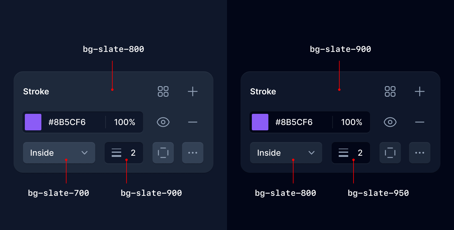
在其余的色谱中,我们优化了 950,以用于高对比度文本和有色控制背景:
🌐 And in the rest of the color spectrum we optimized 950 for high contrast text and tinted control backgrounds:
信不信由你,这个项目最难的部分是让我们自己接受每种颜色有 11 个色调。试图在color palette documentation中把这些看起来好看简直是噩梦。
🌐 Believe it or not the hardest part about this project was convincing ourselves to be okay with having 11 shades per color. Trying to make that look good in the color palette documentation was a nightmare.
也为我们以前能编造的 50 度灰 Jest 点个赞。
🌐 Also pour one out for the 50 shades of gray jokes we used to be able to make.
ESM 和 TypeScript 支持(ESM and TypeScript support)
现在你可以在 ESM 中配置 Tailwind CSS,甚至可以在 TypeScript 中配置:
🌐 Now you can configure Tailwind CSS in ESM, or even in TypeScript:
/** @type {import('tailwindcss').Config} */export default { content: [], theme: { extend: {}, }, plugins: [],};当你运行 npx tailwindcss init 时,我们会检测你的项目是否为 ES 模块,并自动使用正确的语法生成配置文件。
🌐 When you run npx tailwindcss init, we'll detect if your project is an ES Module and automatically generate your config file with the right syntax.
你还可以使用 --esm 标志显式生成 ESM 配置文件:
🌐 You can also generate an ESM config file explicitly by using the --esm flag:
npx tailwindcss init --esm要生成 TypeScript 配置文件,请使用 --ts 标志:
🌐 To generate a TypeScript config file, use the --ts flag:
npx tailwindcss init --ts很多人以为这很容易,因为他们已经在用 ESM 编写自己的代码了(即使代码已经通过他们的构建工具进行了转译),但实际上这非常棘手 - 我们必须实时地为你转译配置文件。
🌐 A lot of people assume this is easy because they're writing their own code in ESM already (even if it's being transpiled by their build tool) but it's actually pretty tricky — we literally have to transpile the config file for you on the fly.
当你想到 TypeScript 的情况时,就更容易理解为什么必须这样做了,因为 Tailwind 当然是以 JavaScript 形式分发的,它无法神奇地导入未编译的 TypeScript 文件。
🌐 It's a bit easier to understand why this has to happen when you think of the TypeScript case, because of course Tailwind is distributed as JavaScript, and it can't magically import an uncompiled TypeScript file.
我们在底层使用出色的 jiti 库来处理这个问题,并使用 Sucrase 来以最佳性能转译代码,同时保持安装占用空间小。
🌐 We're handling this with the wonderful jiti library under the hood, and using Sucrase to transpile the code with the best possible performance while keeping the installation footprint small.
简化的 RTL 支持,并带有逻辑属性(Simplified RTL support with logical properties)
我们已经可以使用我们的LTR 和 RTL 版本来为多向网站进行样式设计有一段时间了,但现在你可以使用逻辑属性更轻松、更自动地完成大部分样式设计。
🌐 We've made it possible to style multi-directional websites using our LTR and RTL variants for a while, but now you can use logical properties to do most of this styling more easily and automatically.
使用像 ms-3 和 me-3 这样的新工具,你可以为元素的 开始 和 结束 添加样式,这样你的样式会自动适应从右到左的布局,而无需编写像 ltr:ml-3 rtl:mr-3 这样的代码:
🌐 Using new utilities like ms-3 and me-3, you can style the start and end of an element so that your styles automatically adapt in RTL, instead of writing code like ltr:ml-3 rtl:mr-3:
Left-to-right

Tom Cook
Director of Operations
Right-to-left

تامر كرم
الرئيس التنفيذي
<div class="group flex items-center"> <img class="h-12 w-12 shrink-0 rounded-full" src="..." alt="" /> <div class="ltr:ml-3 rtl:mr-3"> <div class="ms-3"> <p class="text-sm font-medium text-slate-700 group-hover:text-slate-900" dark-class="text-sm font-medium text-slate-300 group-hover:text-white" > ... </p> <p class="text-sm font-medium text-slate-500 group-hover:text-slate-700" dark-class="text-sm font-medium text-slate-500 group-hover:text-slate-300" > ... </p> </div> </div></div>我们为 inset、margin、padding、border-radius、scroll-margin 和 scroll-padding 添加了新的逻辑属性工具。
🌐 We've added new logical property utilities for inset, margin, padding, border-radius, scroll-margin, and scroll-padding.
以下是我们添加的所有新工具及其对应内容的完整列表:
🌐 Here's a full list of all of the new utilities we've added and what they map to:
| New class | Properties | Physical counterpart (LTR) |
|---|---|---|
start-* | inset-inline-start | left-* |
end-* | inset-inline-end | right-* |
ms-* | margin-inline-start | ml-* |
me-* | margin-inline-end | mr-* |
ps-* | padding-inline-start | pl-* |
pe-* | padding-inline-end | pr-* |
rounded-s-* | border-start-start-radiusborder-end-start-radius | rounded-l-* |
rounded-e-* | border-start-end-radiusborder-end-end-radius | rounded-r-* |
rounded-ss-* | border-start-start-radius | rounded-tl-* |
rounded-se-* | border-start-end-radius | rounded-tr-* |
rounded-ee-* | border-end-end-radius | rounded-br-* |
rounded-es-* | border-end-start-radius | rounded-bl-* |
border-s-* | border-inline-start-width | border-l-* |
border-e-* | border-inline-end-width | border-r-* |
border-s-* | border-inline-start-color | border-l-* |
border-e-* | border-inline-end-color | border-r-* |
scroll-ms-* | scroll-margin-inline-start | scroll-ml-* |
scroll-me-* | scroll-margin-inline-end | scroll-mr-* |
scroll-ps-* | scroll-padding-inline-start | scroll-pl-* |
scroll-pe-* | scroll-padding-inline-end | scroll-pr-* |
如果你经常构建需要支持从左到右(LTR)和从右到左(RTL)语言的网站,这些应该能帮你节省大量代码,而且当你需要更多控制时,你也可以随时将这些与 ltr 和 rtl 变体结合使用。
🌐 These should save you a ton of code if you regularly build sites that need to support both LTR and RTL languages, and you can always combine these with the ltr and rtl variants when you need more control.
微调渐变色停止位置(Fine-tune gradient color stop positions)
我们添加了新的实用工具,例如 from-5%、via-35% 和 to-85%,它们可以让你调整渐变中每个颜色停点的实际位置:
🌐 We've added new utilities like from-5%, via-35%, and to-85% that let you adjust the actual position of each color stop in your gradients:
}
<div class="bg-gradient-to-r from-indigo-500 from-10% via-purple-500 via-30% to-pink-500 to-90% ..."> <!-- ... --></div>我们提供了从 0% 到 100% 的每个值,步长为 5,开箱即用,但你当然可以使用任意值来获得你想要的效果:
🌐 We've included every value from 0% to 100% in steps of 5 out of the box, but you can of course use arbitrary values to get exactly the effect you want:
<div class="bg-gradient-to-r from-cyan-400 from-[21.56%] ..."> <!-- ... --></div>欲了解更多详情,请查看渐变色停点文档。
🌐 For more details, check out the gradient color stops documentation.
开箱即用的 Line-clamp(Line-clamp out of the box)
我们在两年多前发布了我们的官方行截断插件,虽然它使用了很多过时的 -webkit-* 技术,但在所有浏览器中都能正常工作,而且将永远可用,所以我们决定直接把它集成到框架本身。
🌐 We released our official line-clamp plugin just over two years ago and even though it uses a bunch of weird deprecated -webkit-* stuff, it works in every browser and it's going to work forever, so we decided to just bake it into the framework itself.
Boost your conversion rate
Nulla dolor velit adipisicing duis excepteur esse in duis nostrud occaecat mollit incididunt deserunt sunt. Ut ut sunt laborum ex occaecat eu tempor labore enim adipisicing minim ad. Est in quis eu dolore occaecat excepteur fugiat dolore nisi aliqua fugiat enim ut cillum. Labore enim duis nostrud eu. Est ut eiusmod consequat irure quis deserunt ex. Enim laboris dolor magna pariatur. Dolor et ad sint voluptate sunt elit mollit officia ad enim sit consectetur enim.
 Lindsay Walton
<article> <div> <time datetime="2020-03-16" class="block text-sm/6 text-gray-600">Mar 10, 2020</time> <h2 class="mt-2 text-lg font-semibold text-gray-900">Boost your conversion rate</h2> > <p class="mt-4 line-clamp-3 text-sm/6 text-gray-600"> Nulla dolor velit adipisicing duis excepteur esse in duis nostrud occaecat mollit incididunt deserunt sunt. Ut ut sunt laborum ex occaecat eu tempor labore enim adipisicing minim ad. Est in quis eu dolore occaecat excepteur fugiat dolore nisi aliqua fugiat enim ut cillum. Labore enim duis nostrud eu. Est ut eiusmod consequat irure quis deserunt ex. Enim laboris dolor magna pariatur. Dolor et ad sint voluptate sunt elit mollit officia ad enim sit consectetur enim. </p> </div> <div class="mt-4 flex gap-x-2.5 text-sm leading-6 font-semibold text-gray-900"> <img src="..." class="h-6 w-6 flex-none rounded-full bg-gray-50" /> Lindsay Walton </div></article>因此,当你升级到 v3.3 时,如果你正在使用 line-clamp 插件,你可以安全地将其移除:
🌐 So when you upgrade to v3.3, you can safely remove the line-clamp plugin if you were using it:
module.exports = { // ... plugins: [ require('@tailwindcss/line-clamp') ]}插件,出门的时候别让门撞到屁股。
🌐 Don't let the door hit you in the ass on the way out, plugin.
如果你以前没有使用过,请查看新的 line-clamp 文档 以了解它的工作原理。
🌐 Check out the new line-clamp documentation to learn more about how it all works if you haven't played with it before.
新的字体大小工具行高简写(New line-height shorthand for font-size utilities)
多年来,我们在使用 Tailwind 设计漂亮东西的过程中发现的一件事是,我们几乎从来不会只设置行高而不同时设置字体大小。
🌐 One thing we've found over years and years of designing beautiful stuff with Tailwind is that we literally never set a line-height without also setting the font-size at the same time.
受颜色透明度修饰符语法的启发,我们决定通过使用单个工具将它们组合在一起来节省一些字符:
🌐 So inspired by our color opacity modifier syntax, we decided to make it possible to save a few characters by setting them together with a single utility:
<p class="text-lg leading-7 ..."><p class="text-lg/7 ..."> So I started to walk into the water. I won't lie to you boys, I was terrified. But I pressed on, and as I made my way past the breakers a strange calm came over me. I don't know if it was divine intervention or the kinship of all living things but I tell you Jerry at that moment, I <em>was</em> a marine biologist.</p>你可以使用在你的 行高刻度 中定义的任何值,或者如果需要偏离你的设计令牌,也可以使用任意值:
🌐 You can use any value defined in your line-height scale, or use arbitrary values if you need to deviate from your design tokens:
<p class="text-sm/[17px] ..."></p>查看 字体大小文档 获取更多示例。
🌐 Check out the font size documentation for a few more examples.
没有 var() 的 CSS 变量(CSS variables without the var())
为了减少输入,我们还使在将 CSS 变量用作任意值时可以省略 var():
🌐 In the spirit of typing less, we've also made it possible to omit the var() when using a CSS variable as an arbitrary value:
export function MyComponent({ company }) { return ( <div style={{ "--brand-color": company.brandColor, "--brand-hover-color": company.brandHoverColor, }} className="bg-[var(--brand-color)] hover:bg-[var(--brand-hover-color)]" className="bg-[--brand-color] hover:bg-[--brand-hover-color]" /> );}那真是一个很酷的技巧,用来把像 hover: 这样的东西和来自数据库或其他来源的样式结合起来。
🌐 That's a pretty cool trick right there for using things like hover: with styles that come from the database or something by the way.
为自定义字体系列配置 font-variation-settings(Configure font-variation-settings for custom font families)
使用自定义字体时,你通常会希望配置像 font-feature-settings 或 font-variation-settings 这样的选项,以选择字体提供的特定调整。
🌐 When using custom fonts, you'll often want to configure things like font-feature-settings or font-variation-settings to opt-in to specific tweaks the font offers.
我们已经让在 font-feature-settings 上执行此操作变得很容易一段时间了,但现在你也可以通过在配置文件的字体列表后面提供的某种选项对象中为 font-variation-settings 提供一个值来实现同样的效果:
🌐 We've made it easy to do this for font-feature-settings for a while, but now you can do the same thing with font-variation-settings by providing a value for it in the sort-of options object you can plop after the font list in your config file:
module.exports = { theme: { fontFamily: { sans: [ "Inter var, sans-serif" { fontFeatureSettings: '"cv11", "ss01"', fontVariationSettings: '"opsz" 32', }, ], }, },};在上面的例子中,我们使用了最近发布的 Inter,它支持使用光学大小轴来触发字体的“显示”变体,这种变体针对较大字号进行了优化,例如标题。
🌐 In the example above we're using a recent release of Inter that supports using the optical size axis to trigger the "Display" variation of the font, optimized for larger sizes like headlines.
新的 list-style-image 工具(New list-style-image utilities)
有没有想过用胡萝卜的图片作为列表项标记?现在,你可以使用新的 list-image-* 工具来做到这一点。
🌐 Ever wanted to use a picture of a carrot as your list item marker? Well now you can, with the new list-image-* utilities.
- 5 cups chopped Porcini mushrooms
- 1/2 cup of olive oil
- 3lb of celery
<ul class="list-image-[url(/carrot.png)] ..."> <li>5 cups chopped Porcini mushrooms</li> <!-- ... --></ul>我们不会把蔬菜剪贴画随框架一起提供,但你可以使用任何你想要的图片,无论是作为任意值使用,还是在主题的 listStyleImage 部分进行配置。
🌐 We're not going to start shipping vegetable clip art with the framework, but you can use any image you want either as an arbitrary value or configuring it in the listStyleImage section of your theme.
查看 列表样式图片文档 了解更多信息。
🌐 Check out the list style image documentation to learn more.
新的 hyphens 工具(New hyphens utilities)
你听说过 ­ HTML 实体吗?在我们添加对这些 hyphens-* 工具的支持之前,我也没听说过。
🌐 Ever heard of the ­ HTML entity? Me neither until we added support for these hyphens-* utilities.
使用 hyphens-manual 和精心放置的 ­,你可以告诉浏览器在需要将单词拆分到多行时在哪里插入连字符:
🌐 Using hyphens-manual and a carefully placed ­, you can tell the browser where to insert a hyphen when it needs to break a word across multiple lines:
Officially recognized by the Duden dictionary as the longest word in German, Kraftfahrzeughaftpflichtversicherung is a 36 letter word for motor vehicle liability insurance.
<p class="hyphens-manual ...">... Kraftfahrzeug­haftpflichtversicherung is a ...</p>也许像这样的代码片段可以作为你那支难以发音的死亡金属乐队的新闻资料包的一部分,这样报告器们就不会在文章中搞错连字符,从而最终让你暴露身份。
🌐 Maybe a code snippet like this would be useful to include as part of your unpronounceable death metal band's press kit so the journalists don't screw up the hyphenation in the article that finally breaks you on to the scene.
查看 hyphens 文档 以了解更多信息。
🌐 Check out the hyphens documentation to learn more.
新的 caption-side 工具(New caption-side utilities)
对我来说又有一个新的——<caption> 元素!我们有新的 caption-* 工具可以用于表格标题,控制它们是显示在所附表格的顶部还是底部。
🌐 Another new one for me — the <caption> element! We've got new caption-* utilities you can use on table captions to control whether they appear at the top or bottom of the table they're attached to.
| Wrestler | Signature Move(s) |
|---|---|
| "Stone Cold" Steve Austin | Stone Cold Stunner, Lou Thesz Press |
| Bret "The Hitman" Hart | The Sharpshooter |
| Razor Ramon | Razor's Edge, Fallaway Slam |
<table> <caption class="caption-bottom"> Table 3.1: Professional wrestlers and their signature moves. </caption> <thead> <tr> <th>Wrestler</th> <th>Signature Move(s)</th> </tr> </thead> <tbody> <tr> <td>"Stone Cold" Steve Austin</td> <td>Stone Cold Stunner, Lou Thesz Press</td> </tr> <tr> <td>Bret "The Hitman" Hart</td> <td>The Sharpshooter</td> </tr> <tr> <td>Razor Ramon</td> <td>Razor's Edge, Fallaway Slam</td> </tr> </tbody></table>查看 caption side 文档 以获取更多示例。
🌐 Check out the caption side documentation for some more examples.
这就是 Tailwind CSS v3.3!没有重大变更,只是增加了一些有趣的新功能。今天就通过用 npm 更新到最新版本,在你的项目中试试看吧:
🌐 So that's Tailwind CSS v3.3! No breaking changes, just a bunch of fun new stuff. Give it a try in your projects today by updating to the latest version with npm:
npm install -D tailwindcss@latest是的,又一次发布没有 text-shadow 工具。还记得《宋飞正传》那一集吗,克雷默试着看看能在不加油的情况下开多远?那是我最喜欢的一集。
🌐 Yep, another release without text-shadow utilities. Remember that episode of Seinfeld where Kramer tries to see how far he can drive without stopping for gas? That's my favorite episode.