在 Tailwind Plus 中,有很多 UI 模块需要 JavaScript 才能真正发挥作用,比如对话框、下拉菜单、命令面板等等。而除非你是 React 或 Vue 用户,否则使用这些 UI 模块一直意味着你需要自己编写所有那些复杂的 JavaScript。
🌐 There are a lot of UI blocks in Tailwind Plus that need JavaScript to really be useful, like dialogs, dropdowns, command palettes, and more. And unless you're a React or Vue user, using those UI blocks has always meant writing all of that tricky JavaScript yourself.
好消息,今天这一情况终于改变了——Tailwind Plus 中的每个 UI 模块现在都完全可用、可访问且可交互,包括纯 HTML 示例。
🌐 Well today that finally changes — every UI block in Tailwind Plus is now fully functional, accessible, and interactive, including the plain HTML examples.
现在你可以在任何正在进行的项目中使用任意 下拉菜单、命令面板、对话框、抽屉 等——无需任何 JavaScript 框架。
🌐 Now you can use any dropdown, command palette, dialog, drawer, and more in any project you're working on — no JavaScript framework required.
无需框架(No framework required)
为了实现这一点,我们开发了 @tailwindplus/elements —— 一个我们将专门为 Tailwind Plus 客户发布的库。
🌐 To pull this off, we built @tailwindplus/elements — a library we're releasing exclusively for Tailwind Plus customers.
Elements 是一个无头 自定义元素 的集合,它封装了使用纯 HTML 构建自定义交互式用户界面所需的所有复杂行为,并且可以使用实用类或自定义 CSS 以任意方式进行样式化。
🌐 Elements is a collection of headless custom elements that wrap up all of the complex behavior needed to build custom interactive UIs using just HTML, and can be styled any way you like using utility classes or custom CSS.
这些自定义元素并不依赖于特定的 JavaScript 框架,它们可以在任何可以使用 <script> 标签的地方使用:
🌐 Instead of being coupled to a specific JavaScript framework, these custom elements work anywhere you can use a <script> tag:
<script src="https://cdn.jsdelivr.net/npm/@tailwindplus/elements@1" type="module"></script>下面是使用 Elements 构建自定义下拉菜单 的样子:
🌐 Here's what it look like to build a custom dropdown menu with Elements:
<el-dropdown class="relative inline-block text-left"> <button class="inline-flex w-full justify-center gap-x-1.5 rounded-md bg-white px-3 py-2 text-sm font-semibold text-gray-900 shadow-xs ring-1 ring-gray-300 ring-inset hover:bg-gray-50"> Options <svg viewBox="0 0 20 20" fill="currentColor" aria-hidden="true" class="-mr-1 size-5 text-gray-400"> <path d="M5.22 8.22a.75.75 0 0 1 1.06 0L10 11.94l3.72-3.72a.75.75 0 1 1 1.06 1.06l-4.25 4.25a.75.75 0 0 1-1.06 0L5.22 9.28a.75.75 0 0 1 0-1.06Z" clip-rule="evenodd" fill-rule="evenodd" /> </svg> </button> <el-menu anchor="bottom end" popover class="w-56 origin-top-right rounded-md bg-white shadow-lg ring-1 ring-black/5 transition transition-discrete [--anchor-gap:--spacing(2)] focus:outline-hidden data-closed:scale-95 data-closed:transform data-closed:opacity-0 data-enter:duration-100 data-enter:ease-out data-leave:duration-75 data-leave:ease-in"> <div class="py-1"> <a href="#" class="block px-4 py-2 text-sm text-gray-700 focus:bg-gray-100 focus:text-gray-900 focus:outline-hidden">Account settings</a> <a href="#" class="block px-4 py-2 text-sm text-gray-700 focus:bg-gray-100 focus:text-gray-900 focus:outline-hidden">Support</a> <a href="#" class="block px-4 py-2 text-sm text-gray-700 focus:bg-gray-100 focus:text-gray-900 focus:outline-hidden">License</a> <form action="#" method="POST"> <button type="submit" class="block w-full px-4 py-2 text-left text-sm text-gray-700 focus:bg-gray-100 focus:text-gray-900 focus:outline-hidden">Sign out</button> </form> </div> </el-menu></el-dropdown>这就是构建一个 自定义选择 的样子:
🌐 And here's what it looks like to build a custom select:
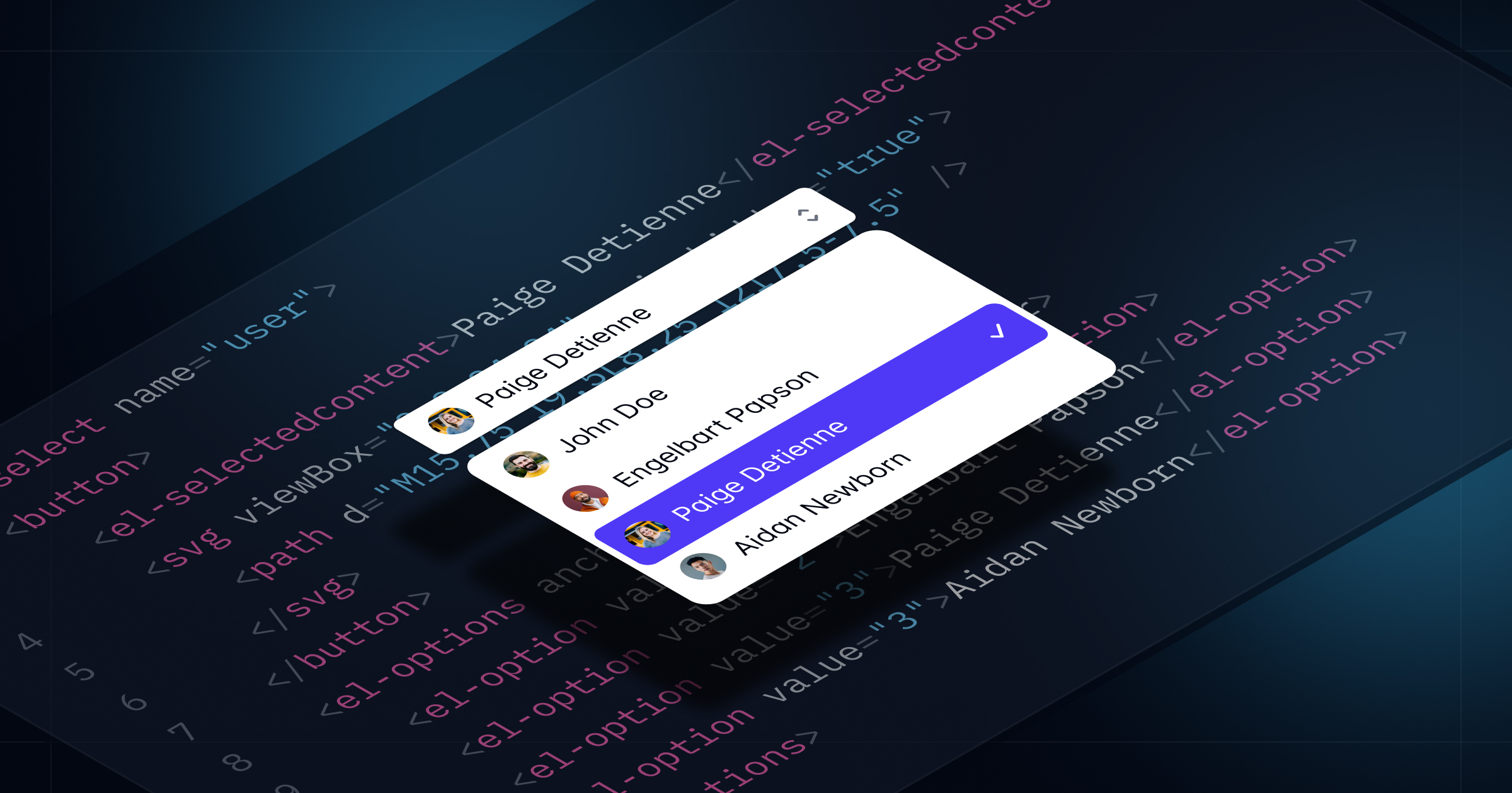
<label for="select" class="block text-sm/6 font-medium text-gray-900">Assigned to</label><el-select id="select" name="selected" value="4" class="mt-2 block"> <button type="button" class="grid w-full cursor-default grid-cols-1 ..."> <el-selectedcontent></el-selectedcontent> <svg viewBox="0 0 16 16" fill="currentColor" aria-hidden="true" class="col-start-1 row-start-1 ..."> <!-- ... --> </svg> </button> <el-options anchor="bottom start" popover class="max-h-60 w-(--button-width) [--anchor-gap:--spacing(1)] ..."> <el-option value="1" class="group/option relative block focus:bg-indigo-600 ..."> <div class="flex items-center"> <span aria-hidden="true" class="inline-block size-2 shrink-0 ..."></span> <span class="ml-3 block group-aria-selected/option:font-semibold ..."> Wade Cooper <span class="sr-only"> is online</span> </span> </div> <span class="group-not-aria-selected/option:hidden group-focus/option:text-white in-[el-selectedcontent]:hidden ..."> <svg viewBox="0 0 20 20" fill="currentColor" aria-hidden="true" class="size-5"> <!-- ... --> </svg> </span> </el-option> <!-- ... --> </el-options></el-select>看到那些自定义的 HTML 元素,比如 <el-select> 和 <el-options> 吗?它们就是让一切正常运行的秘密武器,包括自动管理 ARIA 属性、聚焦处理、键盘支持等等。
🌐 See those custom HTML elements like <el-select> and <el-options>? Those are the secret sauce that make everything work, including automatic ARIA attribute management, focus handling, keyboard support, and more.
你甚至可以使用 Elements 构建像自定义 命令面板 这样复杂的东西,而无需编写任何自己的 JavaScript:
🌐 You can even build something as sophisticated as a custom command palette with Elements, without having to write any of your own JavaScript:
<button command="show-modal" commandfor="dialog" class="rounded-md bg-white/80 px-2.5 py-1.5 text-sm font-semibold text-gray-900 hover:bg-white/90"> Open command palette</button><el-dialog> <dialog id="dialog" class="backdrop:bg-transparent"> <el-dialog-backdrop class="fixed inset-0 bg-gray-500/25 transition-opacity data-closed:opacity-0 data-enter:duration-300 data-enter:ease-out data-leave:duration-200 data-leave:ease-in"></div> <div tabindex="0" class="fixed inset-0 w-screen overflow-y-auto p-4 focus:outline-none sm:p-6 md:p-20"> <el-dialog-panel class="mx-auto block max-w-3xl transform overflow-hidden rounded-xl bg-white shadow-2xl ring-1 ring-black/5 transition-all data-closed:scale-95 data-closed:opacity-0 data-enter:duration-300 data-enter:ease-out data-leave:duration-200 data-leave:ease-in"> <el-command-palette class="divide-y divide-gray-100"> <div class="grid grid-cols-1"> <input type="text" autofocus placeholder="Search..." class="col-start-1 row-start-1 h-12 w-full pr-4 pl-11 text-base text-gray-900 outline-hidden placeholder:text-gray-400 sm:text-sm" /> <svg viewBox="0 0 20 20" fill="currentColor" aria-hidden="true" class="pointer-events-none col-start-1 row-start-1 ml-4 size-5 self-center text-gray-400"> <path d="M9 3.5a5.5 5.5 0 1 0 0 11 5.5 5.5 0 0 0 0-11ZM2 9a7 7 0 1 1 12.452 4.391l3.328 3.329a.75.75 0 1 1-1.06 1.06l-3.329-3.328A7 7 0 0 1 2 9Z" clip-rule="evenodd" fill-rule="evenodd" /> </svg> </div> <div class="flex transform-gpu divide-x divide-gray-100"> <div class="max-h-96 min-w-0 flex-auto scroll-py-4 overflow-y-auto px-6 py-4"> <el-command-list class="-mx-2 block text-sm text-gray-700"> <el-defaults> <h2 class="mx-2 mt-2 mb-4 text-xs font-semibold text-gray-500">Recent searches</h2> <div class="text-sm text-gray-700"> <a id="person-suggestion-6" href="#" class="group flex cursor-default items-center rounded-md p-2 select-none focus:outline-hidden aria-selected:bg-gray-100 aria-selected:text-gray-900"> <img src="https://images.unsplash.com/photo-1472099645785-5658abf4ff4e?ixlib=rb-1.2.1&ixid=eyJhcHBfaWQiOjEyMDd9&auto=format&fit=facearea&facepad=2&w=256&h=256&q=80" alt="" class="size-6 flex-none rounded-full" /> <span class="ml-3 flex-auto truncate">Tom Cook</span> <svg viewBox="0 0 20 20" fill="currentColor" aria-hidden="true" class="ml-3 hidden size-5 flex-none text-gray-400 group-aria-selected:block"> <path d="M8.22 5.22a.75.75 0 0 1 1.06 0l4.25 4.25a.75.75 0 0 1 0 1.06l-4.25 4.25a.75.75 0 0 1-1.06-1.06L11.94 10 8.22 6.28a.75.75 0 0 1 0-1.06Z" clip-rule="evenodd" fill-rule="evenodd" /> </svg> </a> <!-- ... --> </div> </el-defaults> <el-command-group hidden class="sm:h-96"> <a id="person-1" href="#" hidden class="group flex cursor-default items-center rounded-md p-2 select-none focus:outline-hidden aria-selected:bg-gray-100 aria-selected:text-gray-900"> <img src="https://images.unsplash.com/photo-1494790108377-be9c29b29330?ixlib=rb-1.2.1&ixid=eyJhcHBfaWQiOjEyMDd9&auto=format&fit=facearea&facepad=2&w=256&h=256&q=80" alt="" class="size-6 flex-none rounded-full" /> <span class="ml-3 flex-auto truncate">Leslie Alexander</span> <svg viewBox="0 0 20 20" fill="currentColor" aria-hidden="true" class="ml-3 hidden size-5 flex-none text-gray-400 group-aria-selected:block"> <path d="M8.22 5.22a.75.75 0 0 1 1.06 0l4.25 4.25a.75.75 0 0 1 0 1.06l-4.25 4.25a.75.75 0 0 1-1.06-1.06L11.94 10 8.22 6.28a.75.75 0 0 1 0-1.06Z" clip-rule="evenodd" fill-rule="evenodd" /> </svg> </a> <!-- ... --> </el-command-group> </el-command-list> <el-no-results hidden class="block px-6 py-14 text-center text-sm sm:px-14"> <svg viewBox="0 0 24 24" fill="none" stroke="currentColor" stroke-width="1.5" aria-hidden="true" class="mx-auto size-6 text-gray-400"> <path d="M15 19.128a9.38 9.38 0 0 0 2.625.372 9.337 9.337 0 0 0 4.121-.952 4.125 4.125 0 0 0-7.533-2.493M15 19.128v-.003c0-1.113-.285-2.16-.786-3.07M15 19.128v.106A12.318 12.318 0 0 1 8.624 21c-2.331 0-4.512-.645-6.374-1.766l-.001-.109a6.375 6.375 0 0 1 11.964-3.07M12 6.375a3.375 3.375 0 1 1-6.75 0 3.375 3.375 0 0 1 6.75 0Zm8.25 2.25a2.625 2.625 0 1 1-5.25 0 2.625 2.625 0 0 1 5.25 0Z" stroke-linecap="round" stroke-linejoin="round" /> </svg> <p class="mt-4 font-semibold text-gray-900">No people found</p> <p class="mt-2 text-gray-500">We couldn't find anything with that term. Please try again.</p> </el-no-results> </div> <el-command-preview for="person-1" hidden class="h-96 w-1/2 flex-none flex-col divide-y divide-gray-100 overflow-y-auto sm:flex"> <div class="flex-none p-6 text-center"> <img src="https://images.unsplash.com/photo-1494790108377-be9c29b29330?ixlib=rb-1.2.1&ixid=eyJhcHBfaWQiOjEyMDd9&auto=format&fit=facearea&facepad=2&w=256&h=256&q=80" alt="" class="mx-auto size-16 rounded-full" /> <h2 class="mt-3 font-semibold text-gray-900">Leslie Alexander</h2> <p class="text-sm/6 text-gray-500">Co-Founder / CEO</p> </div> <div class="flex flex-auto flex-col justify-between p-6"> <dl class="grid grid-cols-1 gap-x-6 gap-y-3 text-sm text-gray-700"> <dt class="col-end-1 font-semibold text-gray-900">Phone</dt> <dd>1-493-747-9031</dd> <dt class="col-end-1 font-semibold text-gray-900">URL</dt> <dd class="truncate"><a href="https://example.com" class="text-indigo-600 underline">https://example.com</a></dd> <dt class="col-end-1 font-semibold text-gray-900">Email</dt> <dd class="truncate"><a href="mailto:lesliealexander@example.com" class="text-indigo-600 underline">lesliealexander@example.com</a></dd> </dl> <button type="button" class="mt-6 w-full rounded-md bg-indigo-600 px-3 py-2 text-sm font-semibold text-white shadow-xs hover:bg-indigo-500 focus-visible:outline-2 focus-visible:outline-offset-2 focus-visible:outline-indigo-600">Send message</button> </div> </el-command-preview> <!-- ... --> </div> </el-command-palette> </el-dialog-panel> </div> </dialog></el-dialog>为了支持 Tailwind Plus 中的所有 UI 块,我们在 Elements 的第一个版本中提供了以下原语:
🌐 To support all of the UI blocks in Tailwind Plus, we're shipping the following primitives in this first release of Elements:
- 自动补齐 — 用于构建像自定义 下拉框 这样的组件。
- 命令面板 — 用于构建自定义的命令面板。
- 对话 — 用于构建自定义模态对话框、抽屉等。
- Disclosure — 用于构建可折叠的常见问题、移动菜单在导航栏中,以及更多功能。
- 下拉菜单 — 当然是用来创建自定义下拉列表的。
- Popover — 用于构建自定义 Flyout 菜单 等功能。
- 选择 — 用于构建自定义 选择菜单。
- Tabs — 用于创建自定义标签页,就像我们在自定义的 文本区域 和 产品概览 中使用的一样。
如果你是 Tailwind Plus 的客户,请前往全新的 Elements 文档 了解更多有关其工作原理的信息,并查看一些示例。
🌐 If you're a Tailwind Plus customer, head over to the brand new Elements documentation to learn more about how everything works and check out some examples.
充分利用现代 Web 技术(Leveraging the modern web)
我们借鉴了许多现代平台的功能,以尽可能保持 Elements 的轻量级和原生性。
🌐 We leaned on a lot of modern platform features to keep Elements as light and native as a possible.
- 自定义元素 作为一种跨平台组件抽象。
popover属性 用于管理覆盖层和弹出层,并自动进行顶层渲染,同时配合beforetoggle控制过渡效果。- 原生
<dialog>元素 用于聚焦锁定和顶层渲染。 - 调用器命令 用于声明性地管理交互元素,例如切换自定义展开内容。
ElementInternals让我们的自定义表单控件像原生表单控件一样工作。
我们还会为这些功能打包任何必要的 polyfill,以确保 Elements 能在所有与 Tailwind CSS v4.0 支持的浏览器相同的环境中运行。这意味着随着这些现代平台功能的普及,Elements 的体积将只会变得更小。
🌐 We also bundle any necessary polyfills for these features to make sure that Elements works in all of the same browsers supported by Tailwind CSS v4.0. This means Elements will only get smaller as these modern platform features become more widely available.
随处可用的组件(Components that work everywhere)
由于 HTML 是所有 Web 框架之间的最小公分母,Elements 使得 Tailwind Plus 中所有纯 HTML 的 UI 块几乎可以在任何地方工作。
🌐 Since HTML is the lowest common denominator between all web frameworks, Elements makes it possible for all of HTML-only UI blocks in Tailwind Plus to work literally anywhere.
这是我们的一个 Combobox 示例,已在 Svelte 中设置双向绑定:
🌐 Here's one of our Combobox examples wired up with two-way binding in Svelte:
<script> let input = $state(""); function handleSubmit() { alert(`Selected: ${input}`); }</script><form onsubmit={handleSubmit}> <label for="autocomplete" class="block text-sm/6 font-medium text-gray-900">Assigned to</label> <el-autocomplete class="relative mt-2 block"> <input bind:value={input} id="autocomplete" type="text" class="block w-full rounded-md ..." /> <button type="button" class="absolute inset-y-0 right-0 flex ..."> <svg viewBox="0 0 20 20" fill="currentColor" aria-hidden="true" class="size-5 text-gray-400"> <path d="M5.22 8.22a.75.75 ..." clip-rule="evenodd" fill-rule="evenodd" /> </svg> </button> <el-options anchor="bottom end" popover class="max-h-60 w-(--input-width) [--anchor-gap:--spacing(1)] ..."> <el-option value="Leslie Alexander" class="block truncate aria-selected:bg-indigo-600 aria-selected:text-white ...">Leslie Alexander</el-option> </el-options> </el-autocomplete> <button type="submit">Submit</button></form>或者这里有一个自定义的 Rails 下拉选择,它会包含在表单提交中,就像原生表单控件一样:
🌐 Or here's a custom select in Rails that's included in form submissions, just like a native form control:
class OrdersController < ApplicationController def new @cars = Car.all @selected_car = @cars.first end def create car = Car.find(params[:car_id]) flash[:notice] = "Selected car: #{car.name}" redirect_to root_path endend<%= form_with do |form| %> <%= form.label :car_id, "Select model:" %> <el-select name="car_id" id="car_id" value="<%= @selected_car.id %>"> <button type="button" class="grid w-full cursor-default grid-cols-1 ..."> <el-selectedcontent class="col-start-1 row-start-1 truncate pr-6"> <%= @selected_car.name %> </el-selectedcontent> <svg viewBox="0 0 16 16" aria-hidden="true" class="col-start-1 row-start-1 size-5 ..."> <path d="M5.22 10.22a.75.75 ..." clip-rule="evenodd" fill-rule="evenodd" /> </svg> </button> <el-options anchor="bottom end" popover=""> <% @cars.each do |car| %> <el-option value="<%= car.id %>"> <span class="block truncate font-normal group-aria-selected/option:font-semibold"> <%= car.name %> </span> <span class="flex group-not-aria-selected/option:hidden group-focus/option:text-white in-[el-selectedcontent]:hidden ..."> <svg viewBox="0 0 20 20" fill="currentColor" aria-hidden="true" class="size-5"> <path d="M16.704 4.153a.75.75 0 ..." clip-rule="evenodd" fill-rule="evenodd" /> </svg> </span> </el-option> <% end %> </el-options> </el-select> <%= form.submit "Place order" %><% end %>如果你愿意,你甚至可以在 React 中使用 Elements,而不必使用像 Headless UI 或 React Aria 这样的仅限 React 的库:
🌐 You can even use Elements in React instead of using a React-only library like Headless UI or React Aria if you want:
import Link from "next/link";export function Menu() { return ( <el-dropdown className="relative inline-block text-left"> <button className="inline-flex w-full justify-center ..."> Menu <svg viewBox="0 0 20 20" fill="currentColor" aria-hidden="true" className="-mr-1 size-5 text-gray-400"> <path d="M5.22 8.22a.75.75 ..." clip-rule="evenodd" fill-rule="evenodd" /> </svg> </button> <el-menu anchor="bottom end" popover className="transition transition-discrete [--anchor-gap:--spacing(2)] focus:outline-hidden data-closed:scale-95 ..."> <div className="py-1"> <Link href="/" className="block px-4 py-2 focus:bg-gray-100 focus:text-gray-900 focus:outline-hidden ...">Home</Link> <Link href="/about" className="block px-4 py-2 focus:bg-gray-100 focus:text-gray-900 focus:outline-hidden ...">About</Link> <Link href="/faq" className="block px-4 py-2 focus:bg-gray-100 focus:text-gray-900 focus:outline-hidden ...">FAQ</Link> </div> </el-menu> </el-dropdown> );}立即试用(Try it out today)
所有更新后的 UI 模块和全新的 Elements 库现已对所有 Tailwind Plus 客户开放。
🌐 All of the updated UI blocks and the new Elements library are available now to all Tailwind Plus customers.
查看诸如 下拉菜单 和 命令面板 等 UI 模块类别,亲自体验这些更新的互动示例,并浏览新的 元素文档 以了解其工作原理以及如何为你的项目进行自定义。
🌐 Check out UI block categories like Dropdowns and Command Palettes to play with these updated interactive examples yourself, and explore the new Elements documentation to learn how it all works and how to customize things for your projects.
我们迫不及待地想看看你将使用这些东西构建什么!
🌐 We can't wait to see what you'll build with this stuff!