自从发布开发预览版以来,我们刚刚发布了 Catalyst 的第一次重要更新,新增了两个应用布局、导航栏和侧边栏组件、描述列表等功能。
🌐 We just published the first major update to Catalyst since releasing the development preview, with two new application layouts, navbar and sidebar components, description lists, and more.
我们也很兴奋地分享,随着 Headless UI v2.0 for React 的发布,Catalyst 不再处于开发预览阶段——它现在已经正式稳定,你可以立即在生产环境中使用,而无需担心底层依赖出现破坏性更改。
🌐 We're also pumped to share that with the release of Headless UI v2.0 for React, Catalyst is no longer in development preview — it's officially stable and you can start using it in production today without worrying about breaking changes in the underlying dependencies.
查看我们全新的实时演示网站,亲自了解这些更新后完整 Catalyst 项目的样貌和体验。
🌐 Check out our brand new live demo site to see what a full Catalyst project looks and feels like after these updates for yourself.
新的应用布局组件(New application layout components)
尝试开始一个新项目构想时,最困难的事情之一就是突破空白画布的限制,真正开始构建一些东西。
🌐 One of the hardest things about trying to get started on a new project idea is getting past the blank canvas so you can actually start building something.
在此更新中,我们添加了两个新的应用布局组件,以便你轻松地为项目提供形状和结构,从而可以开始构建。
🌐 In this update we've added two new application layout components to make it easy to give your project a shape and structure so you have something you can start building with.
第一个布局是经典的侧边栏布局,在较小的屏幕上会将侧边栏移动到可折叠的移动菜单中:
🌐 The first layout is a classic sidebar layout, that moves the sidebar into a collapsible mobile menu on smaller screens:
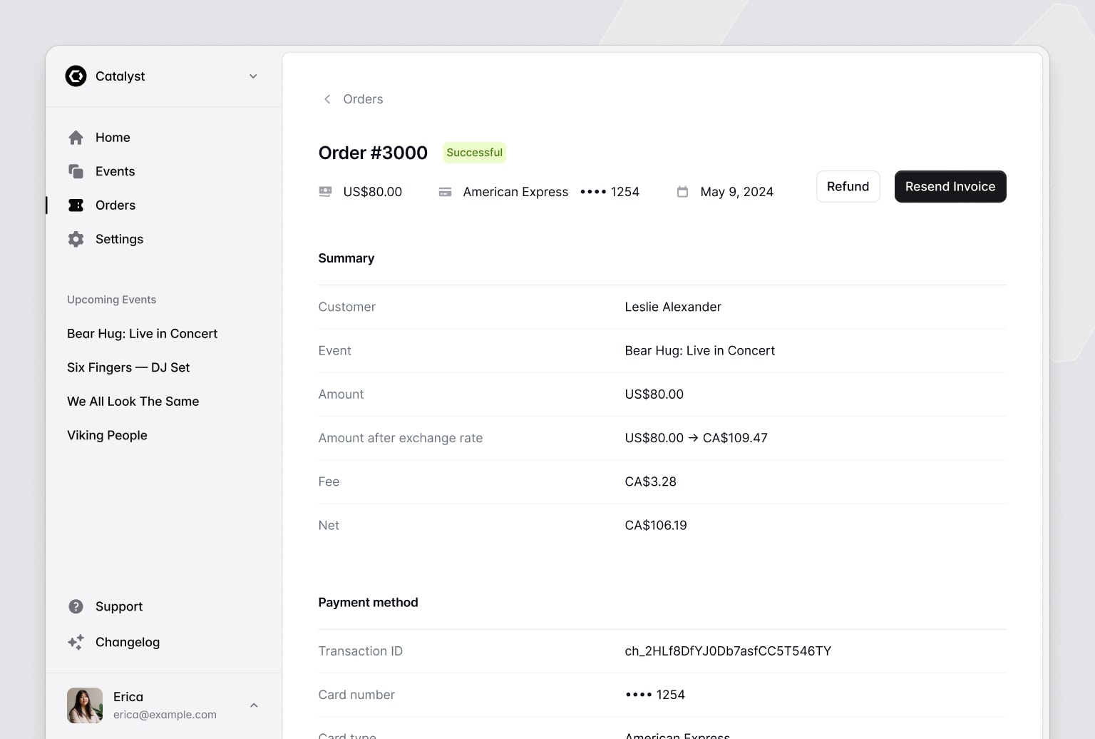
import { SidebarLayout } from "@/components/sidebar-layout";import { Navbar } from "@/components/navbar";import { Sidebar } from "@/components/sidebar";function Example({ children }) { return ( <SidebarLayout sidebar={<Sidebar></Sidebar>} navbar={<Navbar></Navbar>} > </SidebarLayout> );}第二种是一个更简单的堆叠布局,带有水平导航菜单,这通常非常适合页面较少的应用:
🌐 The second is a simpler stacked layout with a horizontal navigation menu, which is often a great fit for apps with fewer pages:
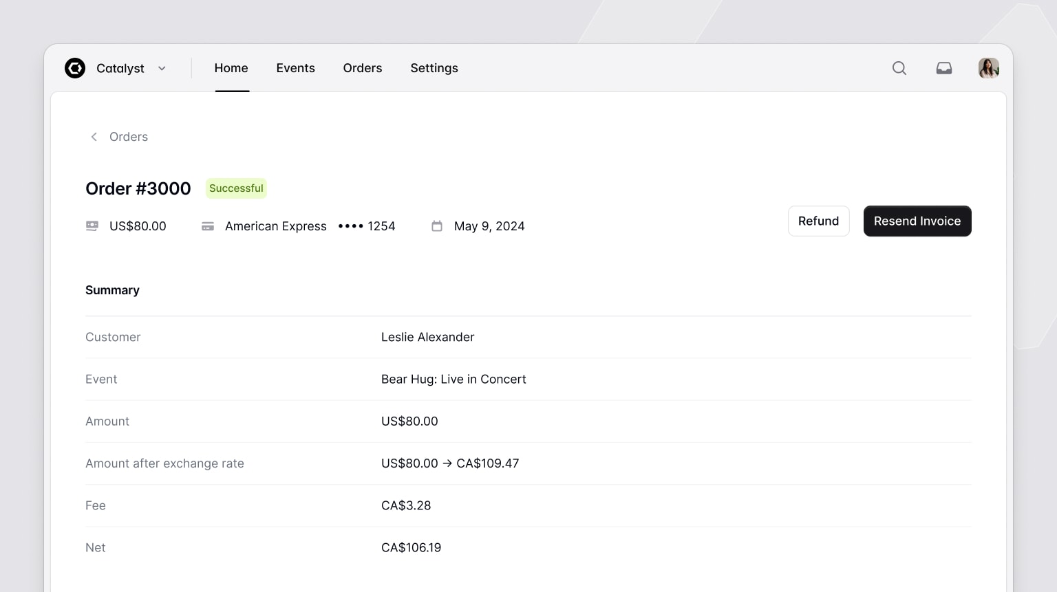
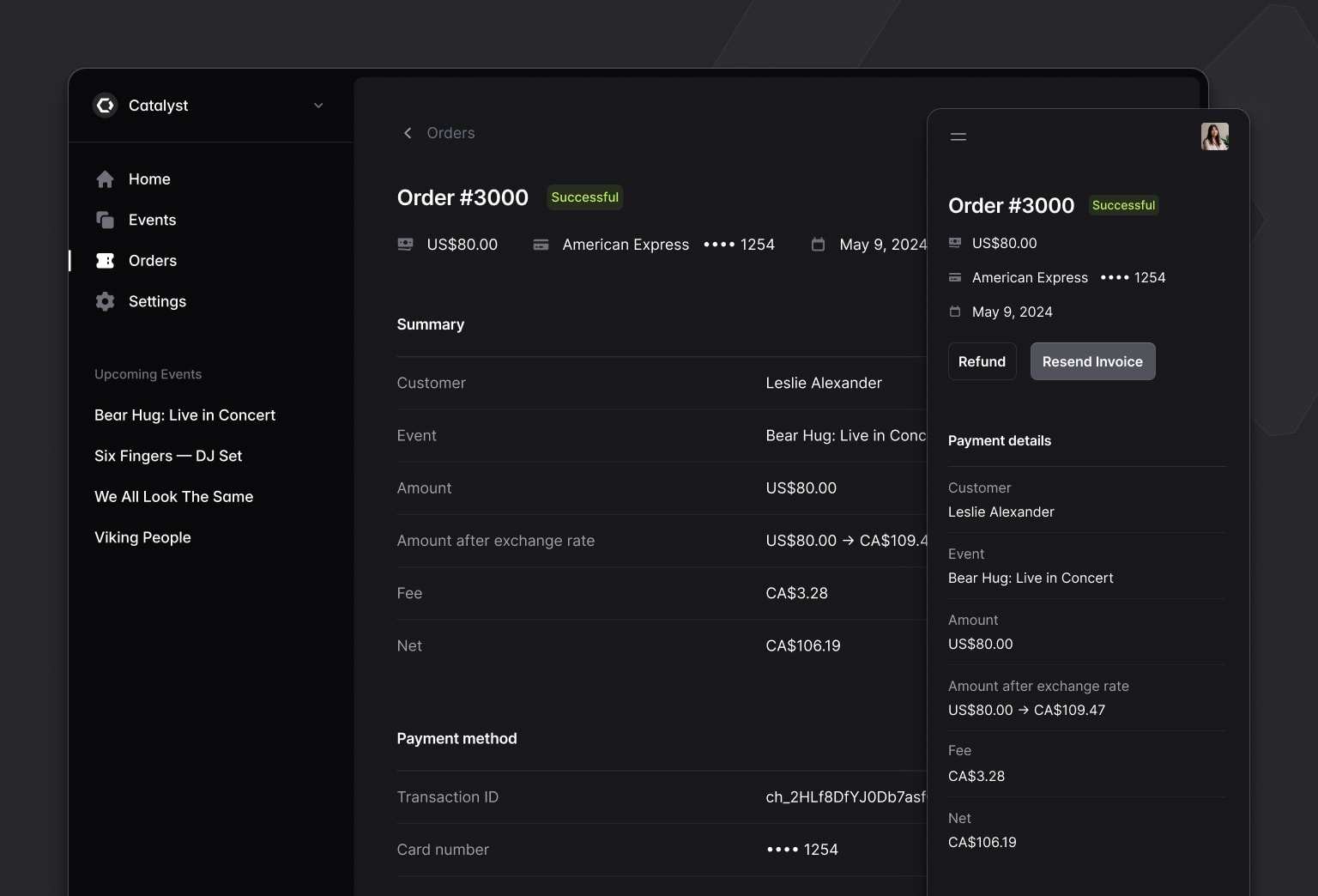
import { StackedLayout } from "@/components/stacked-layout";import { Navbar } from "@/components/navbar";import { Sidebar } from "@/components/sidebar";function Example({ children }) { return ( <StackedLayout navbar={<Navbar></Navbar>} sidebar={<Sidebar></Sidebar>} > </StackedLayout> );}当然,它们都支持暗黑模式:
🌐 And they both support dark mode too, of course:
我们非常努力地确保所有这些组件的 API 都正确无误,以便你可以轻松地将元素放置在需要的位置,还可以选择添加图标、下拉菜单等等。
🌐 We worked really hard to get the APIs for all of these components right, making it easy to position things where you need them to be, optionally include icons, incorporate dropdown menus, and more.
最终结果非常简单,这正是我们想要的,而且我相信你会发现用它们构建起来非常愉快。
🌐 The final result turned out feeling really simple which is exactly what we were going for, and I think you'll find they are a real delight to build with.
查看 侧边栏布局文档 和 堆叠布局文档 以开始,然后深入了解 导航栏 和 侧边栏 组件,学习如何构建所有导航项。
🌐 Check out the Sidebar layout documentation and Stacked layout documentation to get started, then dig into the Navbar and Sidebar components to learn how to structure all of the navigation items.
描述列表(Description lists)
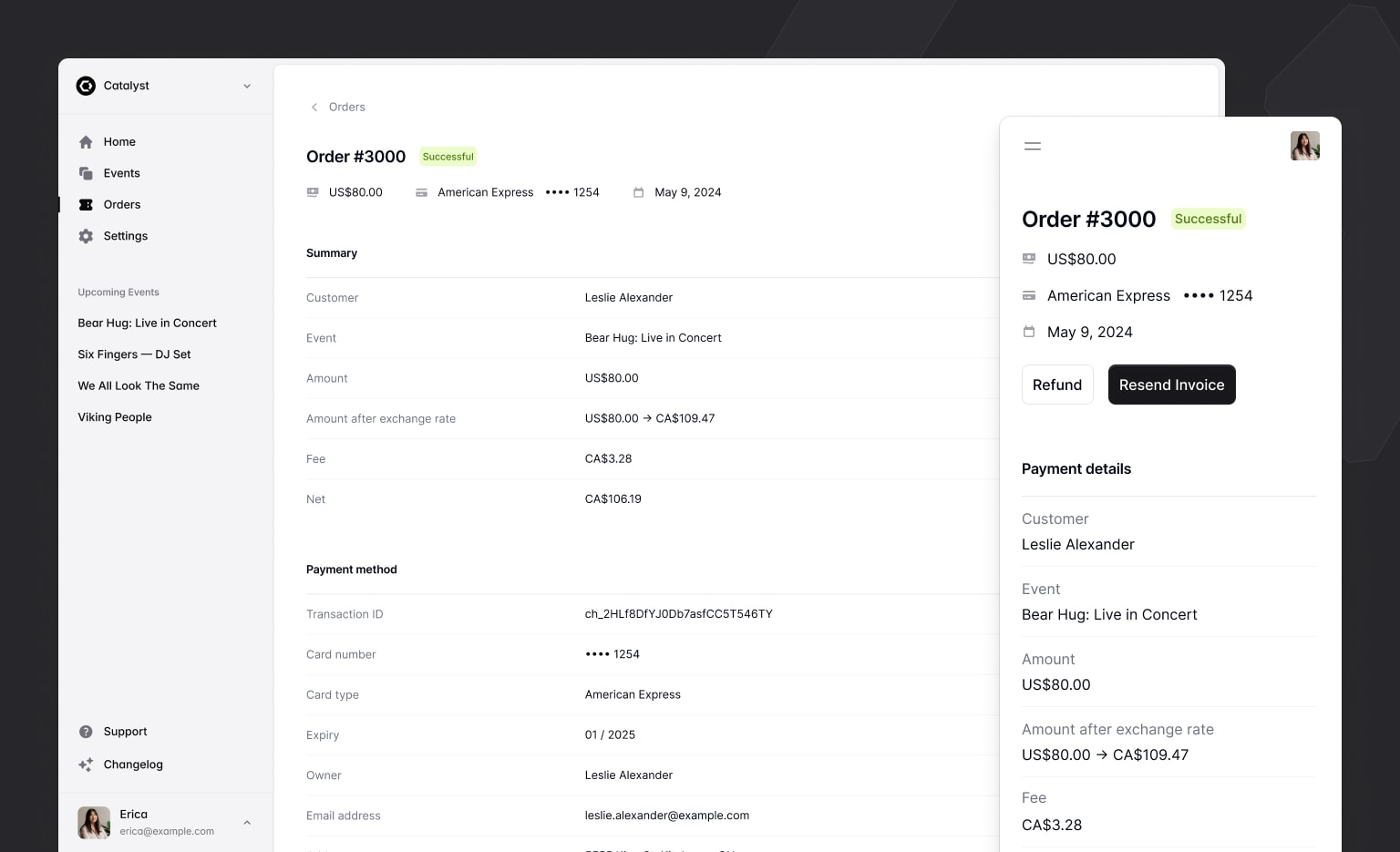
当我们在处理应用布局时,我们意识到没有任何好的内容来展示它们,所以我们制作了一个 DescriptionList 组件来填补那个巨大的空白空间。
🌐 When we were working on the application layouts we realized we didn't have any great content to demo them with, so we cooked up a DescriptionList component to fill in that big empty space.
- Customer
- Michael Foster
- Event
- Bear Hug: Live in Concert
- Amount
- $150.00 USD
- Amount after exchange rate
- US$150.00 → CA$199.79
- Fee
- $4.79 USD
- Net
- $1,955.00
import { DescriptionDetails, DescriptionList, DescriptionTerm } from "@/components/description-list";function Example() { return ( <DescriptionList> <DescriptionTerm>Customer</DescriptionTerm> <DescriptionDetails>Michael Foster</DescriptionDetails> <DescriptionTerm>Event</DescriptionTerm> <DescriptionDetails>Bear Hug: Live in Concert</DescriptionDetails> </DescriptionList> );}这是一个非常简单的 API,工作方式就像 HTML 的 <dl> 元素一样,但样式美观、响应迅速,并且当然支持夜间模式。
🌐 It's a really simple API that works just like the HTML <dl> element, but is nicely styled, responsive, and with dark mode support of course.
查看 Description list 文档以获取更多详细信息。
🌐 Check out the Description list documentation for more details.
页面标题(Page headings)
为了让演示看起来更好,我们需要更多的组件!我们添加了 Heading 和 Subheading 组件,你可以用它们在你的界面中快速且一致地为内容添加标题。
🌐 More components we needed to make the demo look good! We've added Heading and Subheading components you can use to quickly and consistently title things in your UI.
Heading
Subheading
import { Heading, Subheading } from "@/components/heading";function Example() { return ( <div> <Heading>Heading</Heading> <Subheading>Subheading</Subheading> </div> );}你可以使用 level 属性来控制渲染哪个 HTML 标题元素,并且像其他所有元素一样,它们是响应式的,并且内置支持夜间模式。
🌐 You can control which HTML heading element is rendered using the level prop, and like everything else, they're responsive with built-in dark mode support.
请参阅 Heading 文档以获取更多示例。
🌐 See the Heading documentation for more examples.
分隔线(Dividers)
好戏在后头 - Catalyst 现在包含一条灰线,你可以在各个元素之间添加。
🌐 Saved the best for last — Catalyst now includes a gray line you can put in between things.
import { Divider } from "@/components/divider";function Example() { return <Divider />;}我们为此付出了不懈的努力,并非常自豪能够简化你应用开发流程的这一部分。
🌐 We worked tirelessly on this one, and are so proud to make this part of your application development process easier.
查看 Divider 文档——它至少有一个属性。
🌐 Check out the Divider documentation — it does have one prop at least.
Catalyst 已包含在你的 Tailwind UI 全访问权限许可中,无需额外费用,因此如果你已有许可,请登录并下载最新版本以开始构建。
🌐 Catalyst is included with your Tailwind UI all-access license at no additional cost, so if you've got a license, log in and download the latest version to start building.
期待看到你用它做了什么!
🌐 Looking forward to seeing what you do with it!