
在寻找改进方法方面,没有什么比用自己的工具实际构建一些真实的东西更好的了。
🌐 Nothing beats actually building something real with your own tools when it comes to finding ways to make things better.
在过去几个月里,我们一直在开发 Catalyst,同时对 Headless UI 进行了数十项改进,让你可以编写更少的代码,并提升开发者体验。
🌐 As we've been working on Catalyst these last several months, we've been making dozens of improvements to Headless UI that let you write even less code, and make the developer experience even better.
我们刚刚发布了 Headless UI v2.0 for React,这是所有这些工作的巅峰之作。
🌐 We just released Headless UI v2.0 for React, which is the culmination of all this work.
以下是所有最新功能:
🌐 Here's all the best new stuff:
通过从 npm 安装最新版本的 @headlessui/react 将其添加到你的项目中:
🌐 Add it to your project by installing the latest version of @headlessui/react from npm:
npm install @headlessui/react@latest如果你正在从 v1.x 升级,请查看升级指南了解更多更改内容。
🌐 If you're upgrading from v1.x, check out the upgrade guide to learn more about what's changed.
内置锚点定位(Built-in anchor positioning)
我们已经将 Floating UI 直接集成到 Headless UI 中,因此你无需担心下拉菜单会超出视野或被屏幕上的其他元素遮挡。
🌐 We've integrated Floating UI directly into Headless UI, so you never have to worry about dropdowns going out of view or being obscured by other elements on the screen.
在 Menu、Popover、Combobox 和 Listbox 组件上使用新的 anchor 属性来指定锚点位置,然后使用 CSS 变量如 --anchor-gap 和 --anchor-padding 对位置进行微调:
🌐 Use the new anchor prop on the Menu, Popover, Combobox, and Listbox components to specify the anchor positioning, then fine-tune the placement with CSS variables like --anchor-gap and --anchor-padding:
上下滚动以查看下拉位置的变化
import { Menu, MenuButton, MenuItem, MenuItems } from "@headlessui/react";function Example() { return ( <Menu> <MenuButton>Options</MenuButton> <MenuItems anchor="bottom start" className="[--anchor-gap:8px] [--anchor-padding:8px]" > <MenuItem> <button>Edit</button> </MenuItem> <MenuItem> <button>Duplicate</button> </MenuItem> <hr /> <MenuItem> <button>Archive</button> </MenuItem> <MenuItem> <button>Delete</button> </MenuItem> </MenuItems> </Menu> );}这个 API 特别好的地方在于,你可以通过使用像 sm:[--anchor-gap:4px] 这样的工具类来更改 CSS 变量,从而在不同的断点调整样式。
🌐 What makes this API really nice is that you can tweak the styles at different breakpoints by changing the CSS variables using utility classes like sm:[--anchor-gap:4px].
查看每个组件的锚点定位文档以获取所有详细信息。
🌐 Check out the anchor positioning documentation for each component for all of the details.
新的复选框组件(New checkbox component)
我们添加了一个新的无头 Checkbox 组件,以补充我们现有的 RadioGroup 组件,使构建完全自定义的复选框控件变得容易:
🌐 We've added a new headless Checkbox component to complement our existing RadioGroup component, making it easy to build totally custom checkbox controls:
This will give you early access to any awesome new features we're developing.
import { Checkbox, Description, Field, Label } from "@headlessui/react";import { CheckmarkIcon } from "./icons/checkmark";import clsx from "clsx";function Example() { return ( <Field> <Checkbox defaultChecked className={clsx( "size-4 rounded border bg-white dark:bg-white/5", "data-[checked]:border-transparent data-[checked]:bg-blue-500", "focus:outline-none data-[focus]:outline-2 data-[focus]:outline-offset-2 data-[focus]:outline-blue-500", )} > <CheckmarkIcon className="stroke-white opacity-0 group-data-[checked]:opacity-100" /> </Checkbox> <div> <Label>Enable beta features</Label> <Description>This will give you early access to any awesome new features we're developing.</Description> </div> </Field> );}复选框可以是受控的或不受控的,并且可以自动将其状态与隐藏输入同步,以便与 HTML 表单完美兼容。
🌐 Checkboxes can be controlled or uncontrolled, and can automatically sync their state with a hidden input to play nicely with HTML forms.
查看 Checkbox 文档 以了解更多信息。
🌐 Take a look at the Checkbox documentation to learn more.
HTML 表单组件(HTML form components)
我们添加了一整套新的组件,这些组件只是封装了原生表单控件,但会自动为你完成连接 ID 和 aria-* 属性的所有繁琐工作。
🌐 We've added a whole new set of components that just wrap native form controls, but do all of the tedious work of wiring up IDs and aria-* attributes for you automatically.
以下是构建一个简单的 <input> 字段,并在之前正确关联 <label> 和描述时的样子:
🌐 Here's what it looked like to build a simple <input> field with a properly associated <label> and description before:
<div> <label id="name-label" for="name-input"> Name </label> <input id="name-input" aria-labelledby="name-label" aria-describedby="name-description" /> <p id="name-description">Use your real name so people will recognize you.</p></div>以下是 Headless UI v2.0 中这些新组件的外观:
🌐 And here's what it looks like with these new components in Headless UI v2.0:
import { Description, Field, Input, Label } from "@headlessui/react";function Example() { return ( <Field> <Label>Name</Label> <Input name="your_name" /> <Description>Use your real name so people will recognize you.</Description> </Field> );}新的 Field 和 Fieldset 组件也像原生的 <fieldset> 元素一样级联禁用状态,因此你可以轻松地一次性禁用整组控件:
🌐 The new Field and Fieldset components also cascade disabled states like the native <fieldset> element, so you can easily disable an entire group of controls at once:
选择一个国家以启用区域字段
import { Button, Description, Field, Fieldset, Input, Label, Legend, Select } from "@headlessui/react";import { regions } from "./countries";export function Example() { const [country, setCountry] = useState(null); return ( <form action="/shipping"> <Fieldset> <Legend>Shipping details</Legend> <Field> <Label>Street address</Label> <Input name="address" /> </Field> <Field> <Label>Country</Label> <Description>We currently only ship to North America.</Description> <Select name="country" value={country} onChange={(event) => setCountry(event.target.value)}> <option></option> <option>Canada</option> <option>Mexico</option> <option>United States</option> </Select> </Field> <Field disabled={!country}> <Label className="data-[disabled]:opacity-40">State/province</Label> <Select name="region" className="data-[disabled]:opacity-50"> <option></option> {country && regions[country].map((region) => <option>{region}</option>)} </Select> </Field> <Button>Submit</Button> </Fieldset> </form> );}我们在渲染的 HTML 中使用 data-disabled 属性来暴露禁用状态。这使我们即使在不支持原生 disabled 属性的元素(例如相关的 <label> 元素)上也能暴露它,从而可以非常轻松地微调每个元素的禁用样式。
🌐 We expose the disabled state using a data-disabled attribute in the rendered HTML. This lets us expose it even on elements that don't support the native disabled attribute like the associated <label> element, making it really easy to fine-tune the disabled styles for each element.
总的来说,我们在这里添加了8个新组件——Fieldset、Legend、Field、Label、Description、Input、Select和Textarea。
🌐 All in all we've added 8 new components here — Fieldset, Legend, Field, Label, Description, Input, Select, and Textarea.
想了解更多详情,请从 Fieldset 文档 开始,然后逐步浏览其余内容。
🌐 For more details, start with the Fieldset documentation and work your way through the rest.
改进了悬停、聚焦和活动状态检测(Improved hover, focus and active state detection)
Headless UI 现在在底层使用了出色的 React Aria 库的 hooks,为你的控件添加了更智能的 data-* 状态属性,这些属性在不同设备上的表现比原生 CSS 伪类更加一致:
🌐 Using hooks from the awesome React Aria library under the hood, Headless UI now adds smarter data-* state attributes to your controls that behave more consistently across different devices than the native CSS pseudo-classes:
data-active—— 类似于:active,但在从元素拖出时会被移除。data-hover—— 类似:hover,但在触摸设备上会被忽略,以避免悬停状态卡住。-
data-focus—— 类似于:focus-visible,但不会因为命令式聚焦而产生误报。
Click, hover, focus, and drag the button to see the data attributes applied
要了解更多关于使用 JavaScript 应用这些样式的重要性,我强烈建议你阅读 Devon Govett 关于此主题的精彩博客系列:
🌐 To learn more about why applying these styles using JavaScript is important, I highly recommend reading through Devon Govett's excellent blog series on this topic:
网络总是让我惊喜不已,它能让我付出如此多的努力才能创造出如此美好的事物。
🌐 The web never ceases to surprise me with the amount of effort it takes to actually make nice things.
组合框列表虚拟化(Combobox list virtualization)
我们已经将 TanStack Virtual 集成到 Headless UI 中,以支持列表虚拟化,当你需要在组合框中放入十万个项目时,因为,嘿,这是老板让你做的。
🌐 We've integrated TanStack Virtual into Headless UI to support list virtualization when you need to put a hundred thousand items in your combobox because, hey, that's what the boss told you to do.
使用新的 virtual 属性来传入所有项目,并使用 ComboboxOptions 渲染属性来提供单个选项的模板:
🌐 Use the new virtual prop to pass in all of your items, and use the ComboboxOptions render prop to provide the template for an individual option:
打开下拉框并滚动查看1000个选项
import { Combobox, ComboboxButton, ComboboxInput, ComboboxOption, ComboboxOptions } from "@headlessui/react";import { ChevronDownIcon } from "@heroicons/react/20/solid";import { useState } from "react";const people = [ { id: 1, name: "Rossie Abernathy" }, { id: 2, name: "Juana Abshire" }, { id: 3, name: "Leonel Abshire" }, { id: 4, name: "Llewellyn Abshire" }, { id: 5, name: "Ramon Abshire" }, // ...up to 1000 people];function Example() { const [query, setQuery] = useState(""); const [selected, setSelected] = useState(people[0]); const filteredPeople = query === "" ? people : people.filter((person) => { return person.name.toLowerCase().includes(query.toLowerCase()); }); return ( <Combobox value={selected} virtual={{ options: filteredPeople }} onChange={(value) => setSelected(value)} onClose={() => setQuery("")} > <div> <ComboboxInput displayValue={(person) => person?.name} onChange={(event) => setQuery(event.target.value)} /> <ComboboxButton> <ChevronDownIcon /> </ComboboxButton> </div> <ComboboxOptions> {({ option: person }) => ( <ComboboxOption key={person.id} value={person}> {person.name} </ComboboxOption> )} </ComboboxOptions> </Combobox> );}查看新的 虚拟滚动文档 以了解更多信息。
🌐 Check out the new virtual scrolling documentation to learn more.
新网站和改进的文档(New website and improved docs)
为了配合此主要版本的发布,我们还对文档进行了重大修订,并让网站焕然一新:
🌐 To go along with this major release, we've also significantly revamped the documentation and given the website a fresh coat of paint:
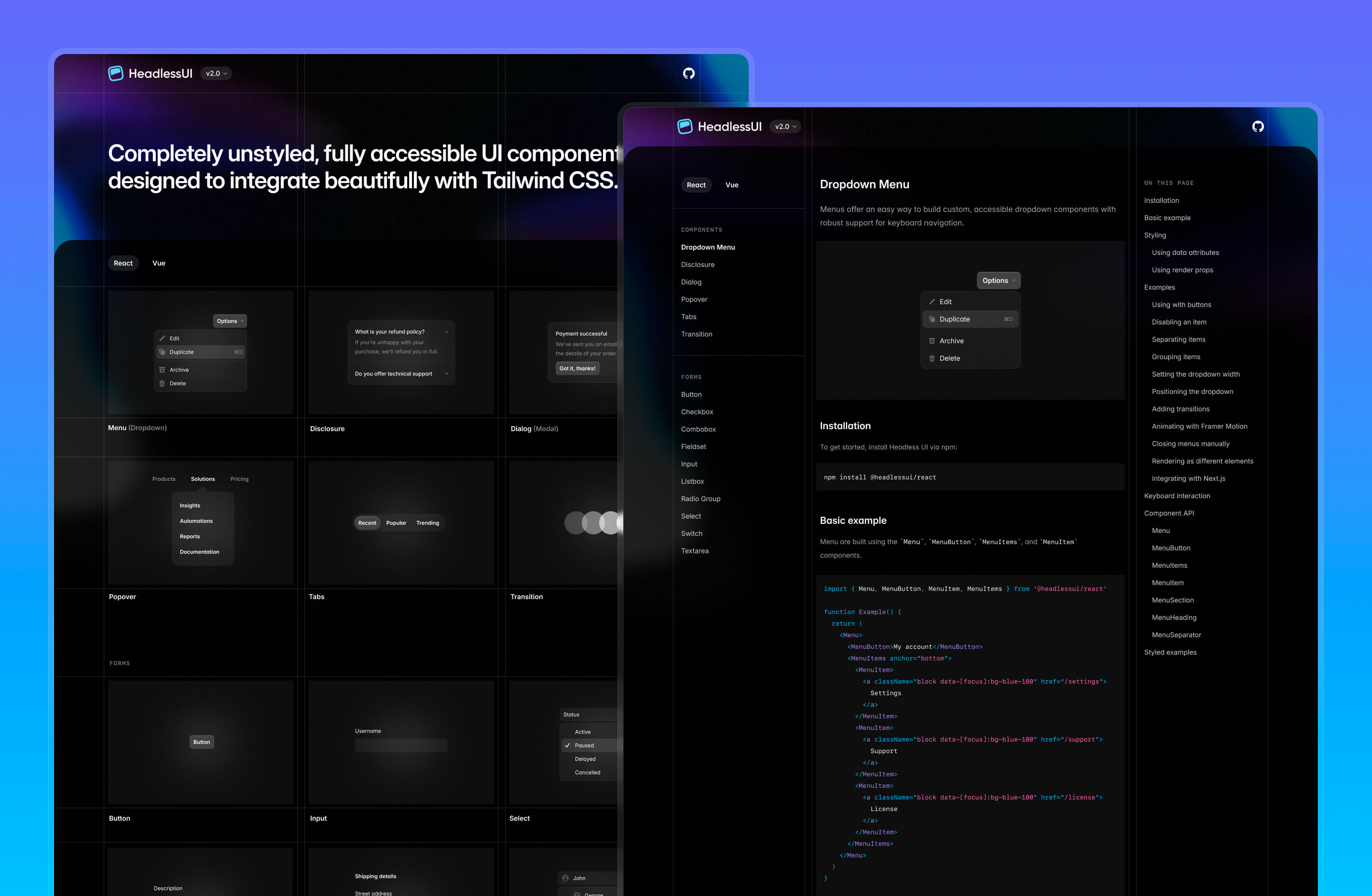
前往新的 headlessui.com 查看吧!
🌐 Head over to the new headlessui.com to check it out!