布局
columns
用于控制元素内列数的工具。
| 类 | 样式 |
|---|---|
columns-<number> | columns: <number>; |
columns-3xs | columns: var(--container-3xs); /* 16rem (256px) */ |
columns-2xs | columns: var(--container-2xs); /* 18rem (288px) */ |
columns-xs | columns: var(--container-xs); /* 20rem (320px) */ |
columns-sm | columns: var(--container-sm); /* 24rem (384px) */ |
columns-md | columns: var(--container-md); /* 28rem (448px) */ |
columns-lg | columns: var(--container-lg); /* 32rem (512px) */ |
columns-xl | columns: var(--container-xl); /* 36rem (576px) */ |
columns-2xl | columns: var(--container-2xl); /* 42rem (672px) */ |
columns-3xl | columns: var(--container-3xl); /* 48rem (768px) */ |
columns-4xl | columns: var(--container-4xl); /* 56rem (896px) */ |
columns-5xl | columns: var(--container-5xl); /* 64rem (1024px) */ |
columns-6xl | columns: var(--container-6xl); /* 72rem (1152px) */ |
columns-7xl | columns: var(--container-7xl); /* 80rem (1280px) */ |
columns-auto | columns: auto; |
columns-(<custom-property>) | columns: var(<custom-property>); |
columns-[<value>] | columns: <value>; |
示例(Examples)
按数字设置(Setting by number)
使用 columns-<number> 工具(如 columns-3)设置应为元素内的内容创建的列数:
🌐 Use columns-<number> utilities like columns-3 to set the number of columns that should be created for the content within an element:
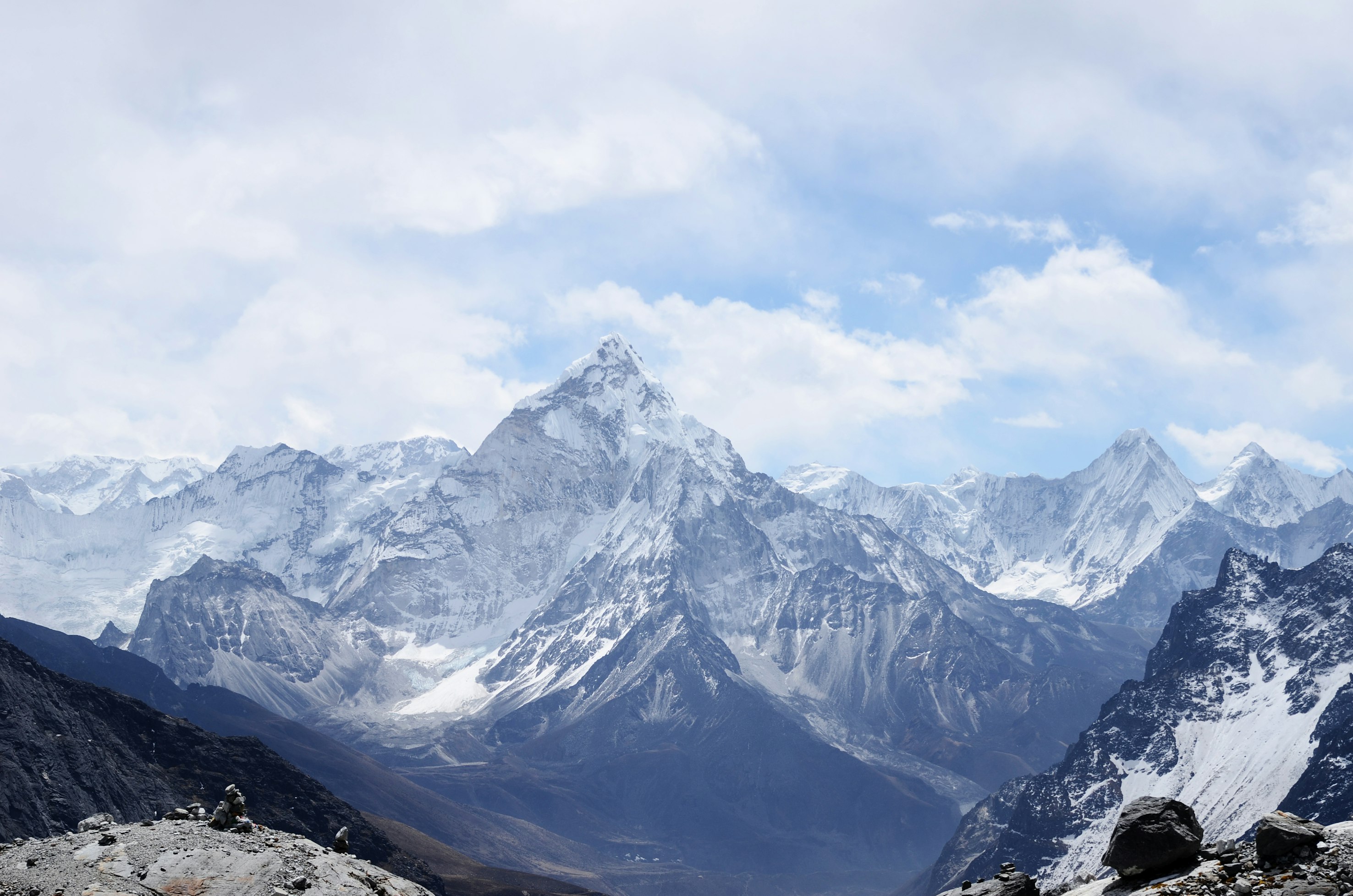


<div class="columns-3 ..."> <img class="aspect-3/2 ..." src="/img/mountains-1.jpg" /> <img class="aspect-square ..." src="/img/mountains-2.jpg" /> <img class="aspect-square ..." src="/img/mountains-3.jpg" /> <!-- ... --></div>列宽将自动调整以适应指定的列数。
🌐 The column width will automatically adjust to accommodate the specified number of columns.
按宽度设置(Setting by width)
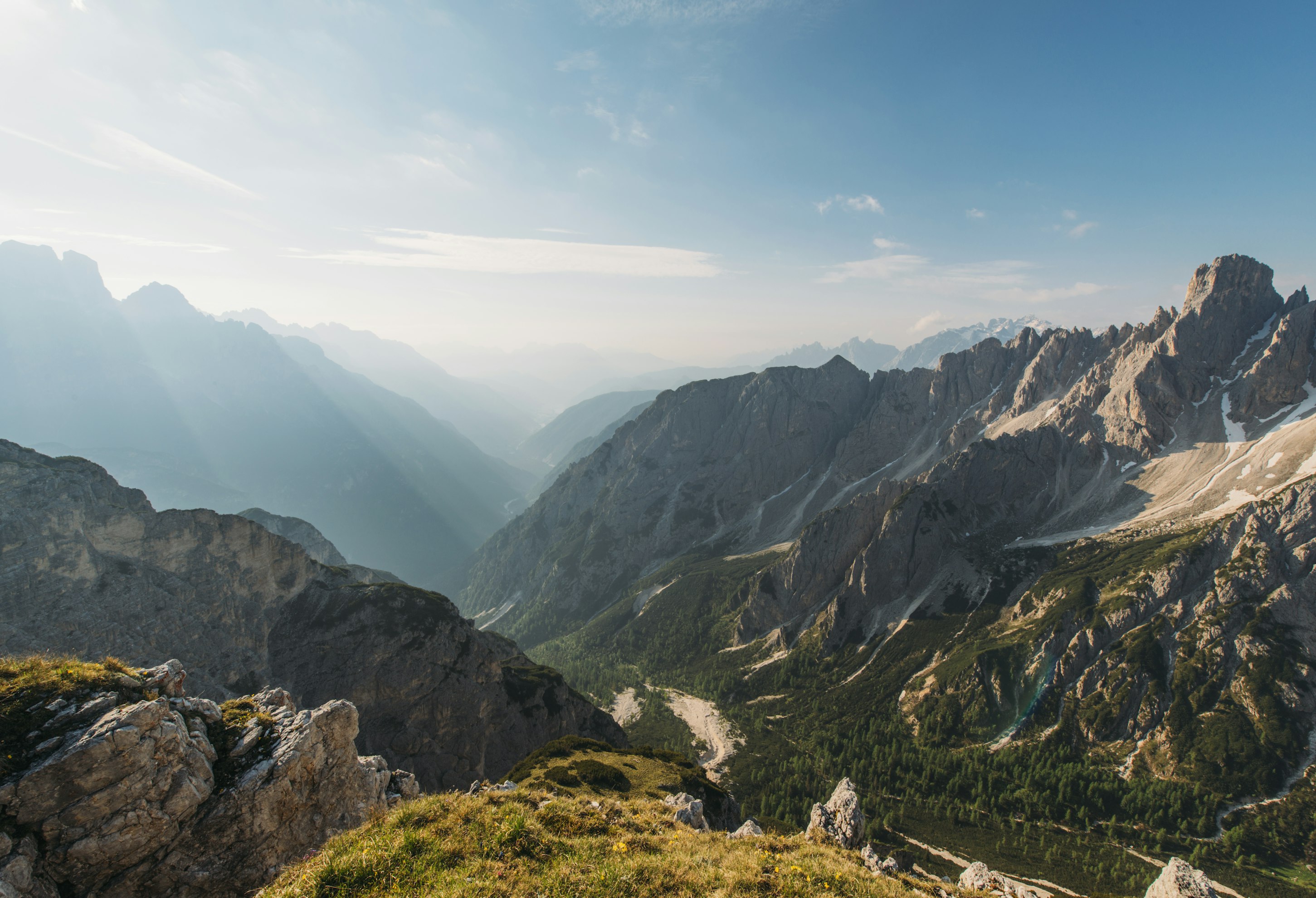
使用 columns-xs 和 columns-sm 这样的工具来设置元素内容的理想列宽:
🌐 Use utilities like columns-xs and columns-sm to set the ideal column width for the content within an element:
调整示例大小以查看预期行为
<div class="columns-3xs ..."> <img class="aspect-3/2 ..." src="/img/mountains-1.jpg" /> <img class="aspect-square ..." src="/img/mountains-2.jpg" /> <img class="aspect-square ..." src="/img/mountains-3.jpg" /> <!-- ... --></div>设置列宽时,列数会自动调整以确保它们不会太窄。
🌐 When setting the column width, the number of columns automatically adjusts to ensure they don't get too narrow.
设置列间距(Setting the column gap)
使用 gap-<width> 工具指定列之间的宽度:
🌐 Use the gap-<width> utilities to specify the width between columns:
<div class="columns-3 gap-8 ..."> <img class="aspect-3/2 ..." src="/img/mountains-1.jpg" /> <img class="aspect-square ..." src="/img/mountains-2.jpg" /> <img class="aspect-square ..." src="/img/mountains-3.jpg" /> <!-- ... --></div>在gap 文档中了解更多关于间距工具的信息。
🌐 Learn more about the gap utilities in the gap documentation.
使用自定义值(Using a custom value)
使用 columns-[<value>] 语法 根据完全自定义的值设置 columns:
<div class="columns-[30vw] ..."> <!-- ... --></div>对于 CSS 变量,还可以使用 columns-(<custom-property>) 语法:
<div class="columns-(--my-columns) ..."> <!-- ... --></div>这只是简写,用于 columns-[var(<custom-property>)] 它会自动为你添加 var() 函数。
响应式设计(Responsive design)
在 columns 工具前面使用断点变体如 sm: 仅在 small 屏幕尺寸及以上时应用工具:
调整示例大小以查看预期行为
<div class="columns-2 gap-4 sm:columns-3 sm:gap-8 ..."> <img class="aspect-3/2 ..." src="/img/mountains-1.jpg" /> <img class="aspect-square ..." src="/img/mountains-2.jpg" /> <img class="aspect-square ..." src="/img/mountains-3.jpg" /> <!-- ... --></div>请参阅 变体文档 详细了解如何使用变体。
自定义主题(Customizing your theme)
使用 --container-* 主题变量来自定义项目中的 fixed-width column 工具:
@theme { --container-4xs: 14rem; }现在 columns-4xs 工具可用于你的标记:
<div class="columns-4xs"> <!-- ... --></div>在此详细了解如何自定义主题: 主题文档。