布局
object-fit
用于控制替换元素内容应如何调整大小的工具。
| 类 | 样式 |
|---|---|
object-contain | object-fit: contain; |
object-cover | object-fit: cover; |
object-fill | object-fit: fill; |
object-none | object-fit: none; |
object-scale-down | object-fit: scale-down; |
示例(Examples)
调整大小以覆盖(Resizing to cover)
使用 object-cover 工具将元素的内容调整为覆盖其容器:
🌐 Use the object-cover utility to resize an element's content to cover its container:
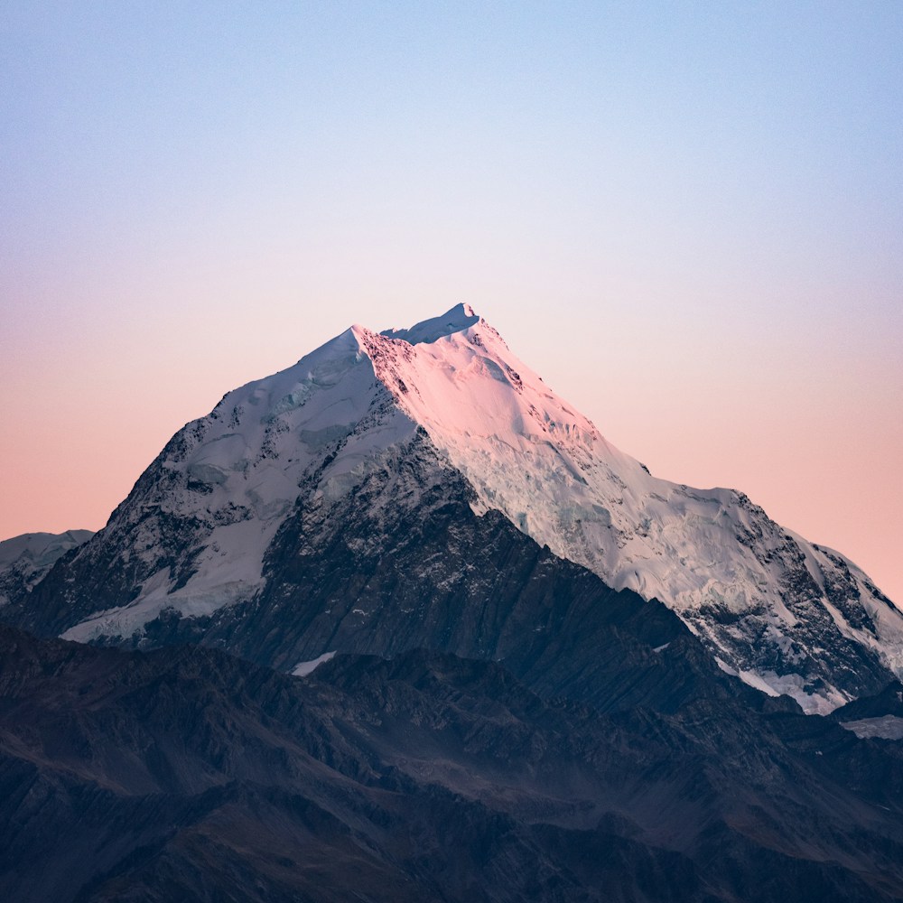
<img class="h-48 w-96 object-cover ..." src="/img/mountains.jpg" />包含在内(Containing within)
使用 object-contain 工具调整元素内容的大小,以保持其在容器内:
🌐 Use the object-contain utility to resize an element's content to stay contained within its container:
<img class="h-48 w-96 object-contain ..." src="/img/mountains.jpg" />拉伸以适应(Stretching to fit)
使用 object-fill 工具将元素的内容拉伸以适应其容器:
🌐 Use the object-fill utility to stretch an element's content to fit its container:
<img class="h-48 w-96 object-fill ..." src="/img/mountains.jpg" />缩小(Scaling down)
使用 object-scale-down 工具以原始大小显示元素的内容,但在必要时将其缩小以适应容器:
🌐 Use the object-scale-down utility to display an element's content at its original size but scale it down to fit its container if necessary:

<img class="h-48 w-96 object-scale-down ..." src="/img/mountains.jpg" />使用原始大小(Using the original size)
使用 object-none 工具显示元素的内容,按原始大小显示而忽略容器大小:
🌐 Use the object-none utility to display an element's content at its original size ignoring the container size:
<img class="h-48 w-96 object-none ..." src="/img/mountains.jpg" />响应式设计(Responsive design)
在 object-fit 工具前面使用断点变体如 md: 仅在 medium 屏幕尺寸及以上时应用工具:
<img class="object-contain md:object-cover" src="/img/mountains.jpg" />请参阅 变体文档 详细了解如何使用变体。